Tag Archives: midtown

Beekman Regent

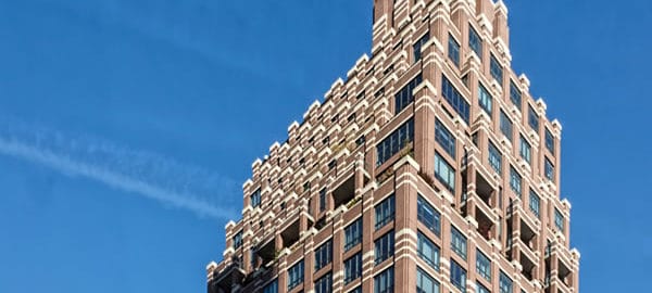
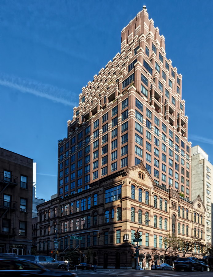
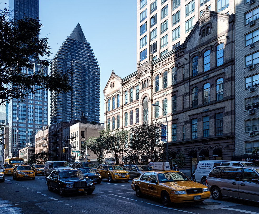
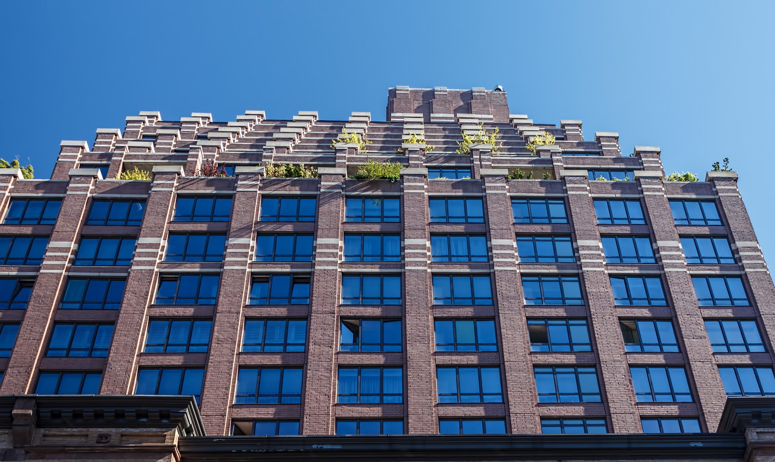
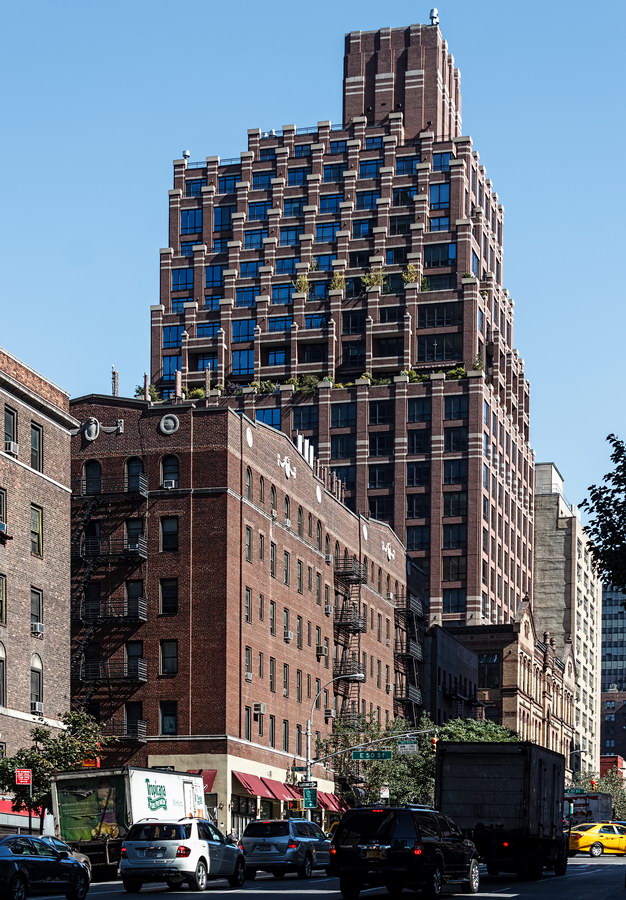
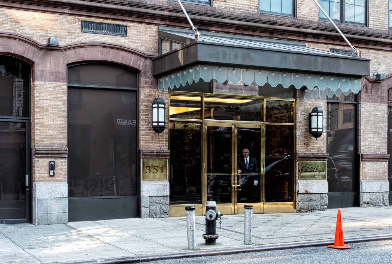
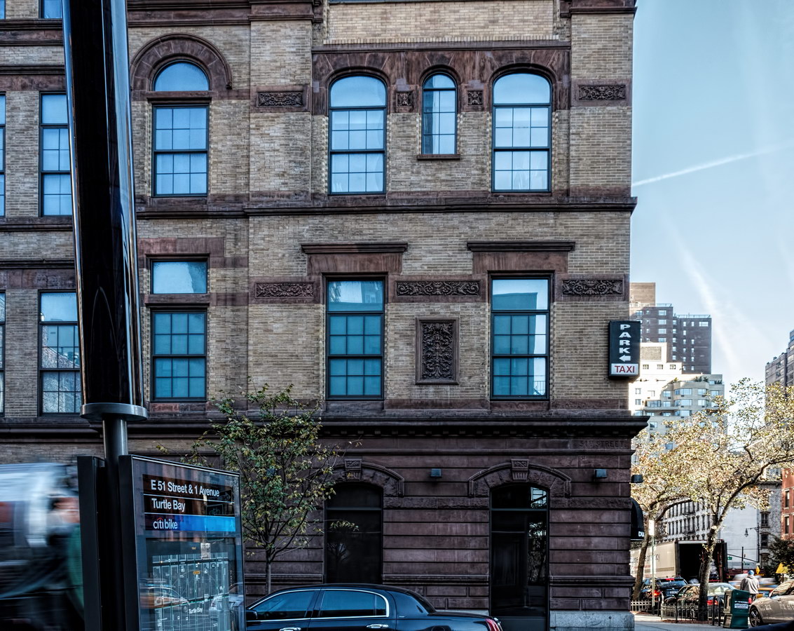
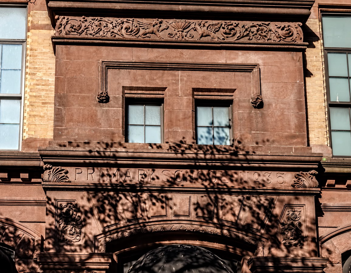
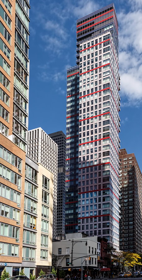
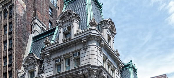
Beekman Regent is the private development of a New York City-owned property, P.S. 135 (originally Primary School No. 35) in the Turtle Bay section of Manhattan.

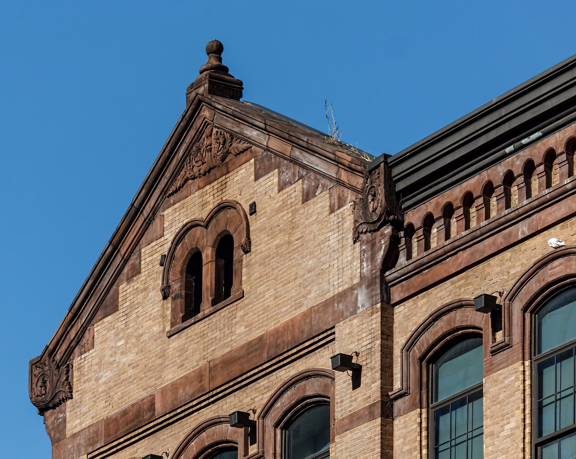
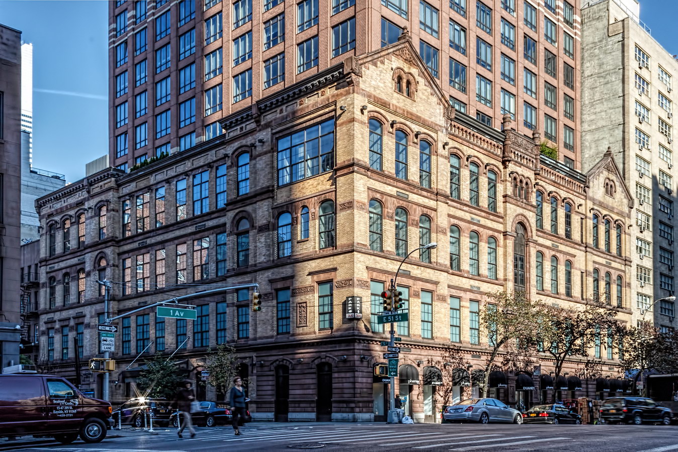
The original buff-colored five-story Romanesque building of 1893 was used as a school until the 1970s, when the Board of Education decided to sell it. The prospective developer intended to demolish the building, but neighborhood groups fought to save the school.

Preservationists succeeded in getting the building listed in the National Register of Historic Places – but not NYC Landmark status. Nonetheless, the city relented and required preservation of the school facade as a condition of the school’s sale. A decade later, the city found a developer that would observe those terms.

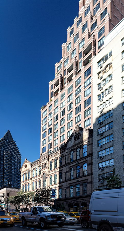
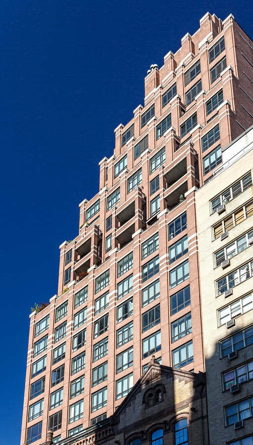
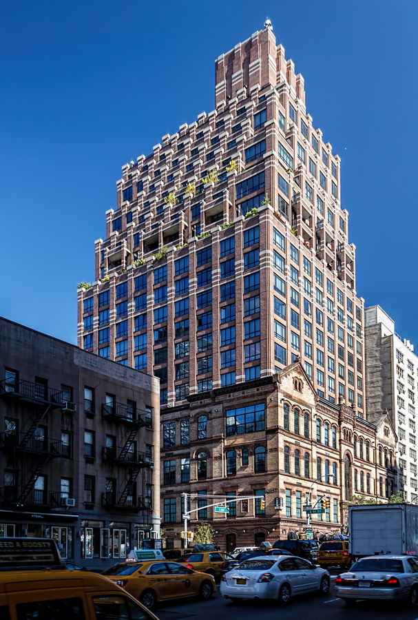
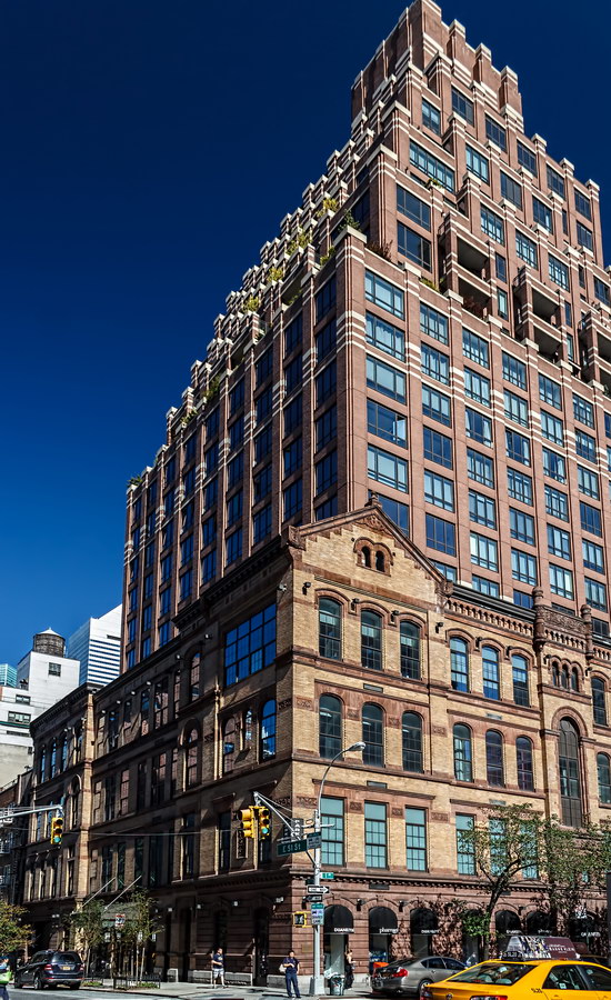
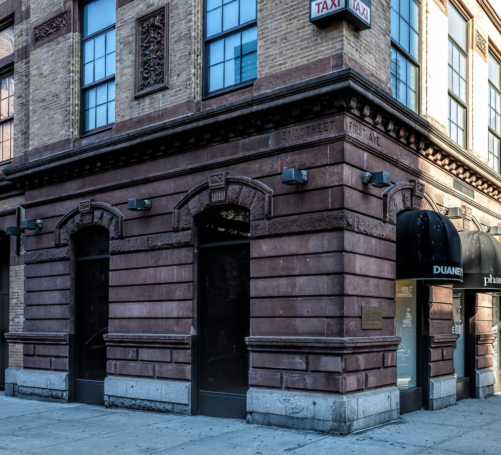
Within the first five floors – the original building height – are retail space (currently a Duane Reade drugstore) and four floors of loft apartments with 14-foot ceilings and 10-foot windows. Above that are duplex, standard and penthouse condominium apartments – homes, in developer-speak.

The apartment tower and historic base are different colors and architectural styles. The effect isn’t as drastic as the glass and steel tower that erupts from the Hearst Building (Eighth Avenue at W 57th Street), but it is odd, like the NYU dorm built behind a fragment of St. Ann’s Shrine Armenian Catholic Cathedral on E 12th Street.

Beekman Regent Vital Statistics
Beekman Regent Recommended Reading

Google Map

Morgan Court

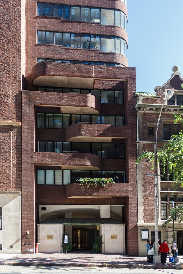
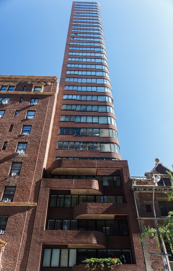
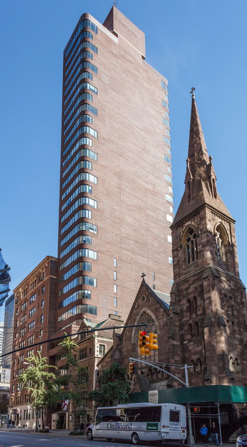
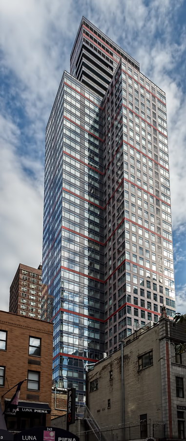
Morgan Court is the New York sliver building, by virtue of being the set of the Sharon Stone movie “Sliver” as well as by its 33-foot-wide architecture.

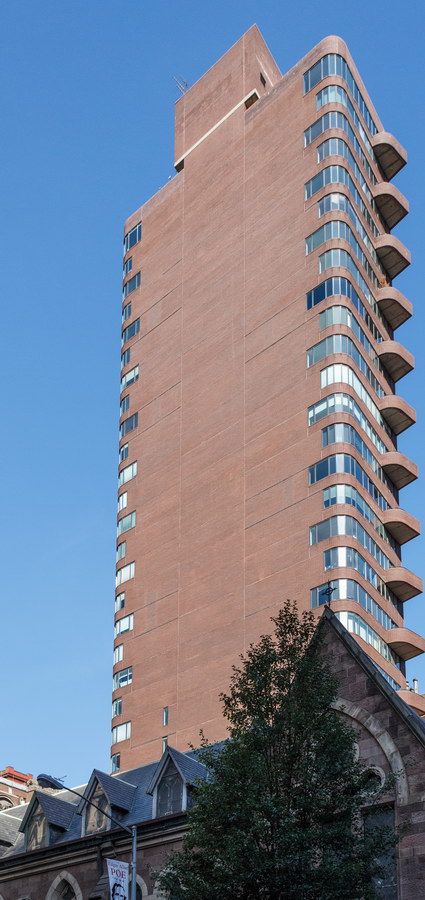
Sliver buildings are the tall thin buildings that tower over their neighbors to become visual sore thumbs. This particular sliver building was thin in a second dimension: The foundation was finished one day before a zoning law that would have prohibited the structure went into effect. Morgan Court is a good 20 stories higher than its neighbors, which include the landmarks Church of the Incarnation and the Morgan Library and Museum.

To their credit, Liebman & Liebman Architects did make the building visually interesting, not just tall and skinny. The ribbon windows, curved southern corners, interlocking balconies on the front (Madison Avenue), and comb-like balconies at the northeast corner are more pleasing than some possible alternatives. The ribbon windows and balconies also have the effect of de-emphasizing Morgan Court’s height.

(Morgan Court takes its name from its proximity to the Morgan Library and Museum, a half block to the north on Madison Avenue.)

Morgan Court Vital Statistics
Morgan Court Recommended Reading

Google Map

Mondrian

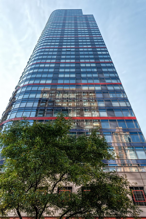
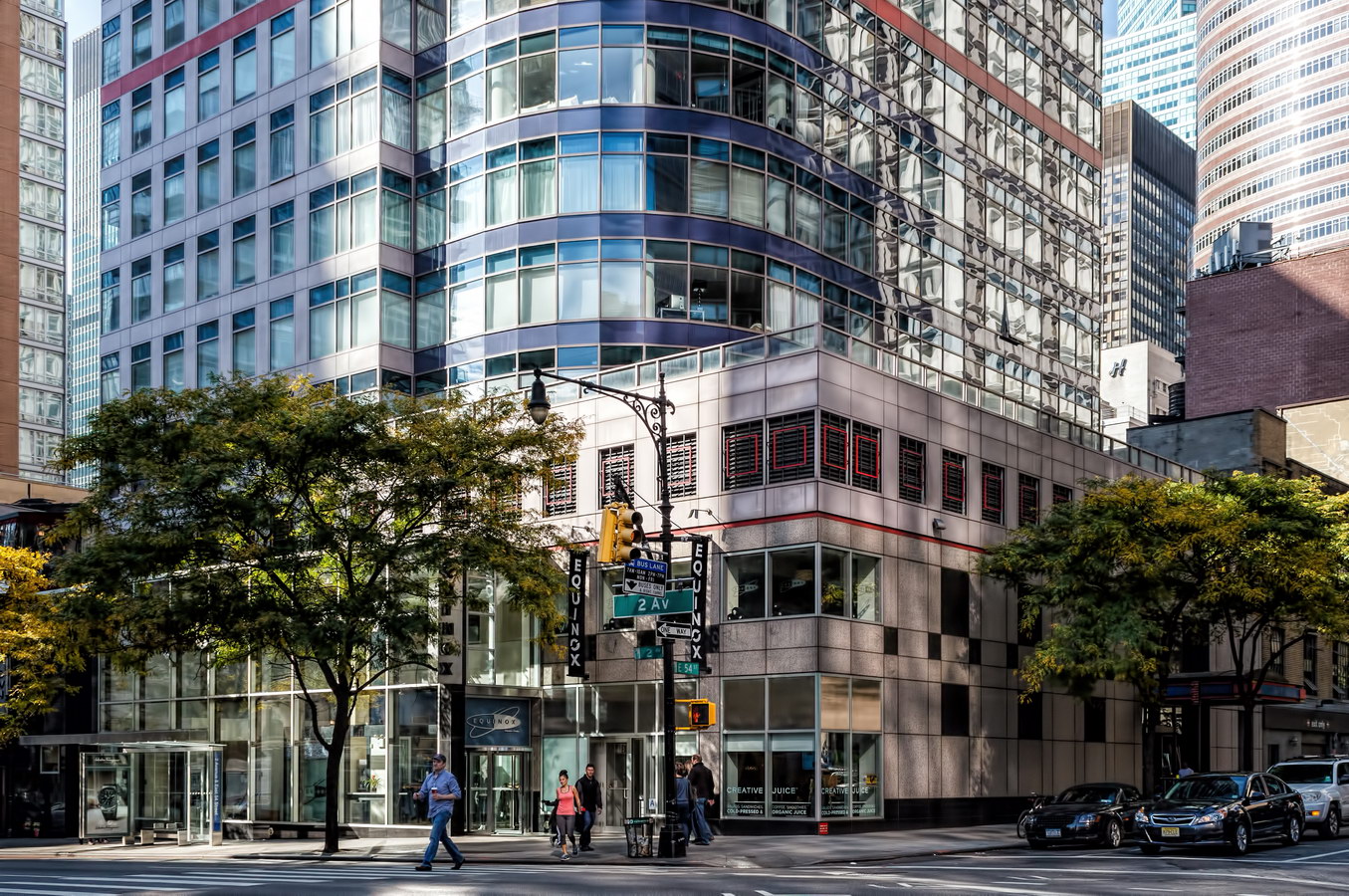
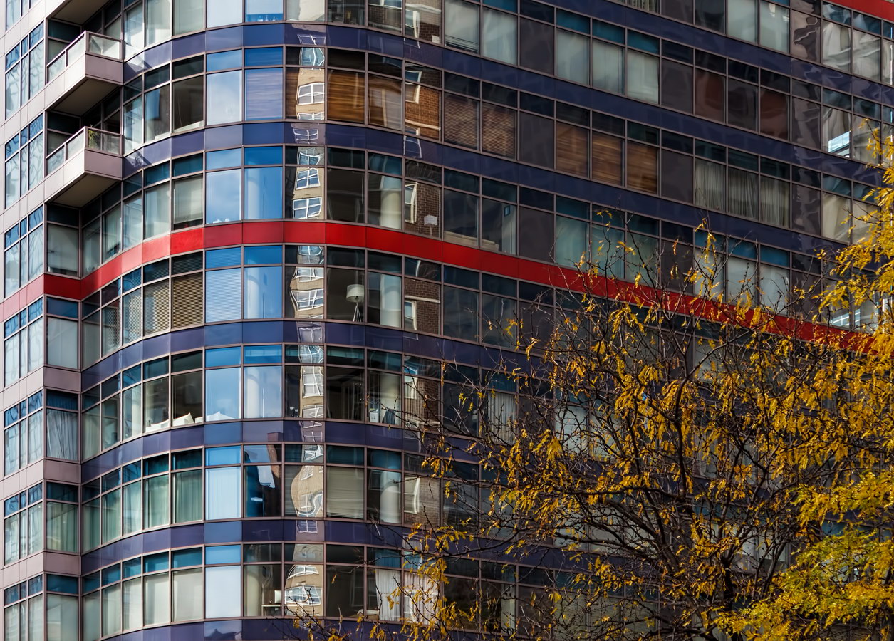
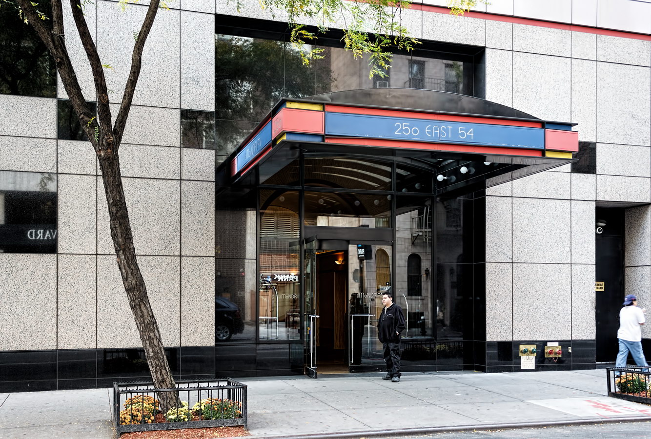
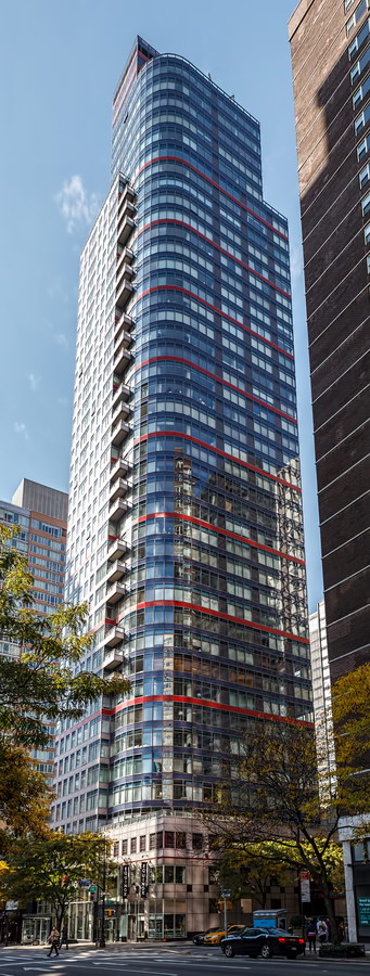
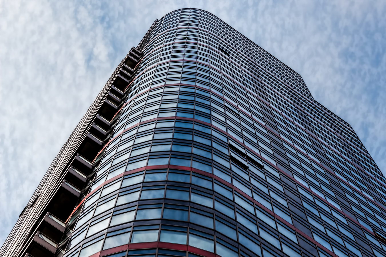
Le Mondrian – now Anglicized to The Mondrian – wears a colorful grid that lives up to its name despite the rounded corner. The tower is certainly among New York’s most colorful pieces of architecture.

The name came years after the glass-enclosed condo was finished, however. The 1992 structure was originally Le Palais – an unluckily timed condo that sat vacant for two years. New owners held a naming contest, and Le Mondrian was the winner. “Music Box” might be an equally appropriate name, for the way that balconies intersect the tower’s curved northeast corner.

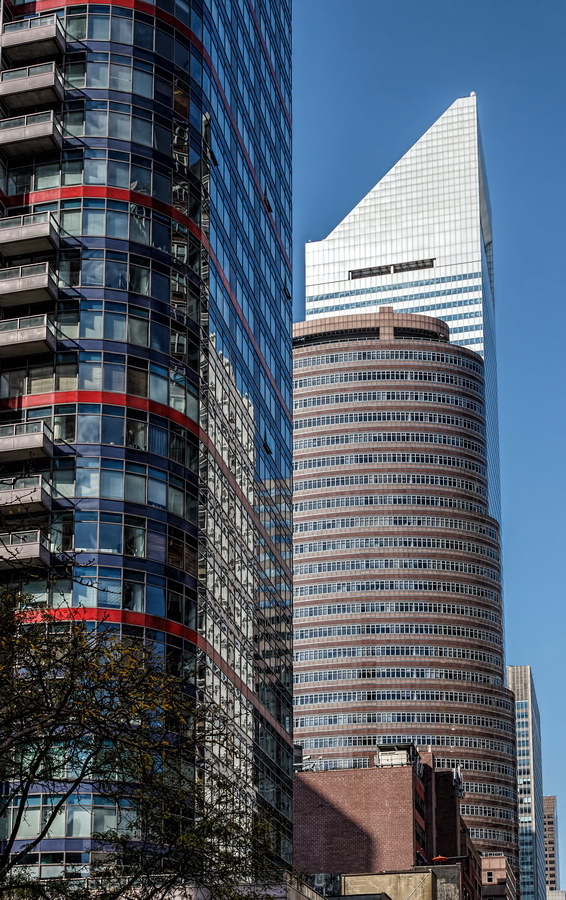
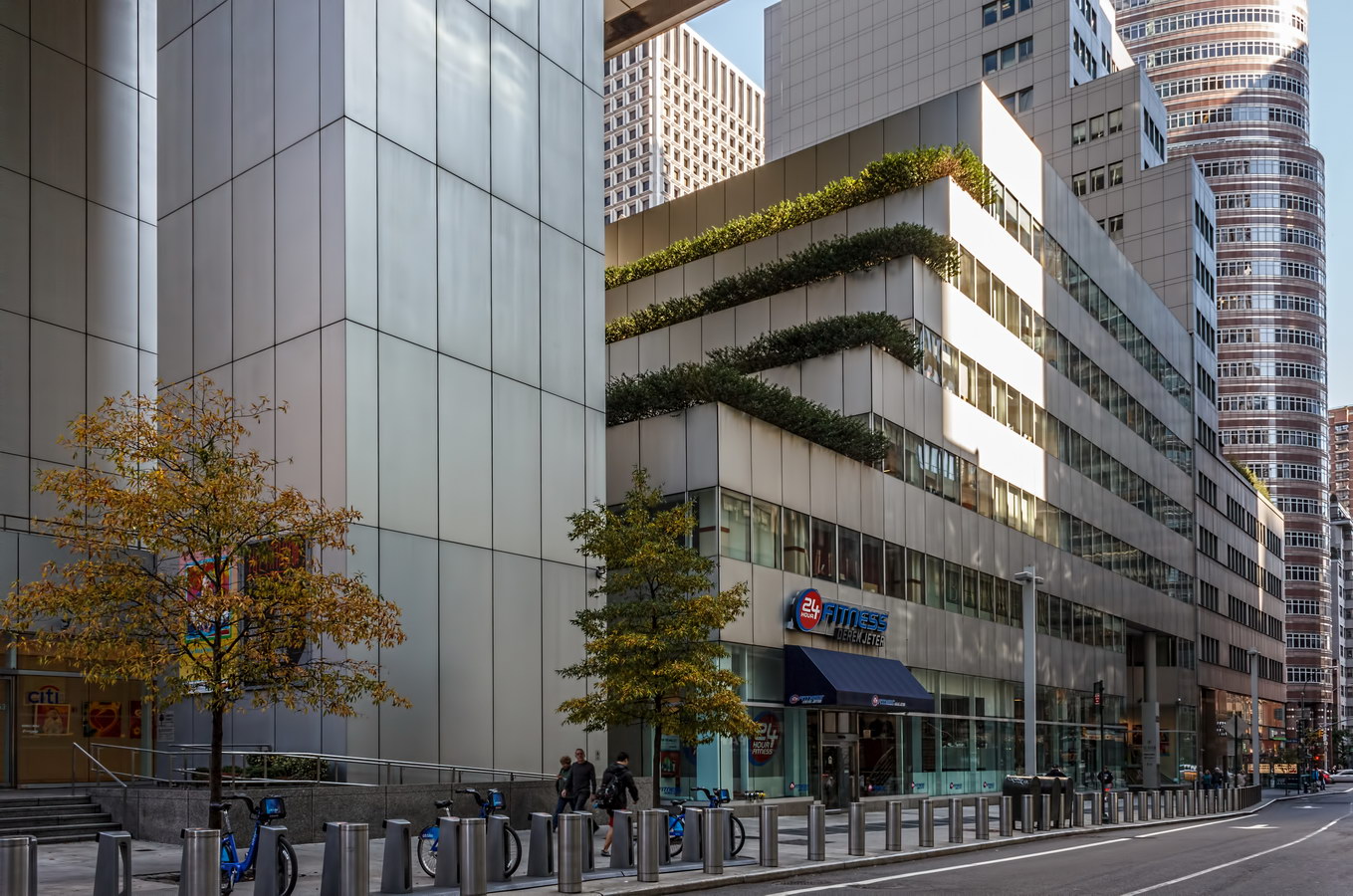
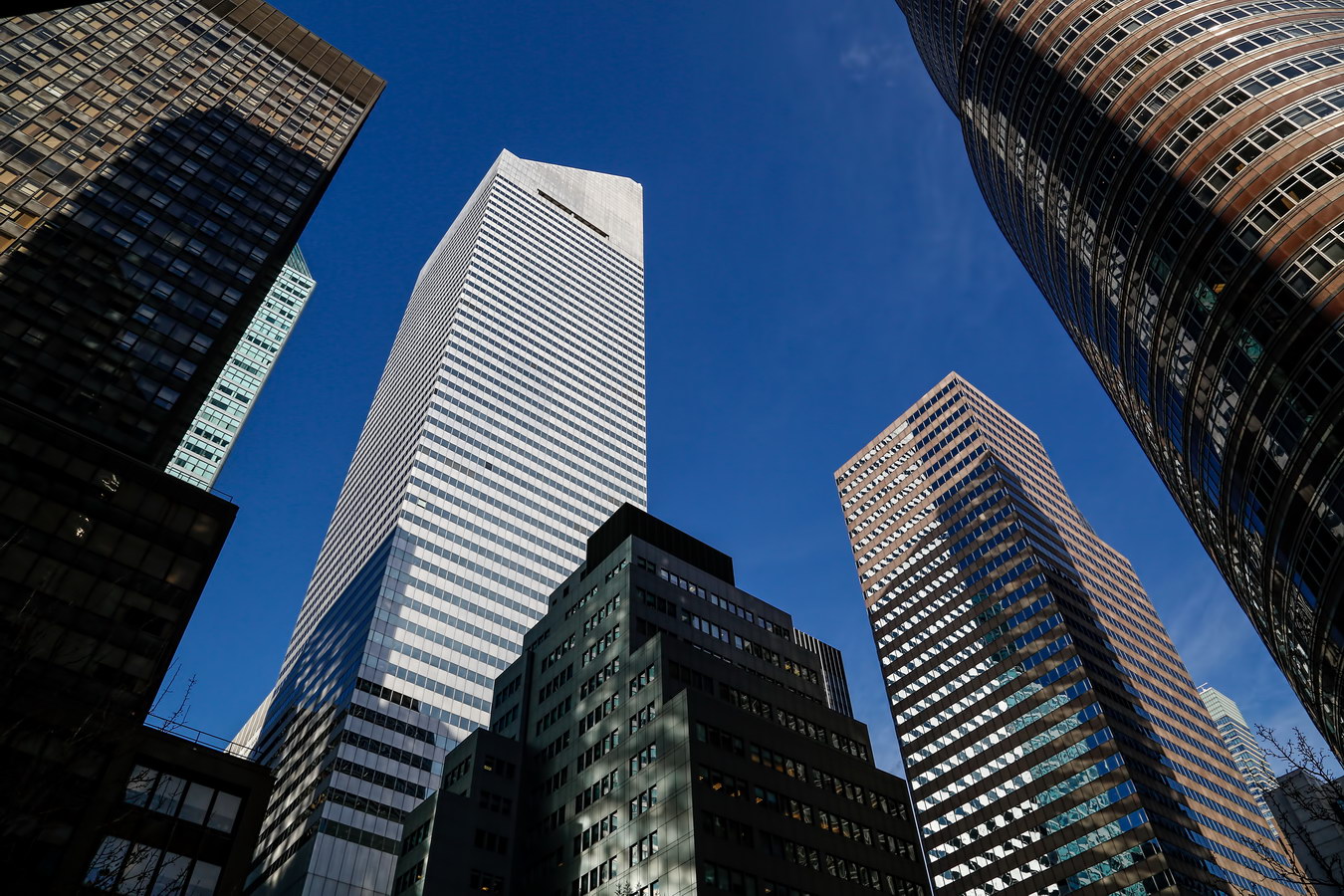
But by any other name, this eye candy would look as sweet in a neighborhood known for its polished geometric icons: Lipstick Building, CitiGroup Center, and 599 Lexington Avenue are just down the block.

Mondrian Vital Statistics
Mondrian Recommended Reading

Google Map

Lefcourt Colonial Building

Lefcourt Colonial Building was among the last buildings developed by Abraham Lefcourt, one of New York’s “rags to riches to rags” stories.

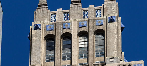
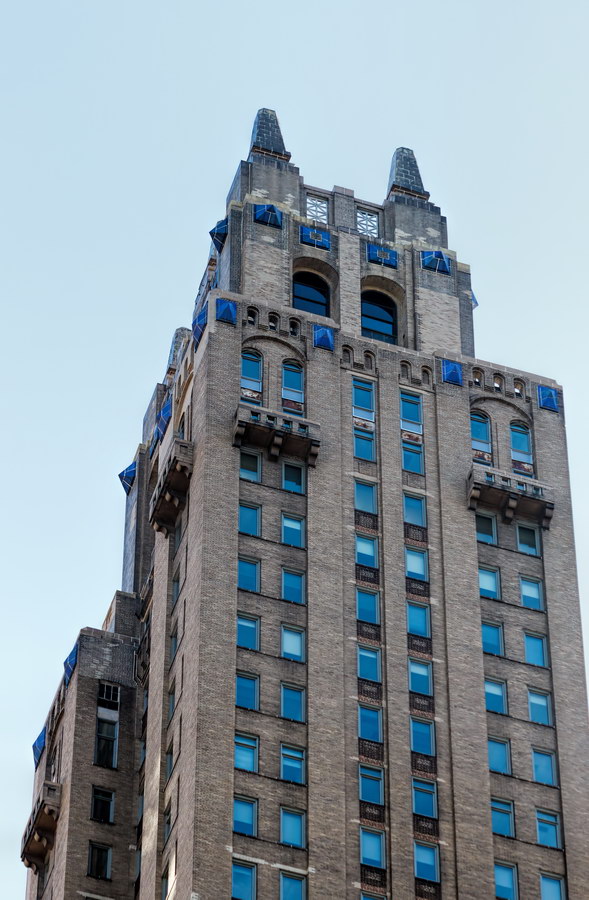
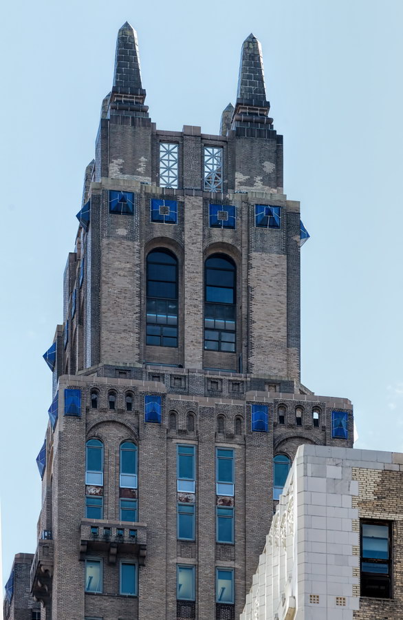
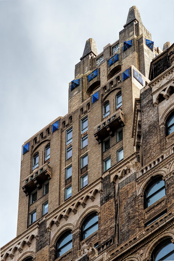
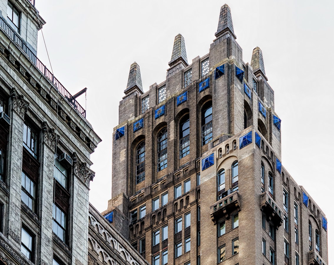
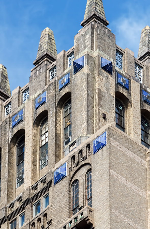
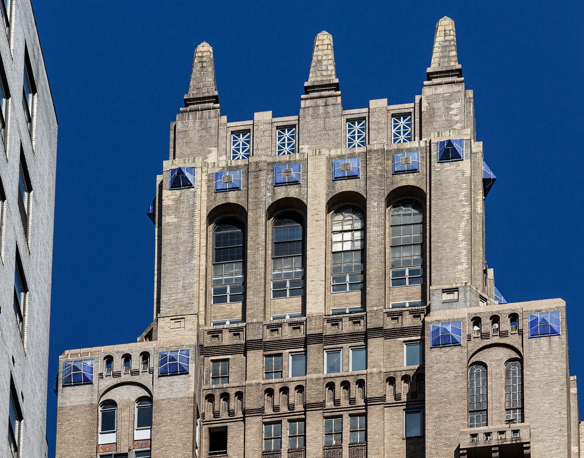
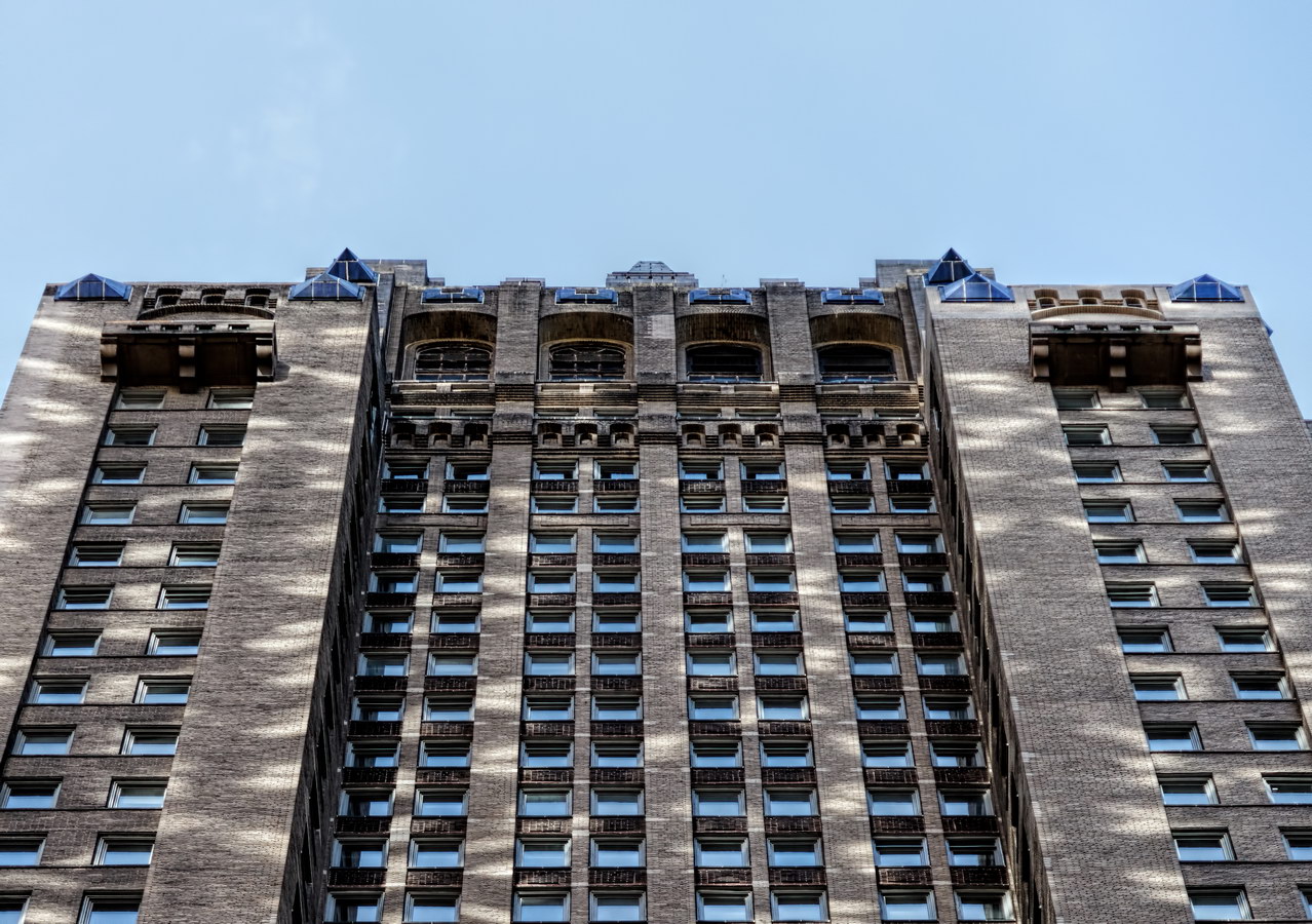
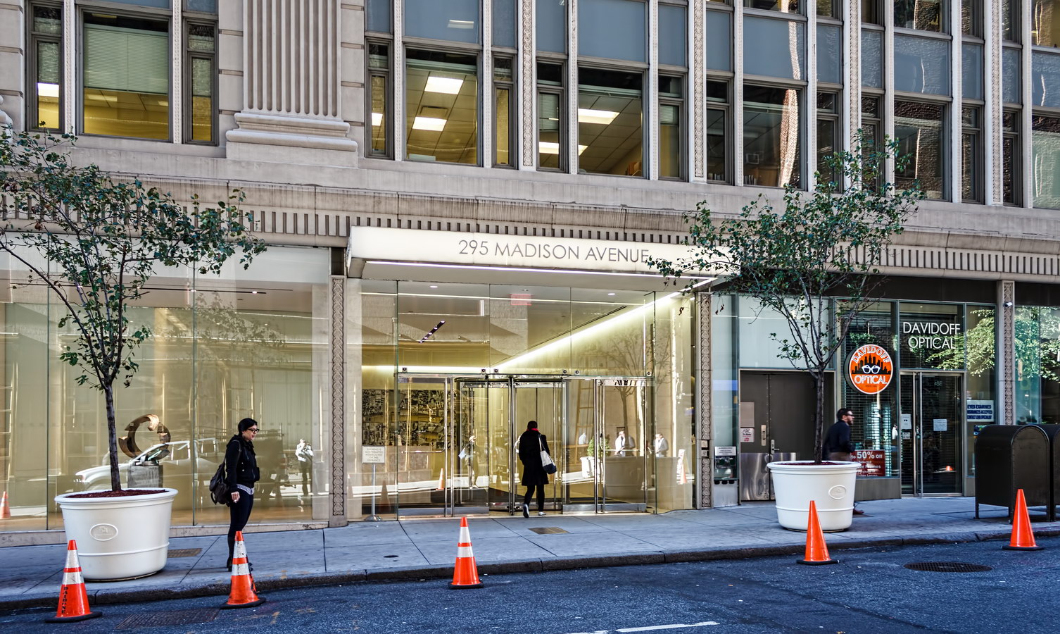
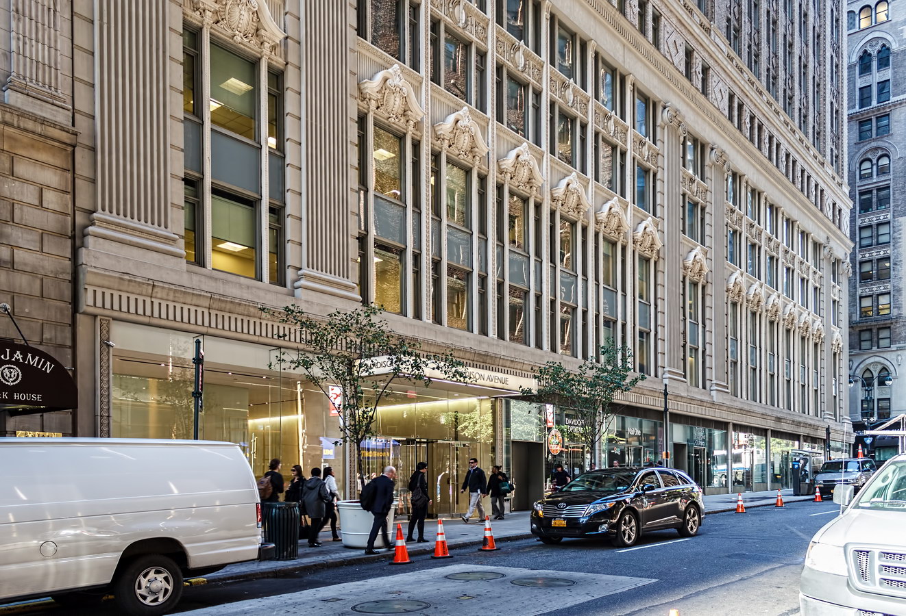
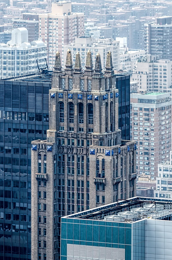
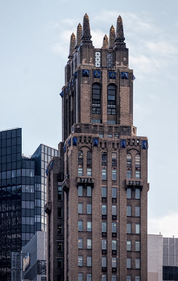
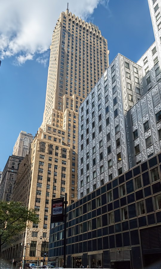
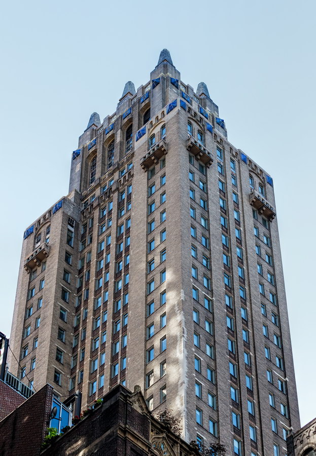
Now known as 295 Madison Avenue, the 45-story Neo-Gothic tower is an architectural landmark without the official title. The distinctive blue terra cotta medallions and gilded finials are visible from most of midtown. The street level retail space and lobby have been thoroughly modernized, but above that, the six-story base is richly decorated with terra cotta, false balustrades and layered brickwork.

Lefcourt Colonial was auctioned off in foreclosure just two years after it was completed, as the Great Depression demolished Abraham Lefcourt’s real estate and banking empire. And the day after the Lefcourt Colonial was sold – for $3.5 million – the Sevilla Towers faced the same fate. Sevilla Towers was the Lefcourt-built apartment hotel, completed but not yet opened, now known as the Essex House.

Lefcourt Colonial has something in common with the Empire State Building, Chrysler Building and Statue of Liberty: You can buy a cast replica of the structure!

Lefcourt Colonial Building Vital Statistics
Lefcourt Colonial Building Recommended Reading

Google Map

Socony-Mobil Building

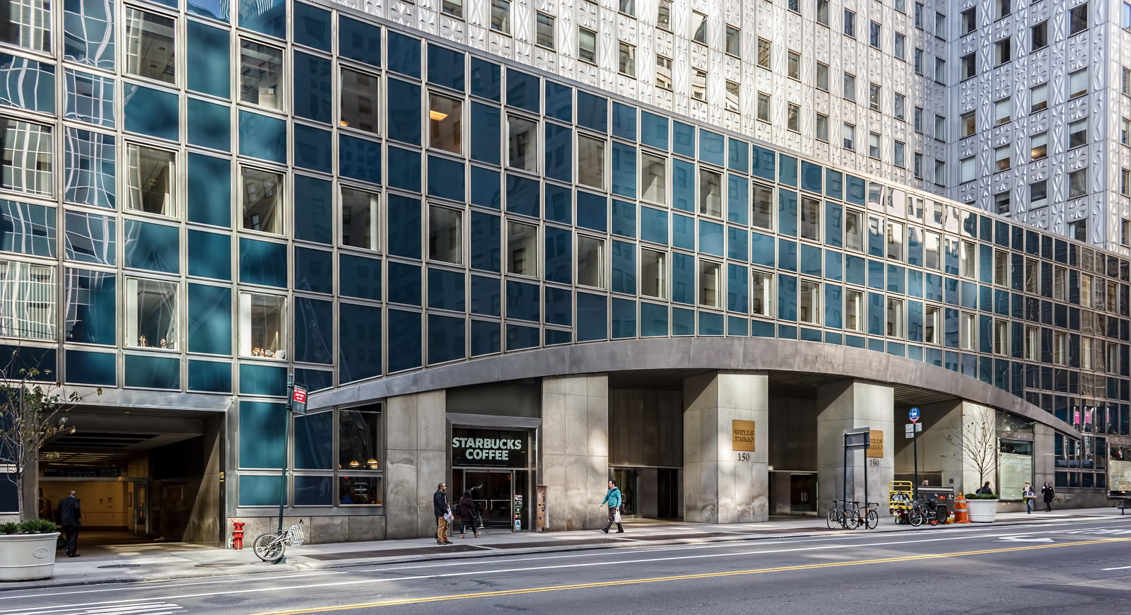
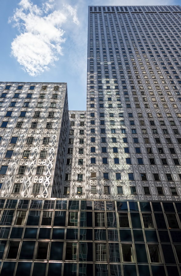
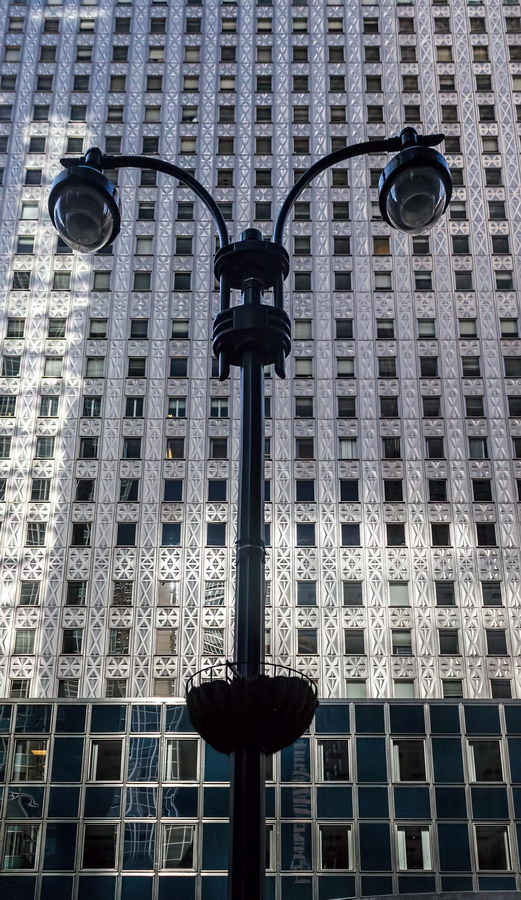
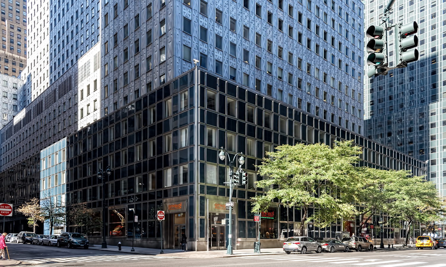
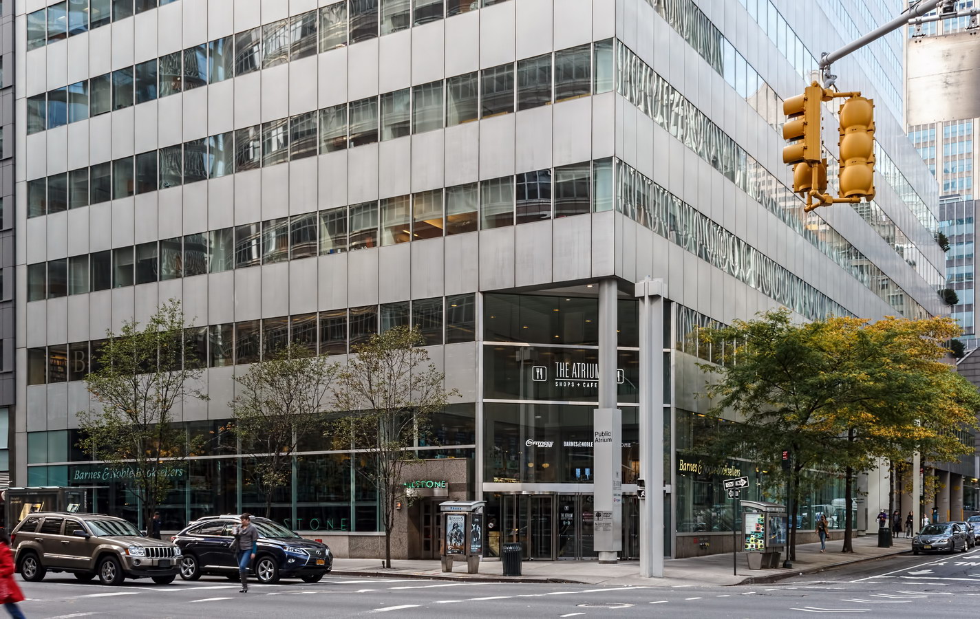
Socony-Mobil Building, aka 150 E 42nd Street, is another piece of New York City “love-it or hate-it” architecture. Landmarked in 2003 as an “impressive skyscraper” with “dramatic stainless steel arches,” it is also on some critics’ “ugliest buildings” list.

The original design, by John B. Peterkin, was a 30-story brick tower rising from a garden atop a three-story granite base. The developer, Galbreath Corporation, was unable to attract prime tenants, so in 1952 new architectural muscle was called in: Harrison & Abramovitz. Principals at that firm had worked with Galbreath on other projects and, incidentally, with the Rockefeller family during construction of New York icons Rockefeller Center and the United Nations.

The Harrison & Abramovitz-revised plan was for a 42-story tower with 13-story wings, clad in stainless steel. The firm was a pioneer in metal-clad architecture, earlier completing the Alcoa Building in Pittsburgh. Aluminum was considerably cheaper than stainless steel, but the steel industry agreed to match aluminum’s price for the opportunity to promote their product.

Why metal at all? Partly marketing – to give the building a modern identity. Partly structural – like glass, metal is lighter and thinner (leaves more rentable floor space) than masonry. Partly speed – metal panels go up faster than brick.

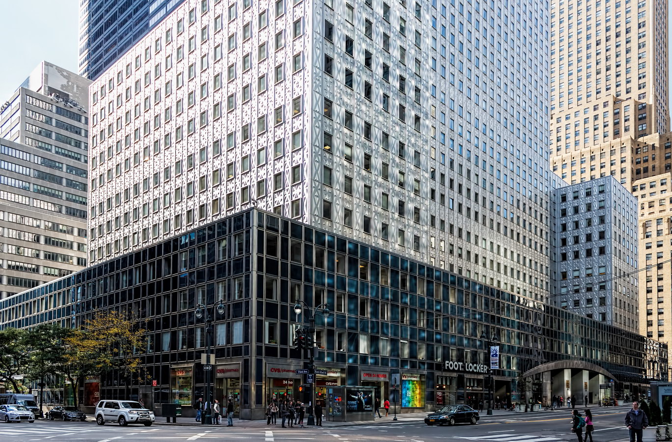
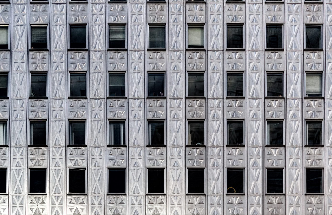
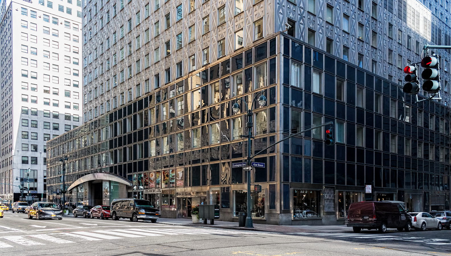
The 7,000 steel panels were embossed with four patterns (selected from more than 100): a rosette-like motif for above and below the windows; a large and small rosette to flank the windows, and two variants displaying a design of interlocking pyramids. These last panels are less wide and appear at the eighth floor where the ceiling is higher, or at the corners of the side elevations.

These controversial patterns were explained as necessary to stiffen the panels, diminish reflections, and create a self-cleaning surface (via wind and rain). The New Yorker‘s architecture critic, Lewis Mumford, called the design a “disaster” and said that the elevations looked as if they were “coming down with measles.”

The “self-cleaning” aspect wasn’t entirely accurate – the building was scrubbed with detergent in 1995.

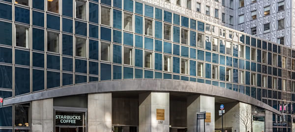
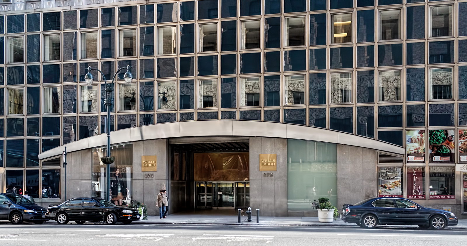
The building’s four-story blue glass base, not nearly as controversial, is no less striking. The E 42nd Street and Lexington Avenue facades feature massive shallow eyebrow arches of stainless steel, resting on granite piers.

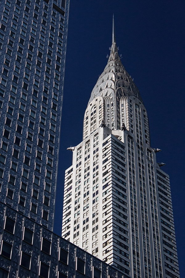
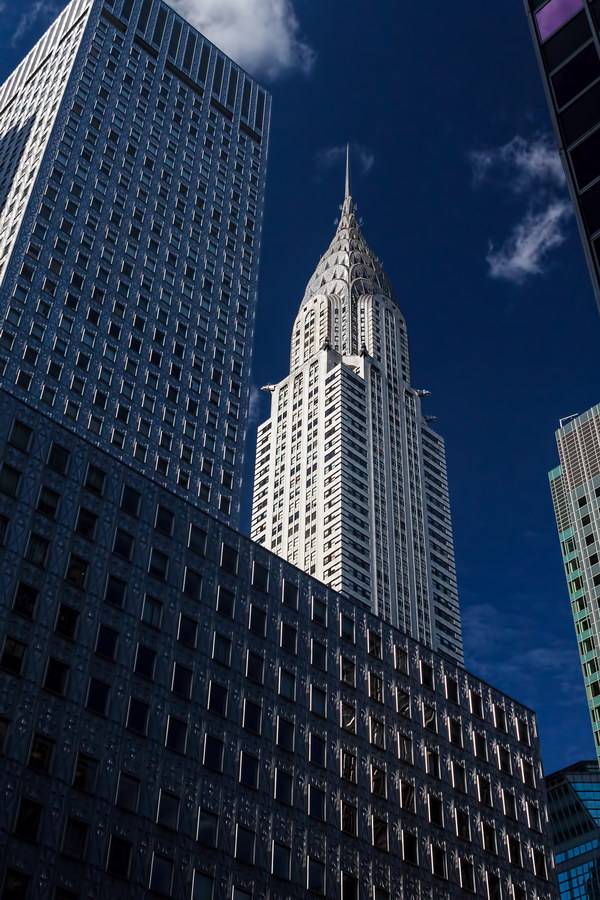
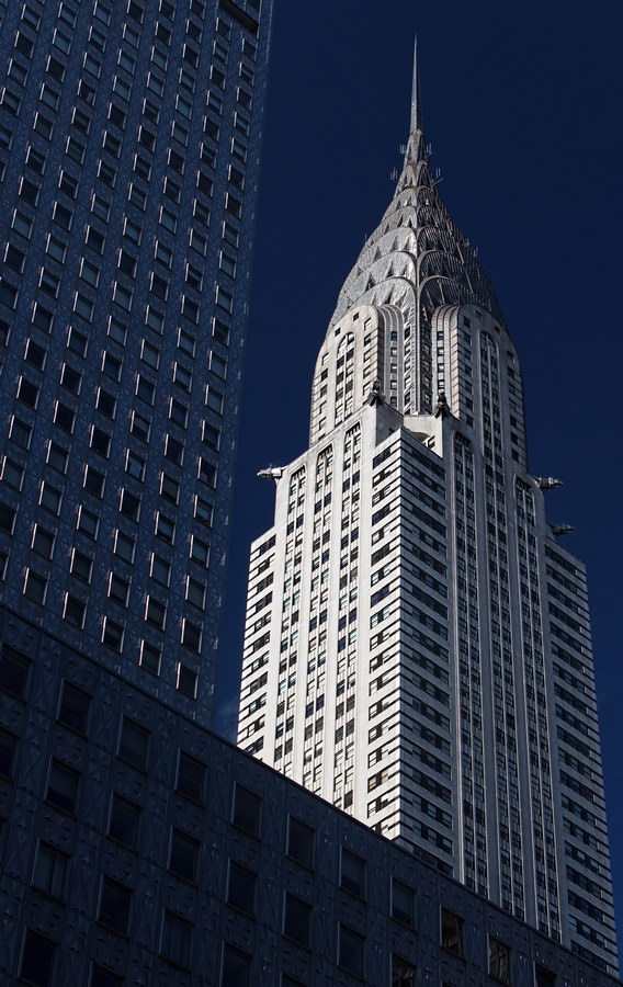
One wonders: Did the architects realize how well the Socony-Mobil Building frames the stainless steel spire of the Chrysler Building across the street? It’s a spectacular photo op!

Trivia: According to the building’s website, elevators to the top floors operate at 1,200 feet per minute, while elevators in the lowest floors operate at only 500 feet per minute.

Socony-Mobil Building Vital Statistics
Socony-Mobil Building Recommended Reading

Google Map

De Lamar Mansion

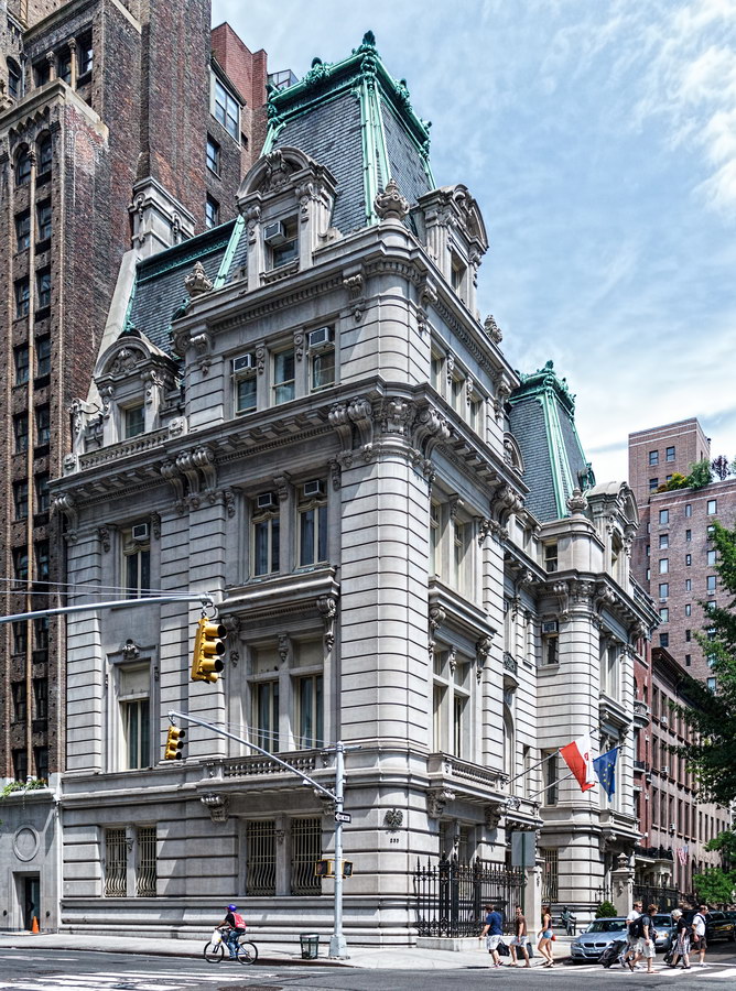
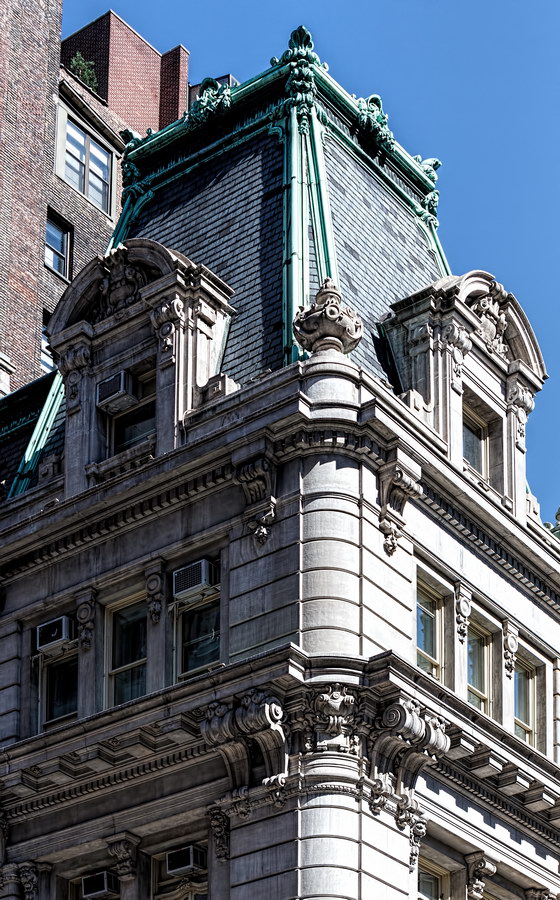
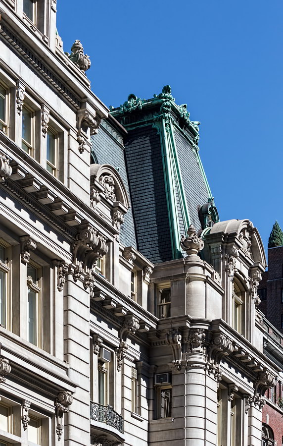
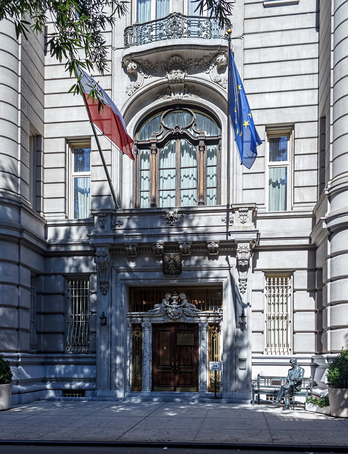
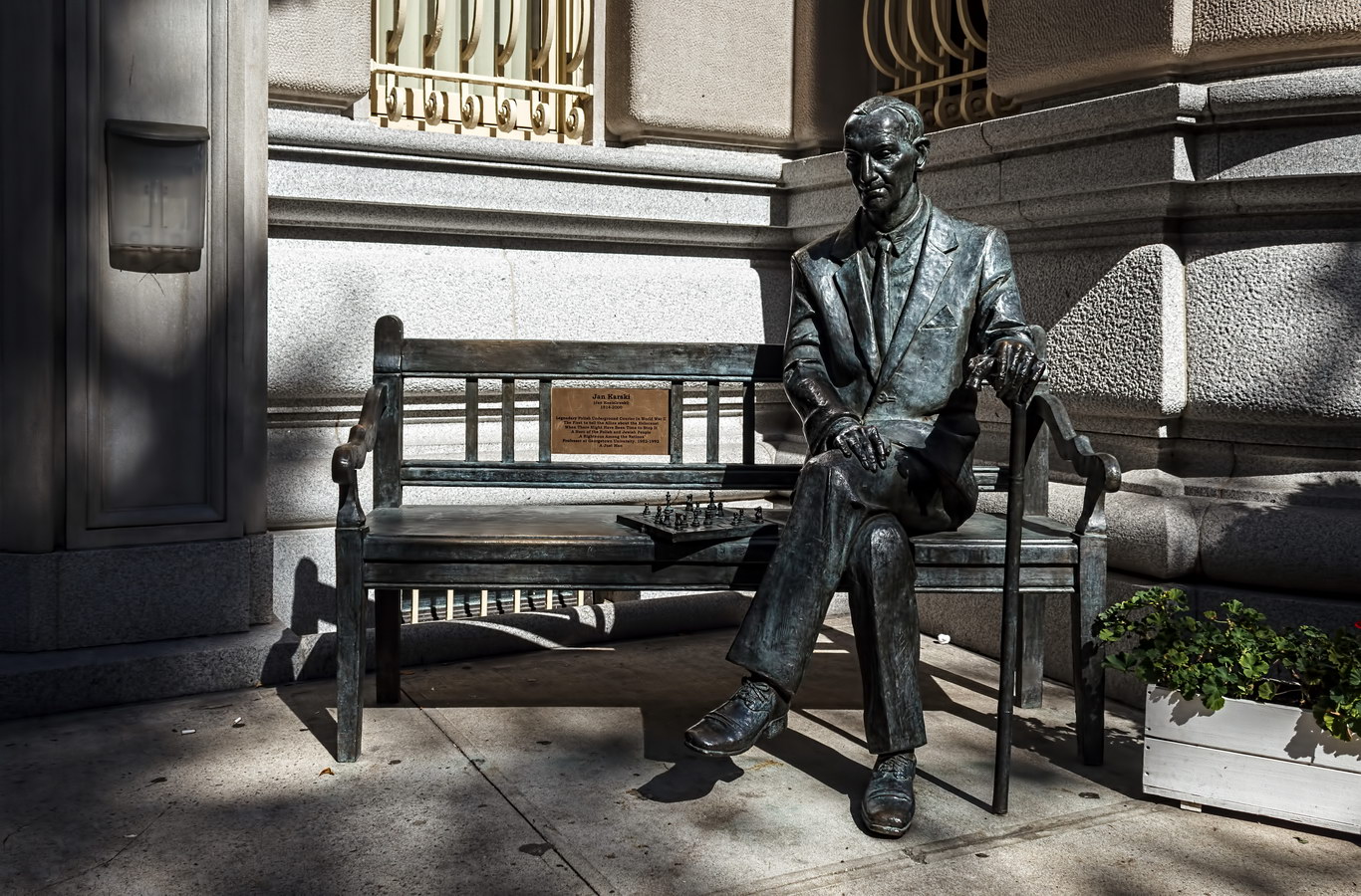
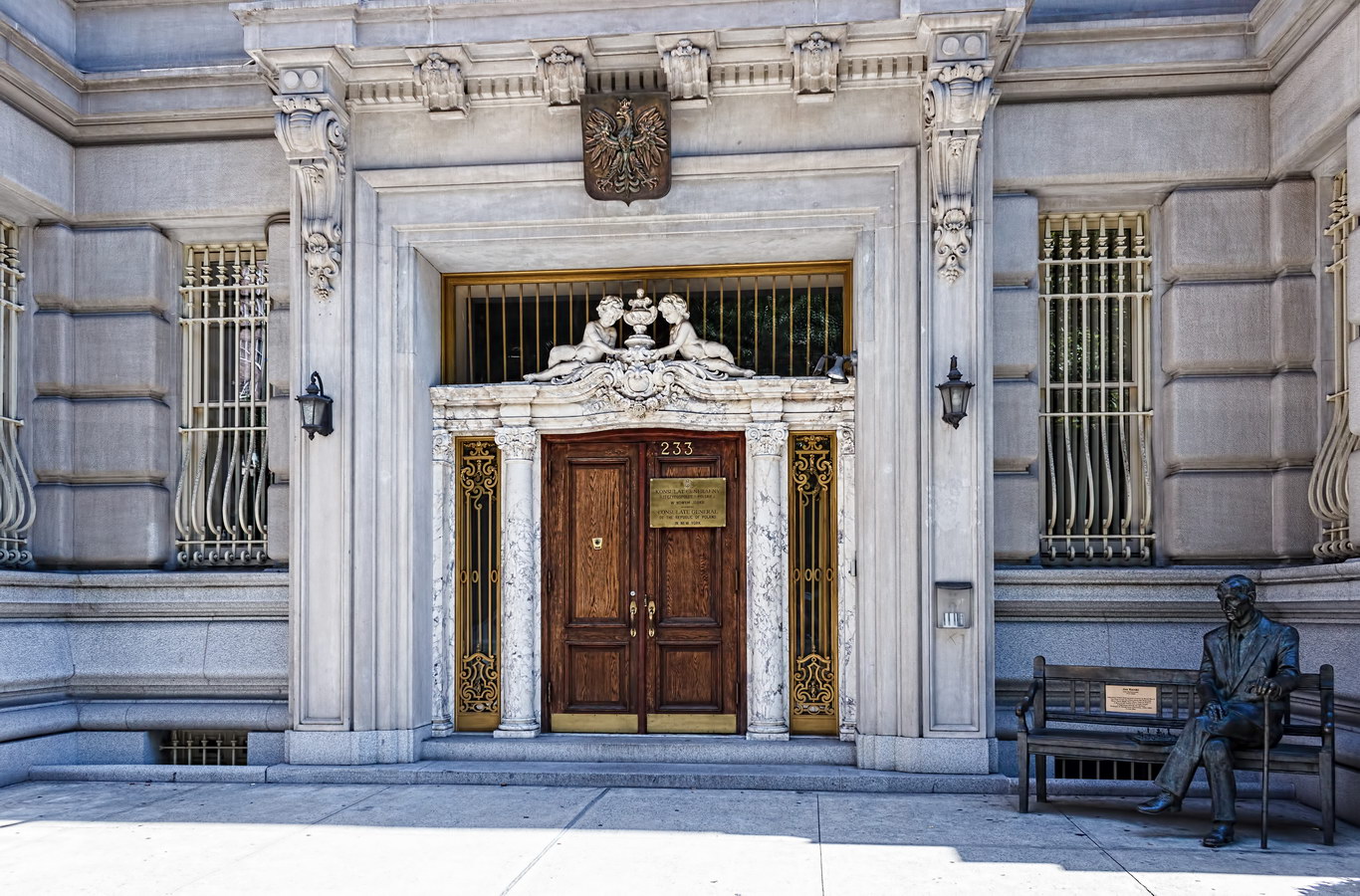
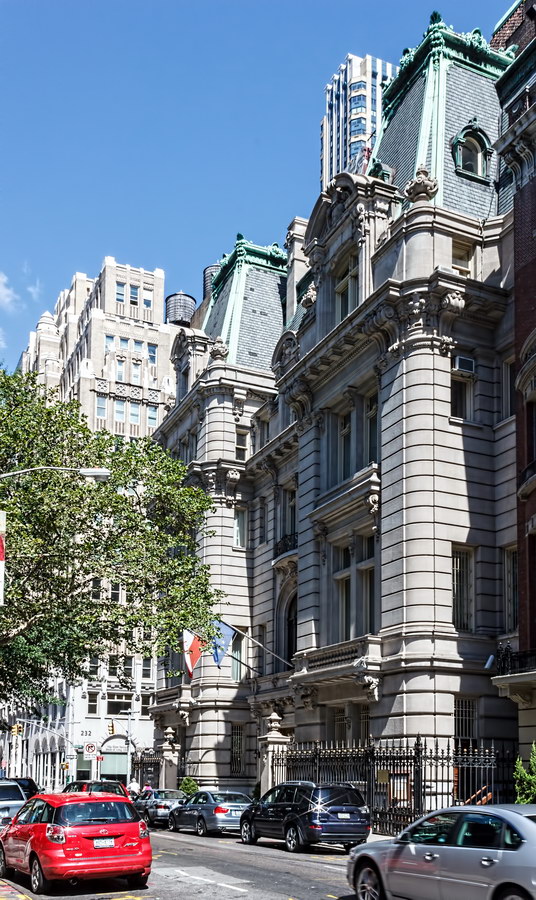
The De Lamar Mansion (Joseph Raphael De Lamar House), now the Polish Consulate General in New York, is a prime example of Beaux Arts architecture in New York.

C.P.H. Gilbert designed this for Joseph De Lamar, who struck it rich in the Colorado Gold Rush and wanted a home fit to enter New York’s high society. Besides towering over neighboring mansions (such as J.P. Morgan’s home across the street), the De Lamar mansion had the unheard-of luxury of an underground garage, served by electric hoist. [See Daytonian in Manhattan]

Joseph and his 10-year-old daughter Alice – he was divorced – lived in the palatial home with nine servants.

After Joseph died in 1918, Alice moved out and sold the mansion to the American Bible Society, which later sold it to the National Democratic Club. Much later (1973), the Republic of Poland bought the mansion to house its consulate.

De Lamar Mansion Vital Statistics
De Lamar Mansion Recommended Reading

Google Map

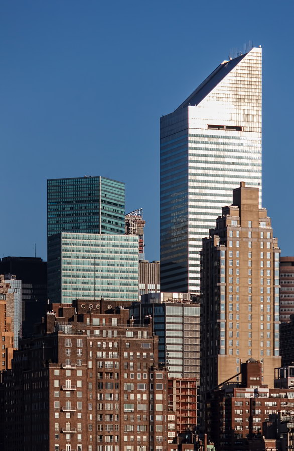
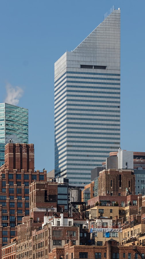
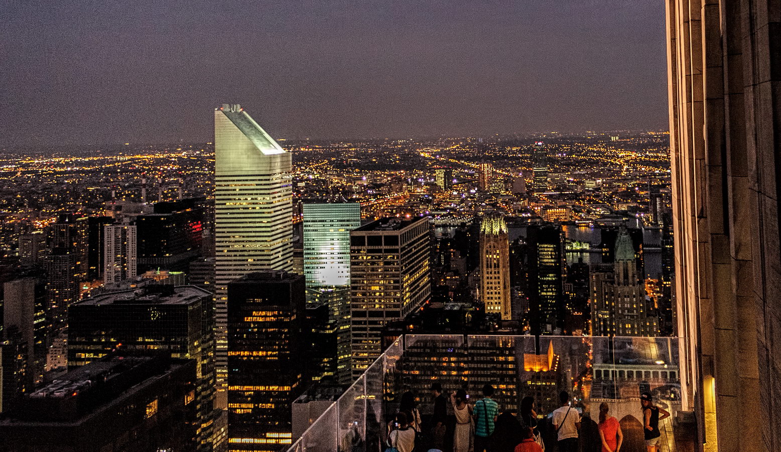
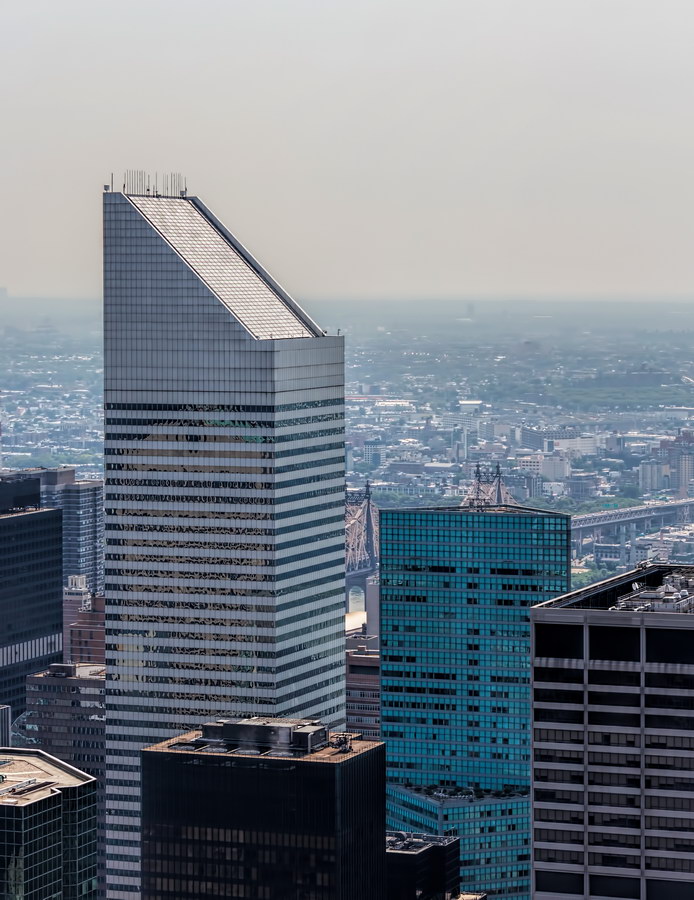
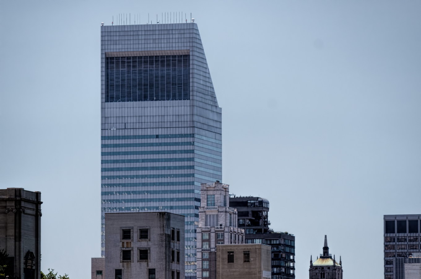
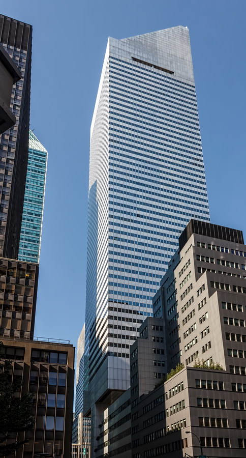
Citigroup Center

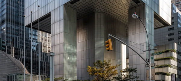
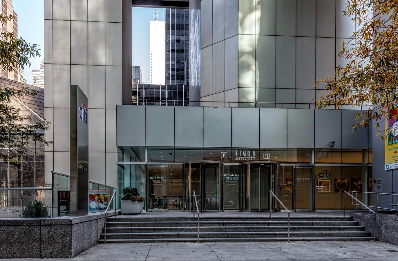
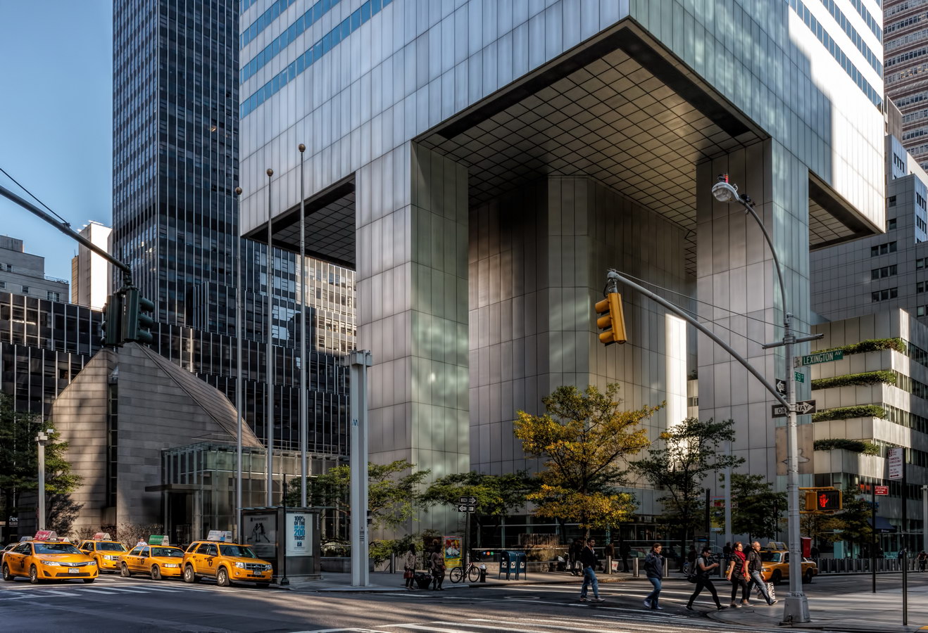
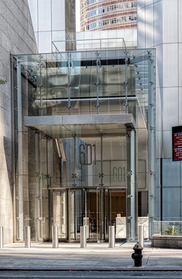
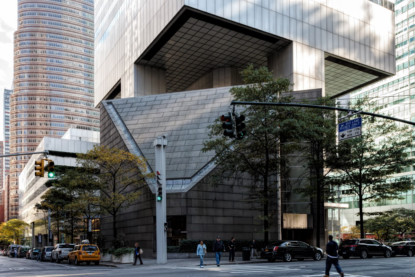
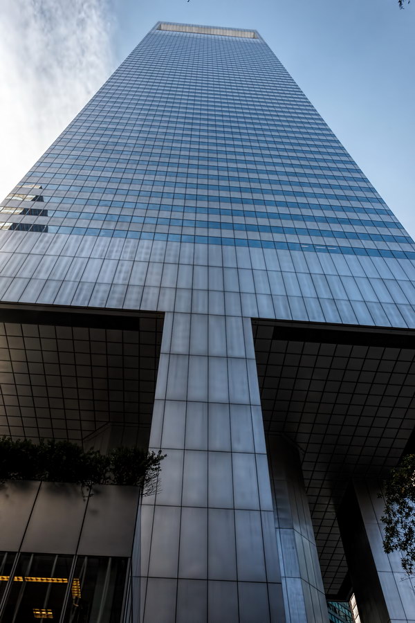
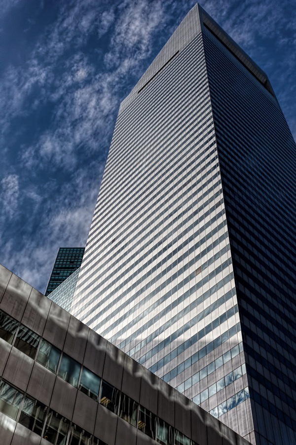
Citigroup Center is remarkable New York architecture, with an engineering story even more dramatic than its photographs. The distinctive floating tower (renamed 601 Lexington Avenue in 2009) became a scary 59-story lesson for architects, engineers, public officials, lawyers and journalists worldwide.

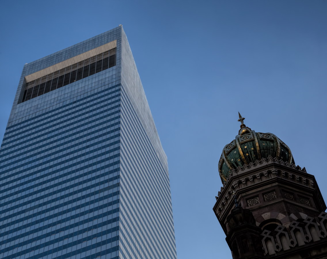
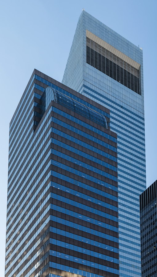
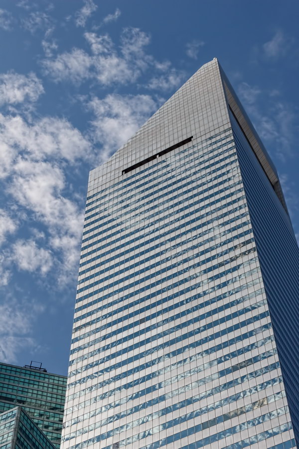
Two elements make Citigroup (originally Citicorp) Center so distinctive: The southwest-facing 45-degree roof and the nine-story stilt base.

The signature angled roof, unmistakably visible for miles, was designed as a solar collector. A power gauge in the lobby once showed how much electricity was being generated by the sun. Apparently the solar panels were no threat to Con Ed – they’ve since been unplugged.

The stilt base was designed to turn a profit, not heads. It was almost a disaster.

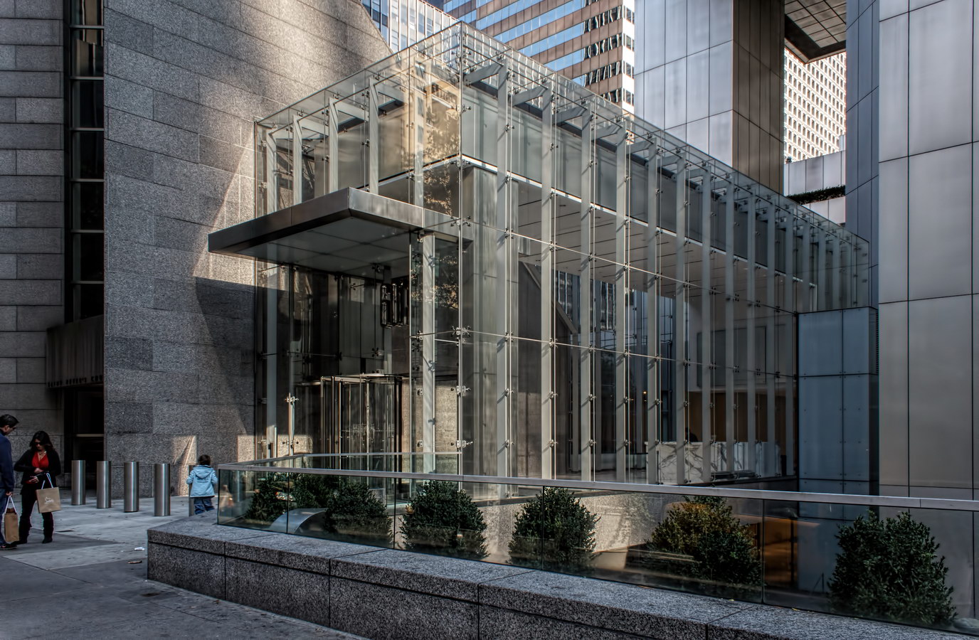
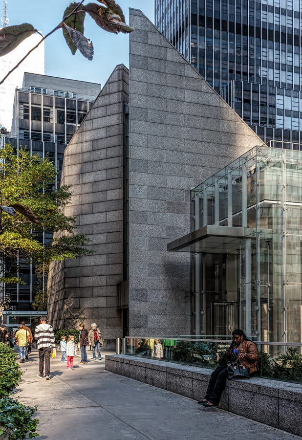
The nucleus of the building’s site was owned by St. Peter’s Lutheran Church, which wanted to sell the land and use the profits to build a new church in a less valuable location. As Citicorp assembled the other pieces of the site, St. Peter’s discovered that they couldn’t locate a suitable new church site. Oops. Citicorp’s solution was to build a new church on the corner, and erect the office tower above the church. (See “Holdouts!: The Buildings That Got in the Way” by Andrew Alpern and Seymour Durst for the full story.)

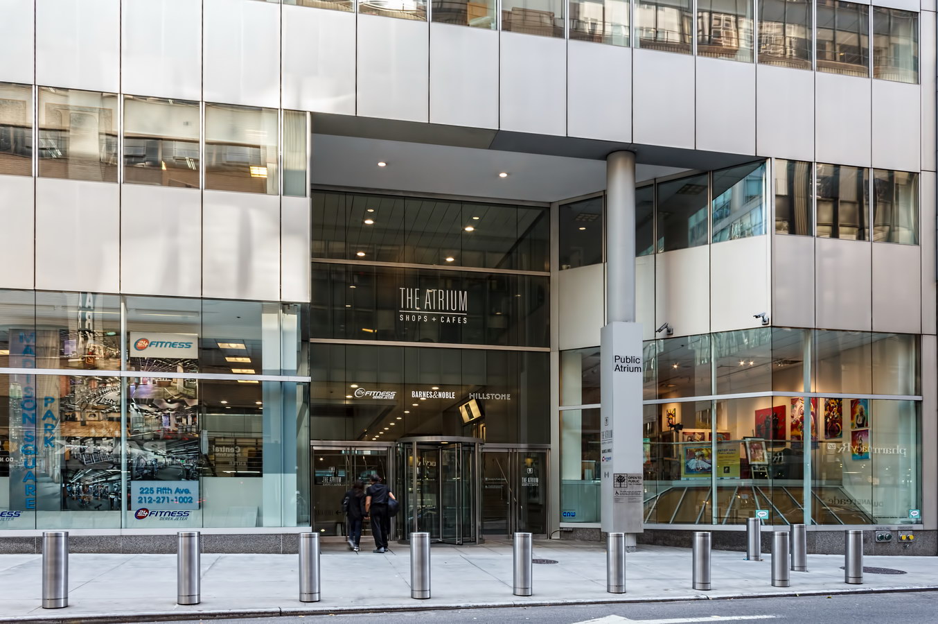
With the church located on the corner, the tower supports had to be placed at the center of each wall, instead of at the corners. This, in turn, required special bracing to transfer the weight of the building to the piers.

There was a miscalculation. In determining the maximum loads, LeMessurier had considered the effect of winds perpendicular to the facades – but not “quartering” winds that would push against two sides simultaneously. Making matters worse, the steel contractor had substituted bolted joints for the much stronger (but $250,000 more expensive) welded joints that were specified. LeMessurier discovered the error and the bolt substitution a year after the building was completed. The engineer ordered wind tunnel tests and discovered to his horror that the building was vulnerable to winds over 70 m.p.h.

After urgent meetings with Citicorp, LeMessurier ordered two-inch-thick plates to be welded in place over the bolted joints. Welders worked every night for three months in a race against hurricane season. They almost lost: Hurricane Ella was headed for New York on Sept. 1, 1978 but fortunately it turned out to sea, averting a massive evacuation of the neighborhood. (The Red Cross had estimated 200,000 deaths if the building toppled.)

The massive repair project went virtually unreported for 17 years – a newspaper strike hit New York just as the repairs began; The New Yorker broke the story in 1995. Diane Hartley, a Princeton engineering student, was the hero in this drama. In the course of writing her thesis, she had questioned LeMessurier’s calculations – triggering his reevaluation of the design. LeMessurier’s unflinching disclosure of the problem is today used as a case study in professional ethics.

In 2002 the building was reinforced again – this time one of the massive base columns was encased in steel and copper to protect against a terrorist bomb blast.

The engineering crisis overshadowed Citicorp Center’s other impressive features: Double-decker elevators used interior space more efficiently; a tiered, sunken plaza beneath the building’s southwest corner provides space for sidewalk cafes and entry to the subway system; a 410-ton “tuned damper” system in the crown minimizes the building’s wind-induced swaying.

Drama notwithstanding, Citigroup Center is an impressive and attractive addition to New York’s architectural treasure chest, whether viewed from afar, up close or inside.

Citigroup Center Vital Statistics
Citigroup Center Recommended Reading

Google Map
480 Park Avenue

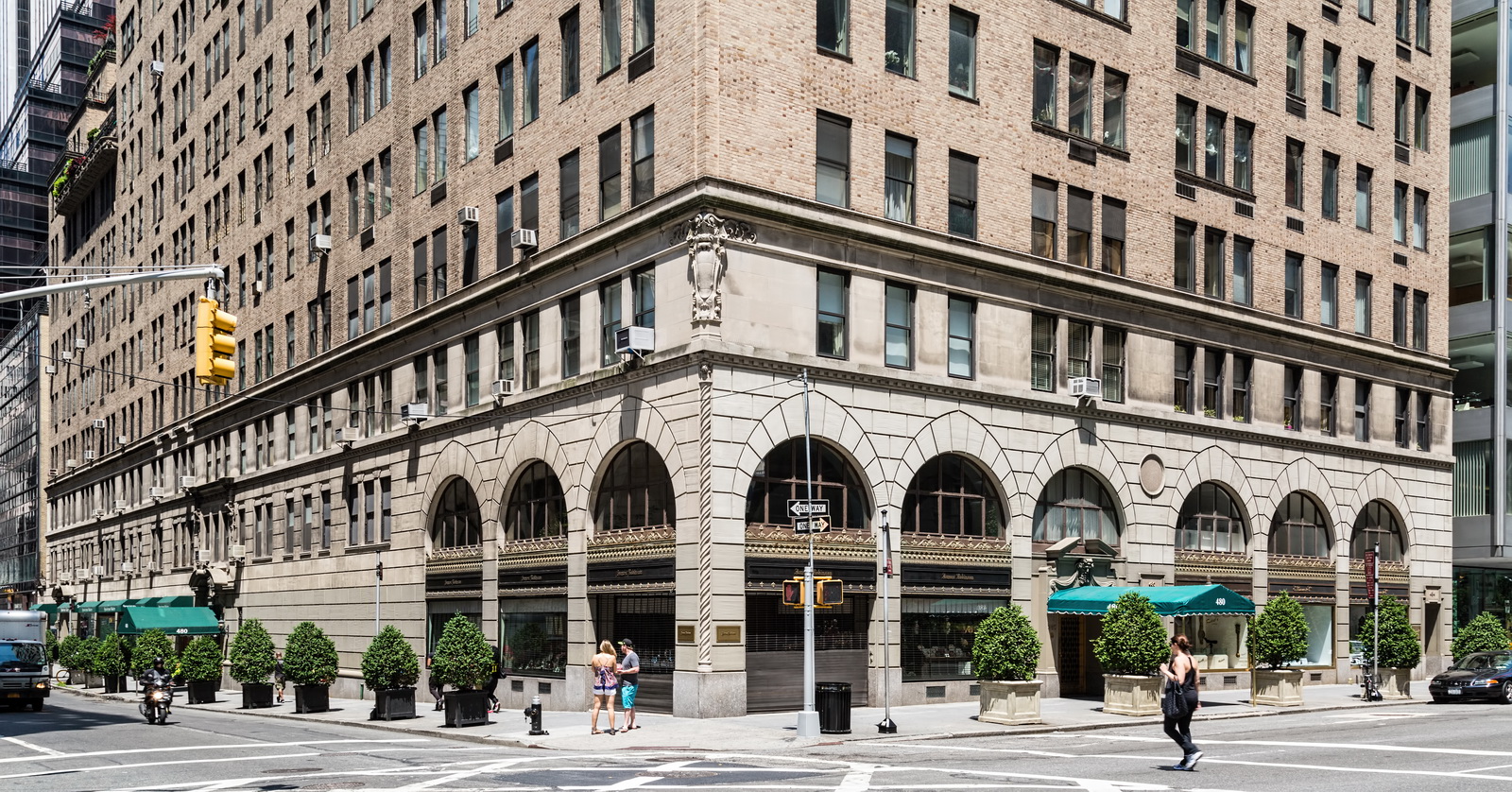
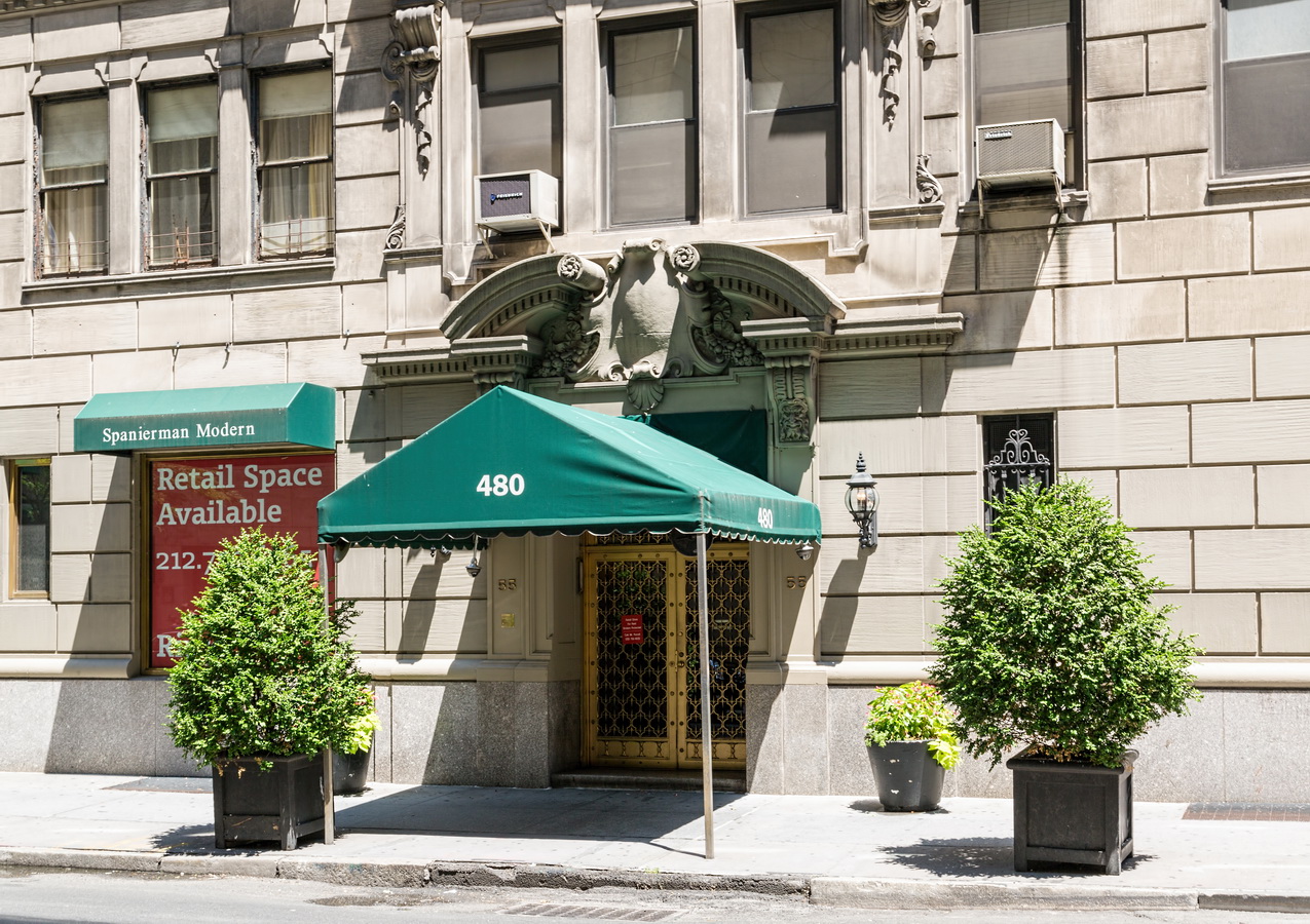
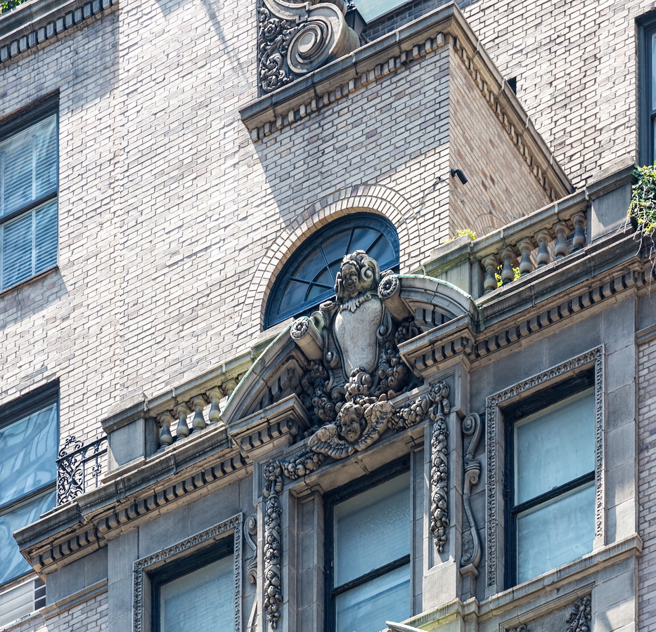
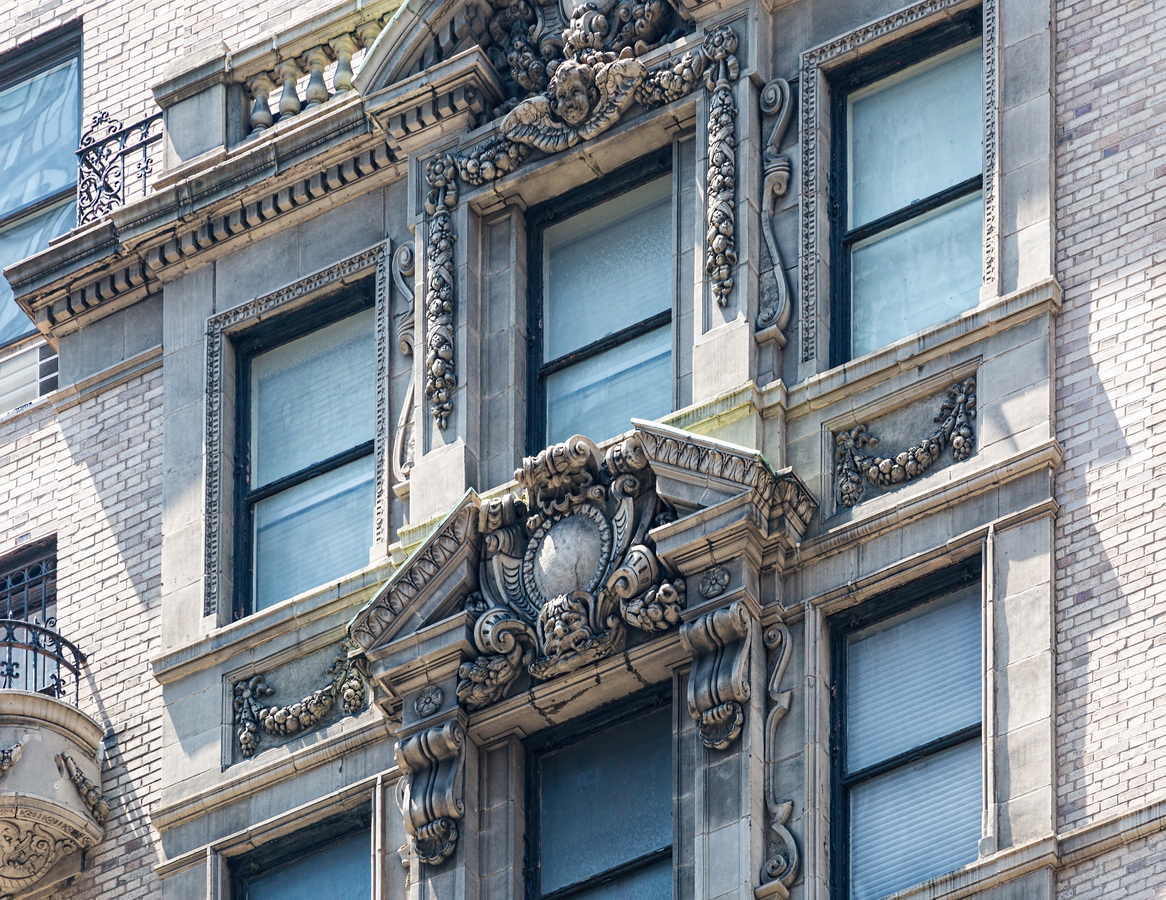
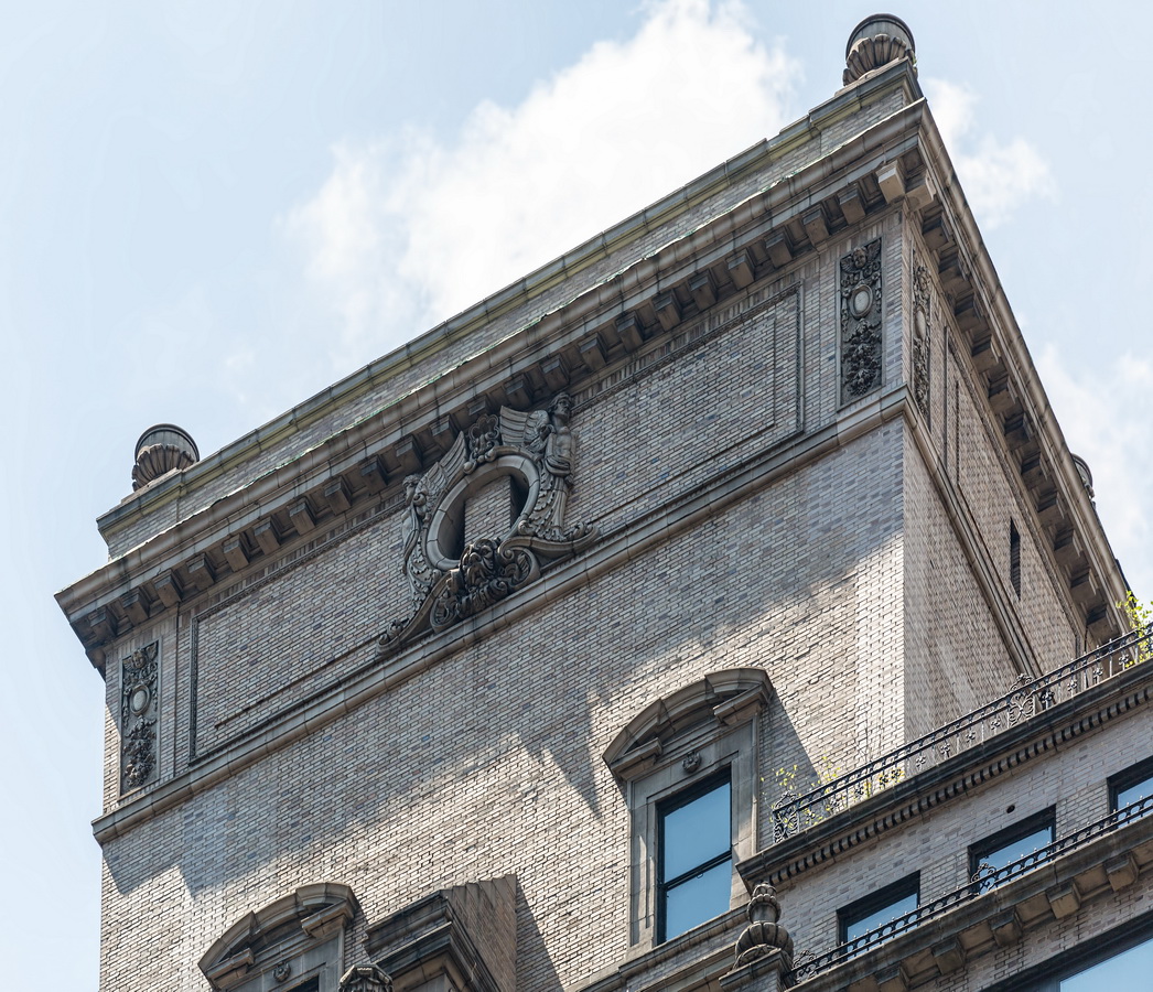
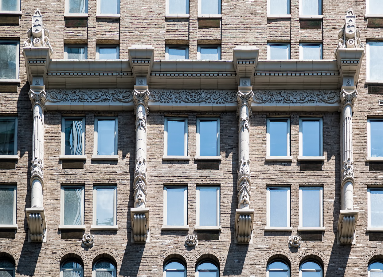
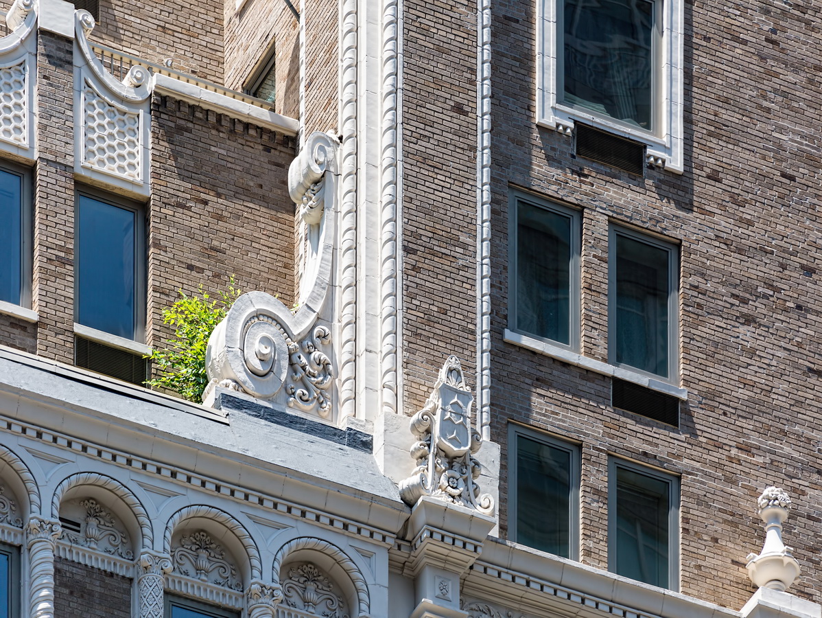
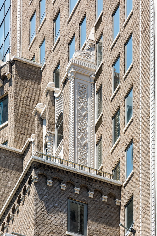
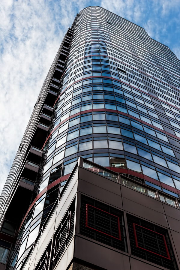
480 Park Avenue is one of those buildings that makes a non-architect wonder: Why is so much decoration put so high, where no one can see it?

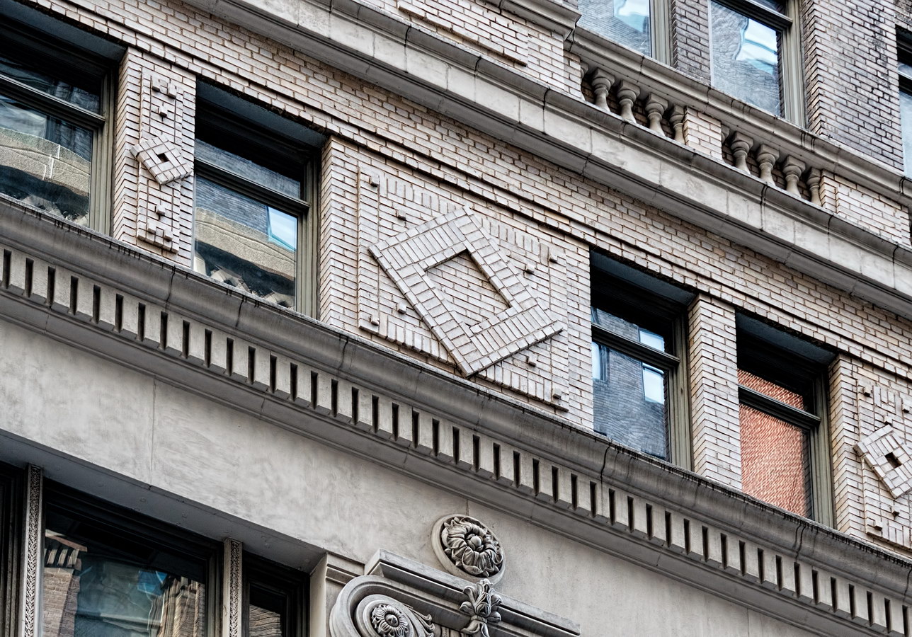
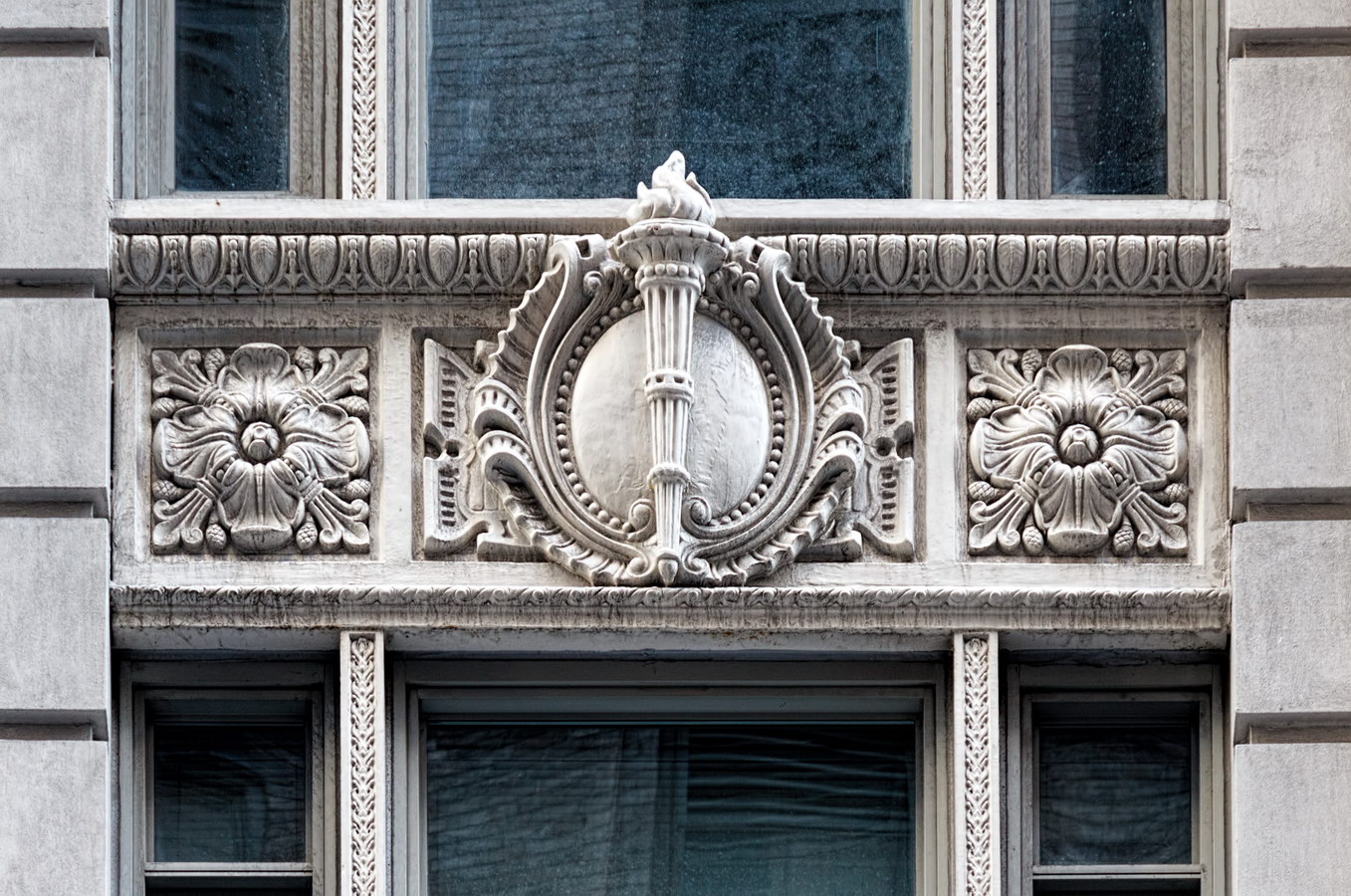
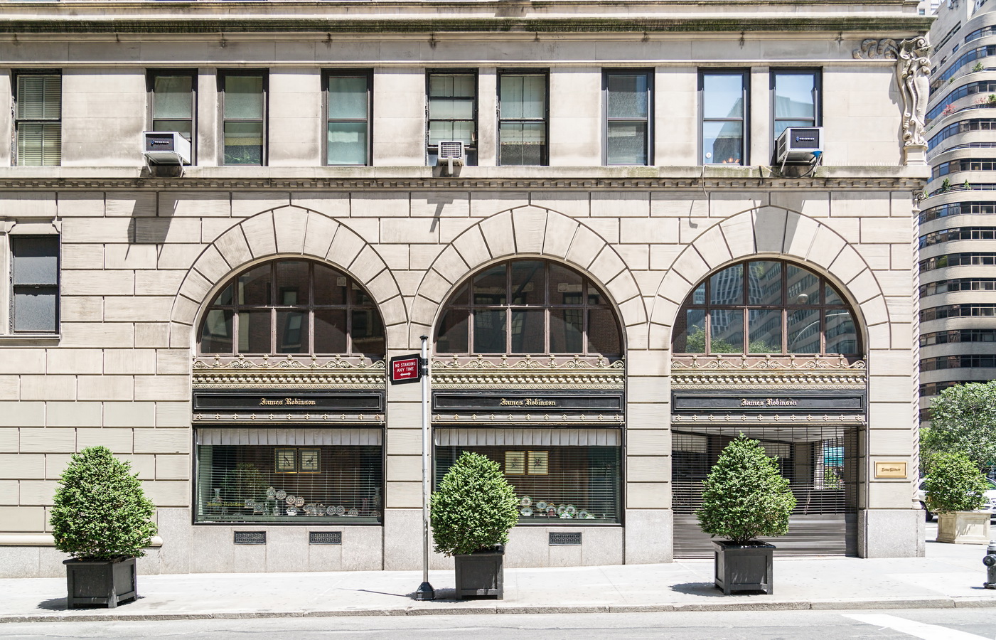
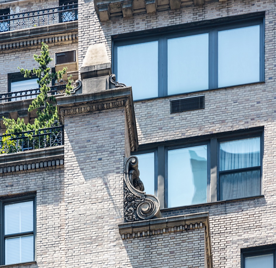
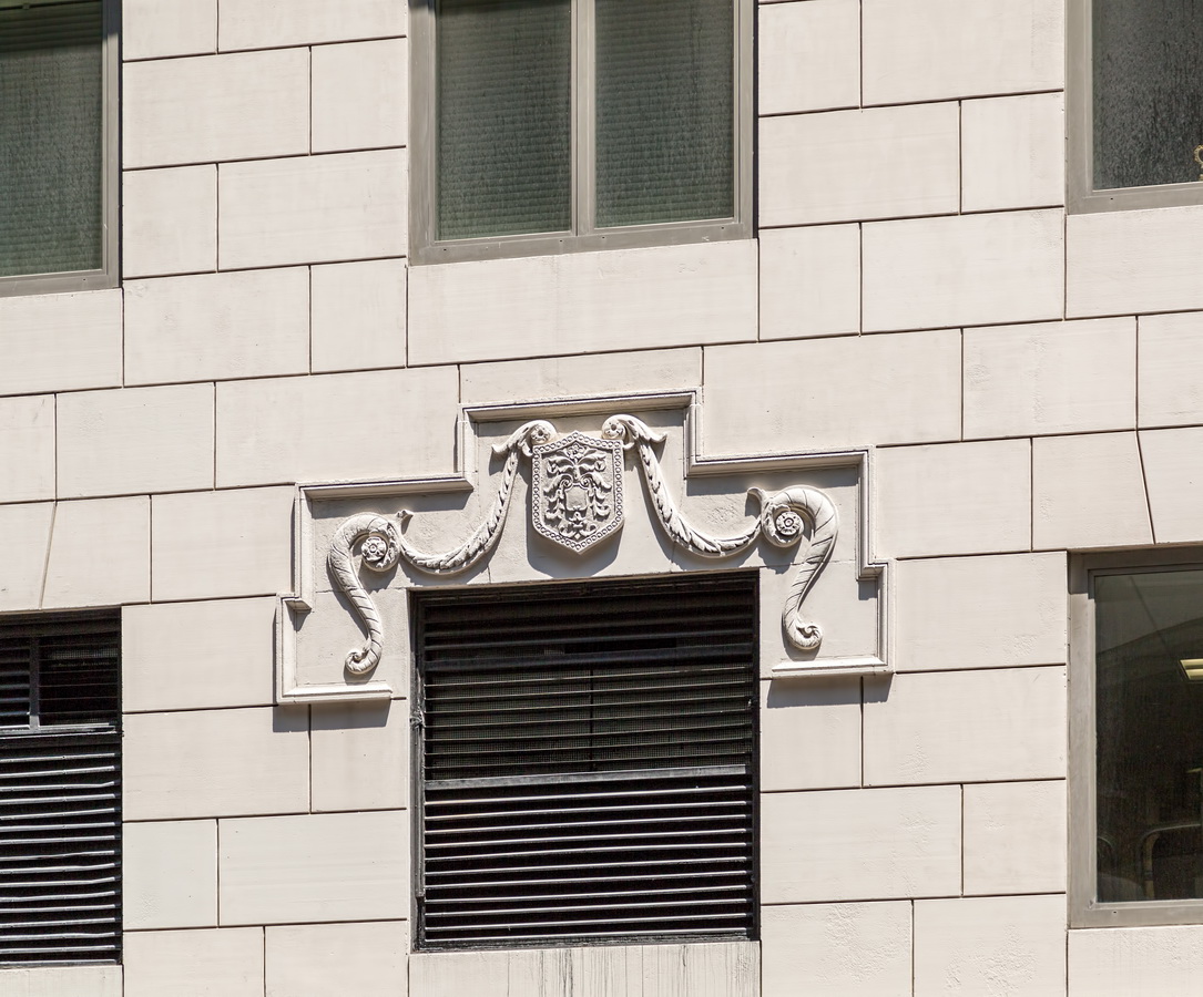
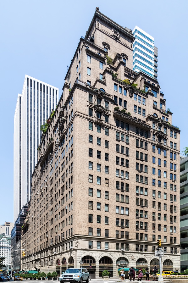
Modest decoration appears on the three-story base; but at the 13th floor and above, there’s a proliferation of terra cotta. Garlands, grotesques, medallions, dentil and egg-and-dart moldings, brackets, balustrades, sculpted balconies and wrought-iron railings galore!

This is one of Emery Roth’s lesser-known buildings in New York – he has more than 200 to his credit. It’s still a joy to study, and another reason to look skyward when walking the streets of New York.

480 Park Avenue Vital Statistics
480 Park Avenue Recommended Reading

Google Map
502 Park Avenue

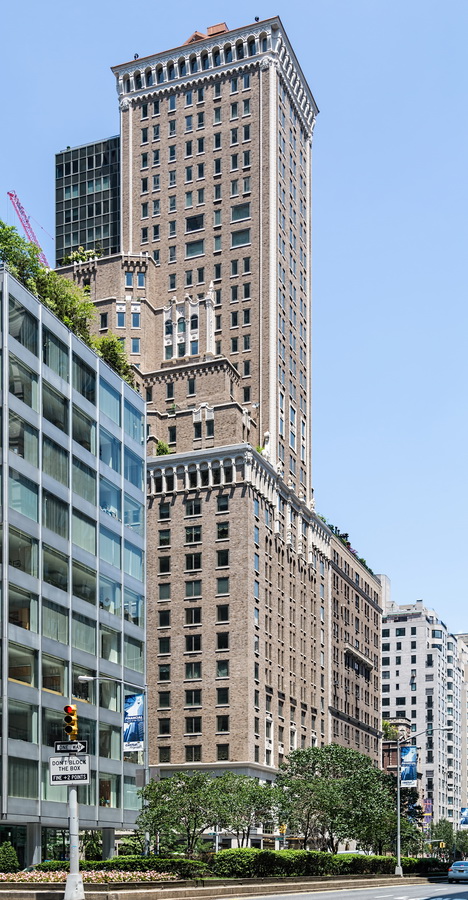
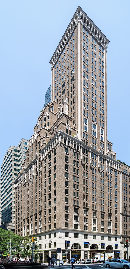
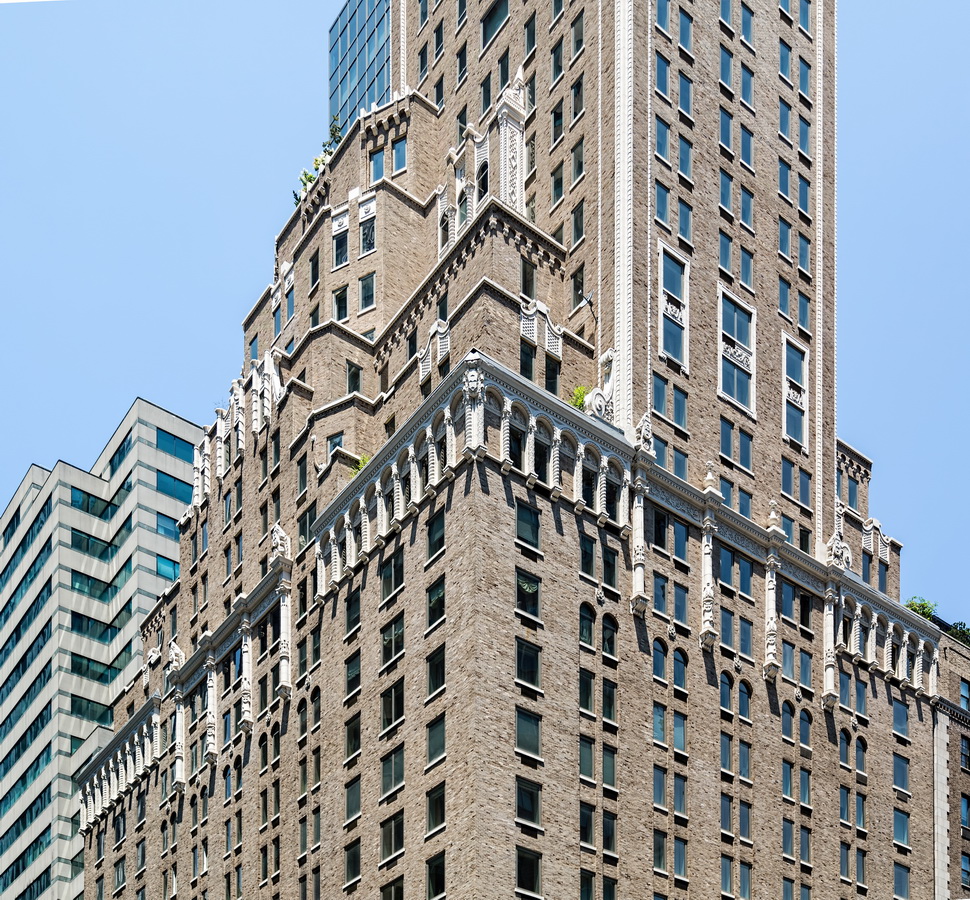
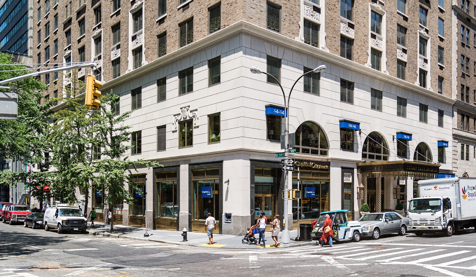
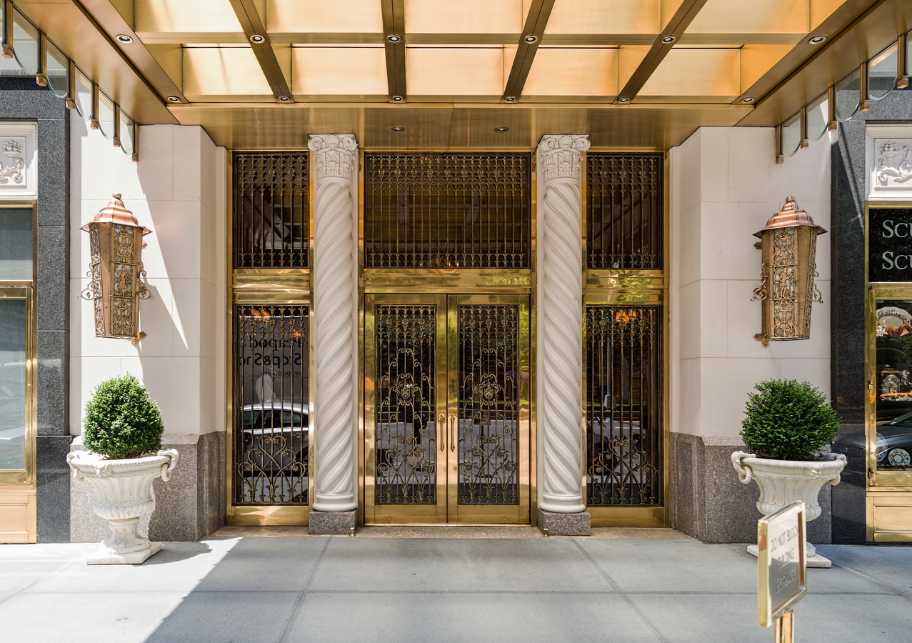
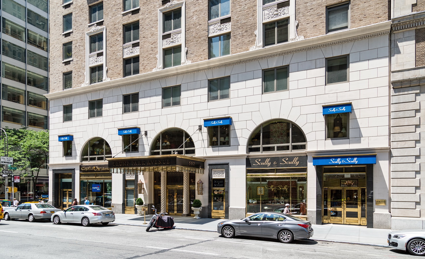
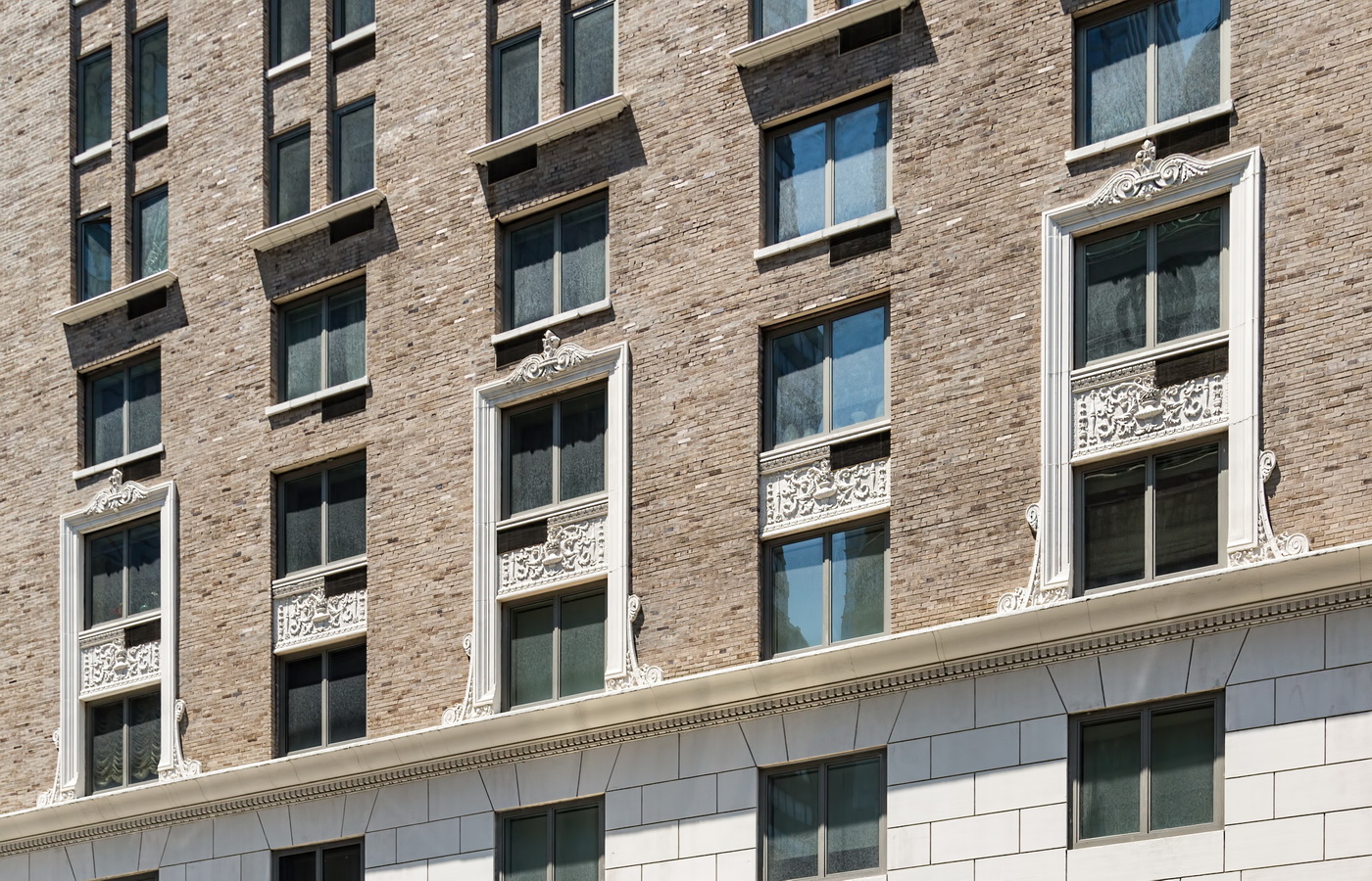
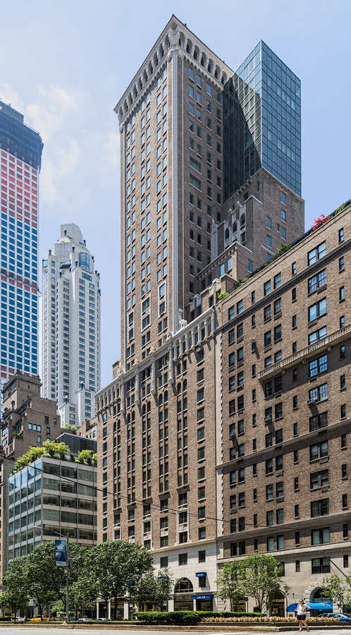
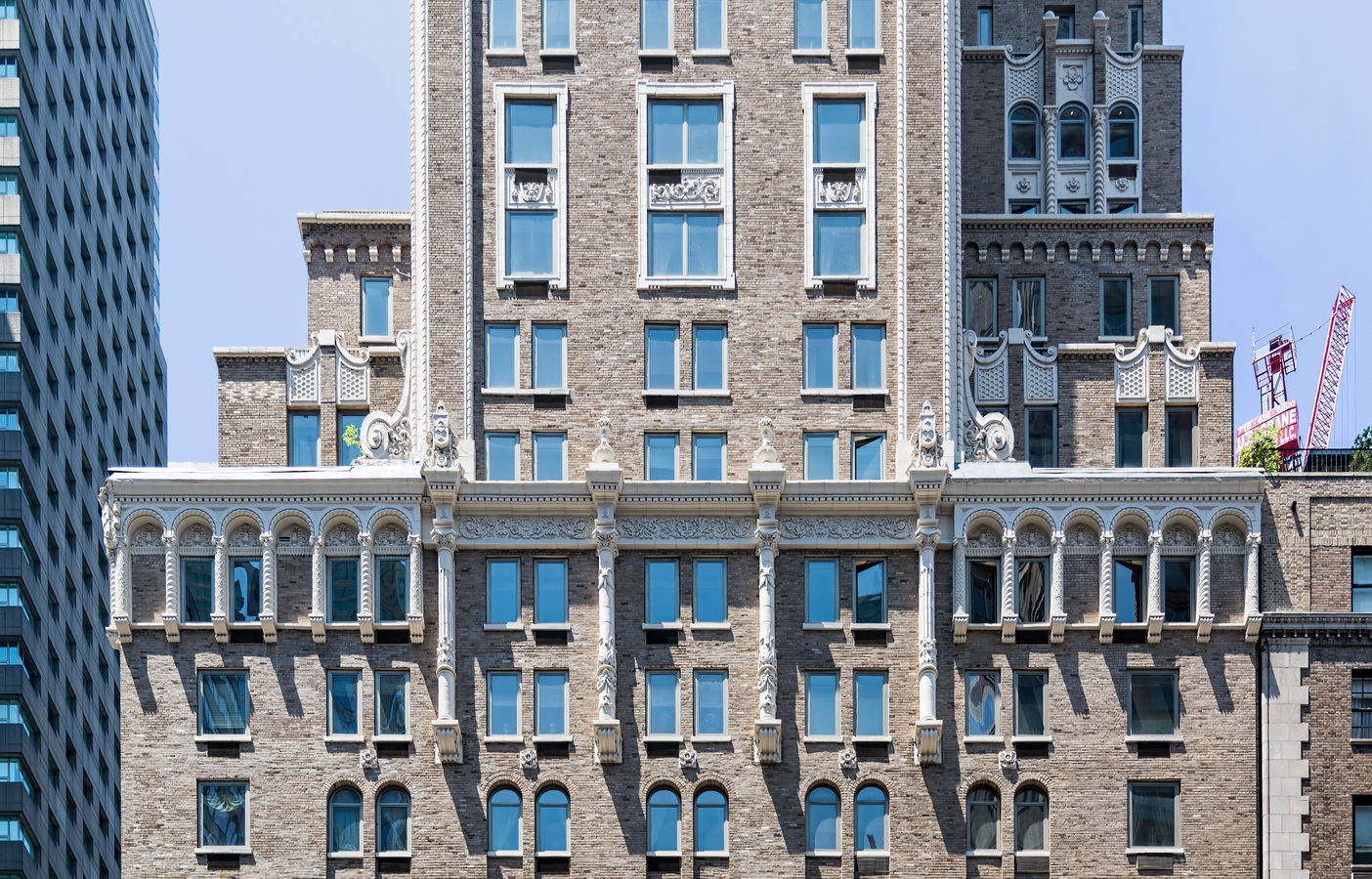
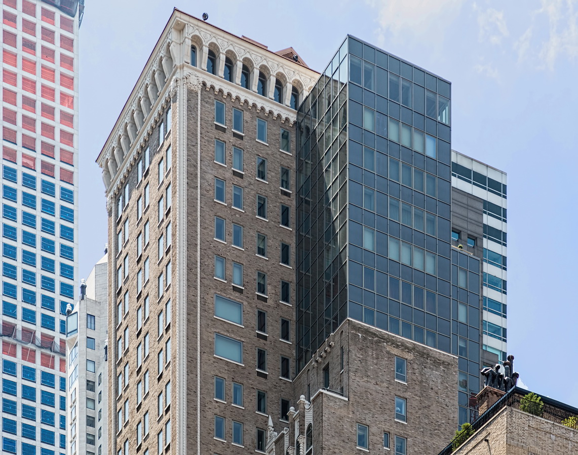
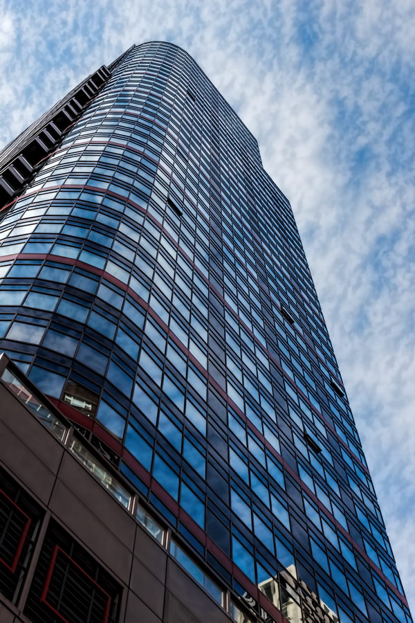
502 Park Avenue, aka Trump Park Avenue, is now in its fifth incarnation. Built in 1929 as the Viceroy Hotel, it was victim of the stock market crash and quickly became the Cromwell Arms, then Delmonico’s. It has been a hotel, rental apartments, a cooperative, back to hotel, and finally as a condominium.

Donald Trump’s conversion added a seven-story glass box to the top of the north side of the tower, adding floor space at the expense of the building’s appearance.

502 Park Avenue Vital Statistics
502 Park Avenue Recommended Reading

Google Map
Aramco Building

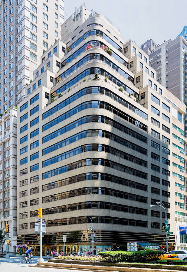
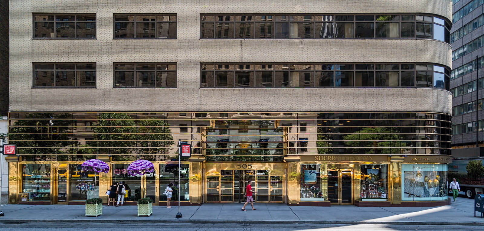
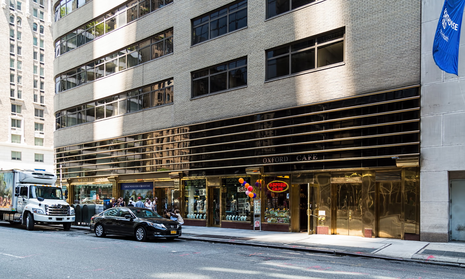
Aramco Building reminds one, with its brick, curved corner, and strip windows, of the Starrett-Lehigh Building in West Chelsea. It served as headquarters of the Arabian American Oil Company (Aramco) from 1949 to 1973.
According to a New York Times article, the Aramco Building was designed with a view to possible future conversion to residential use. In 1987 the building was updated by Der Scutt, the architect responsible for the Trump Building, Grand Hyatt, and 100 United Nations Plaza Tower, among others. In the renovation, Der Scutt created a two-story lobby and modern two-story base clad in polished brass, tinted glass and marble.
Aramco Building Vital Statistics
Aramco Building Recommended Reading

Google Map