Tag Archives: Manhattan

Colony Club

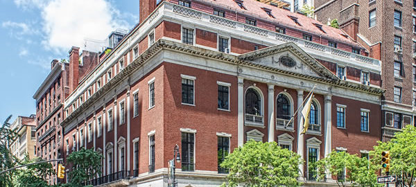
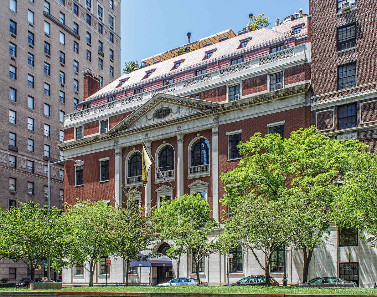
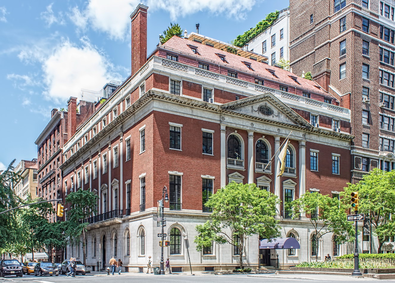
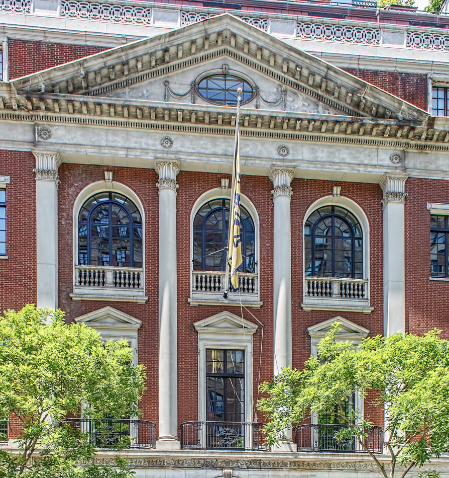
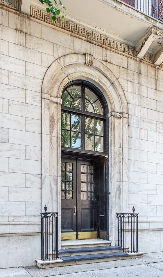
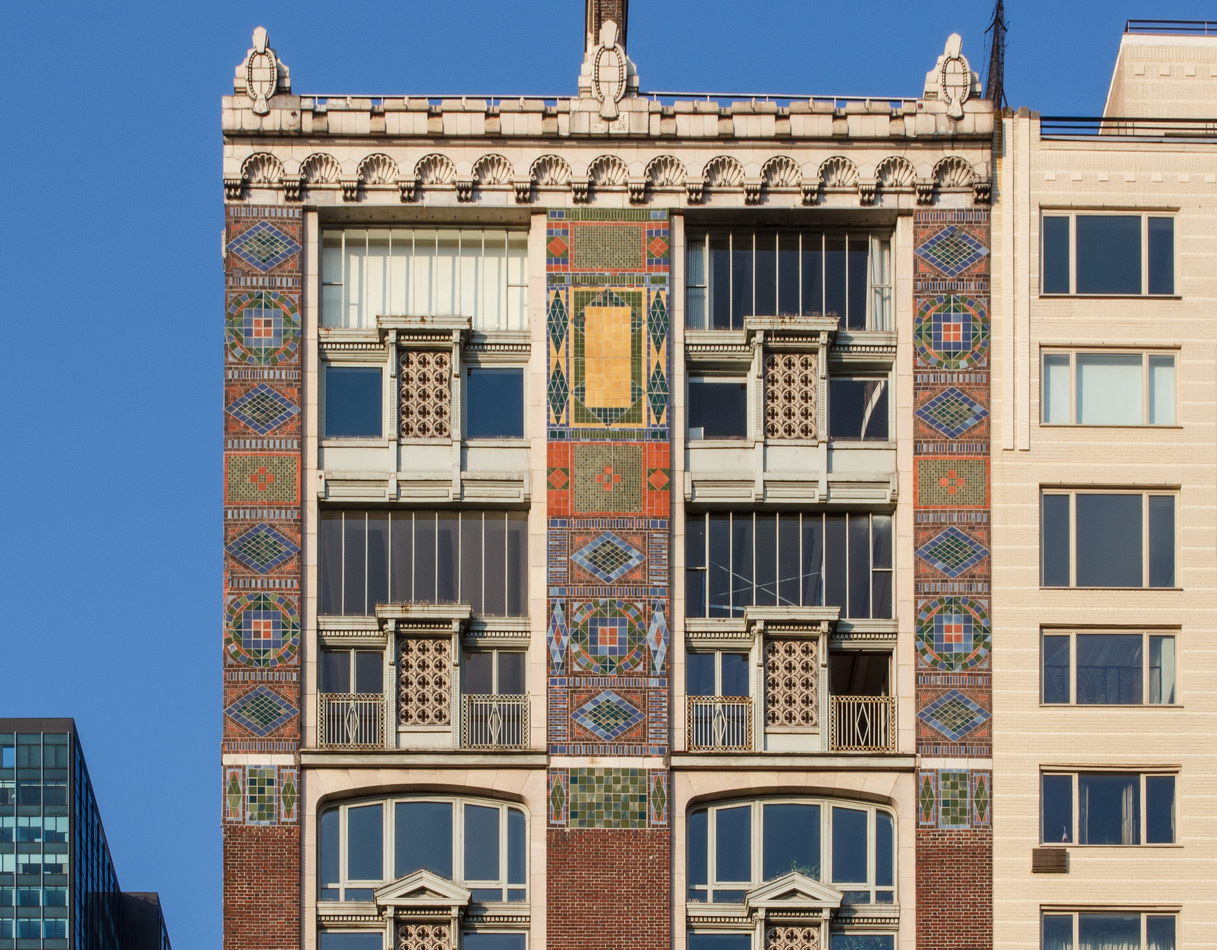
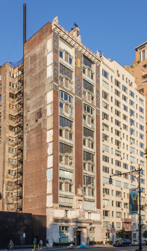
This is the second home of the Colony Club, the prestigious women’s social club that quickly outgrew its 1908 Stanford White-designed headquarters on Madison Avenue and E 31st Street. (Why didn’t White get to design the second club? He was shot by a jealous husband – but that’s another story.)

Like men’s clubs of the era, Colony Club was big on fitness facilities: the basement has what is said to be New York’s deepest indoor pool, a spa, and (via express elevator) a gymnasium and squash courts on the fifth floor. Other facilities included a ballroom and even a kennel for members’ pets.

Membership was (and still is) restricted to women – you must be recommended by a current member to be considered. Past members include Harrimans, Morgans, Astors and Rockefellers, to drop a few names.

Colony Club Vital Statistics
Colony Club Recommended Reading

Google Map
Hugh O’Neill Building

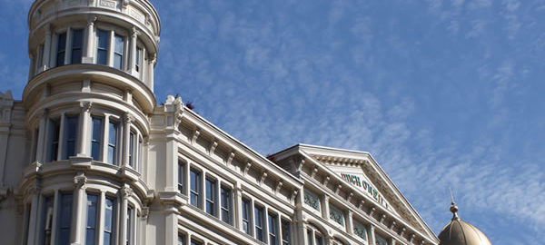
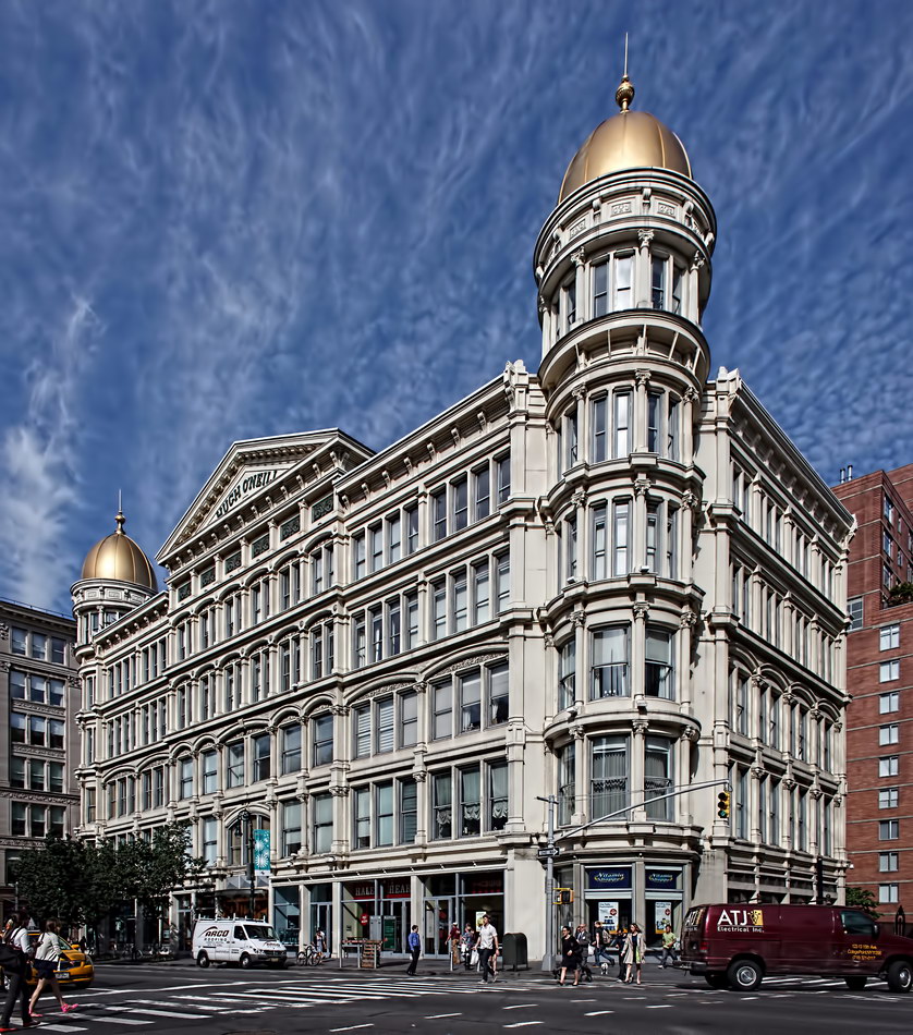
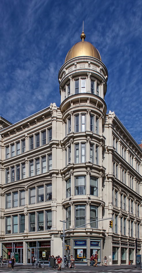
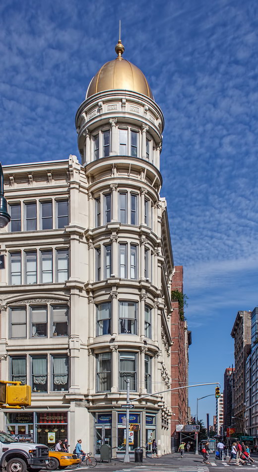
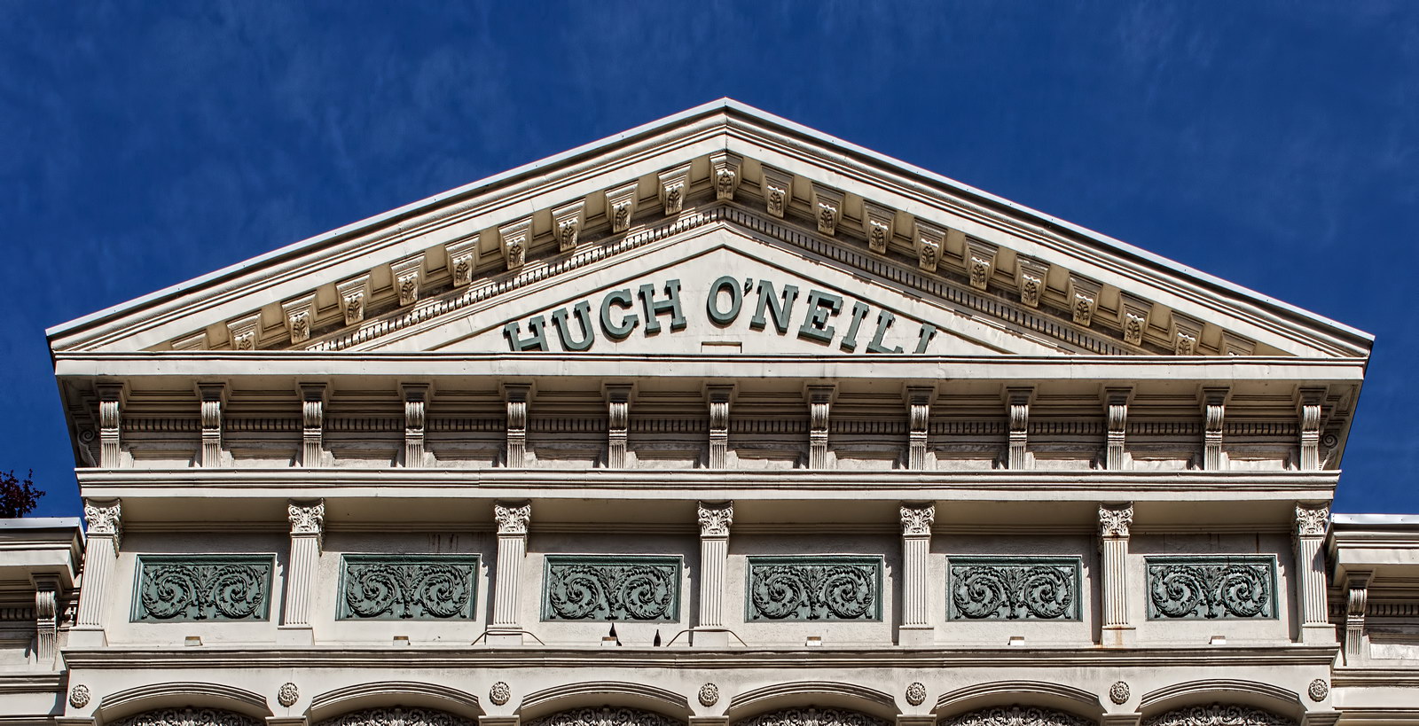
The dazzling white Hugh O’Neill Building on Sixth Avenue is a great example of historic restoration and recycling in New York. Not only did the developers bring an old building back to life, they also magically added two floors without changing the original appearance. While structural problems have appeared, the future looks bright.

Hugh O’Neill, an Irish immigrant, was a very successful retailer. He outgrew his original Sixth Avenue store and replaced it in 1887 with a four-story double-domed emporium. In 1890, he expanded the store at the rear of the West 20th Street wing. In 1895 he added a fifth floor (raising the domes one story in the process).

Alas, after O’Neill died in 1902 the store (and most neighboring retailers) deteriorated and closed. The corner domes were removed in the early 1900s, and the building was converted to lofts.

In 2004 the by-then grey building got a new lease on life: Conversion to condominium apartments. The developer Elad Properties, and architects Cetra/Ruddy Inc. got Landmarks Preservation Commission approval to restore the missing domes – and add two stories of apartments at the same time. The trick was to set back the new floors so that they are not visible from the street.

In December 2012 one of the building’s columns on West 2oth Street collapsed, forcing evacuation. Repairs were made, but scaffolding still covers the West 20th Street facade at this writing (June 2013).

Hugh O’Neill Building Vital Statistics
Hugh O’Neill Building Recommended Reading

Google Map
Chelsea Modern

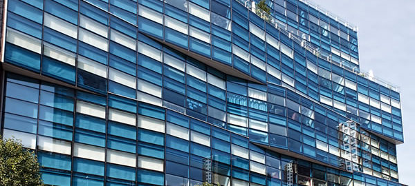
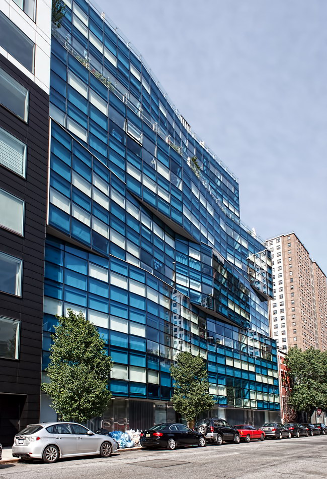
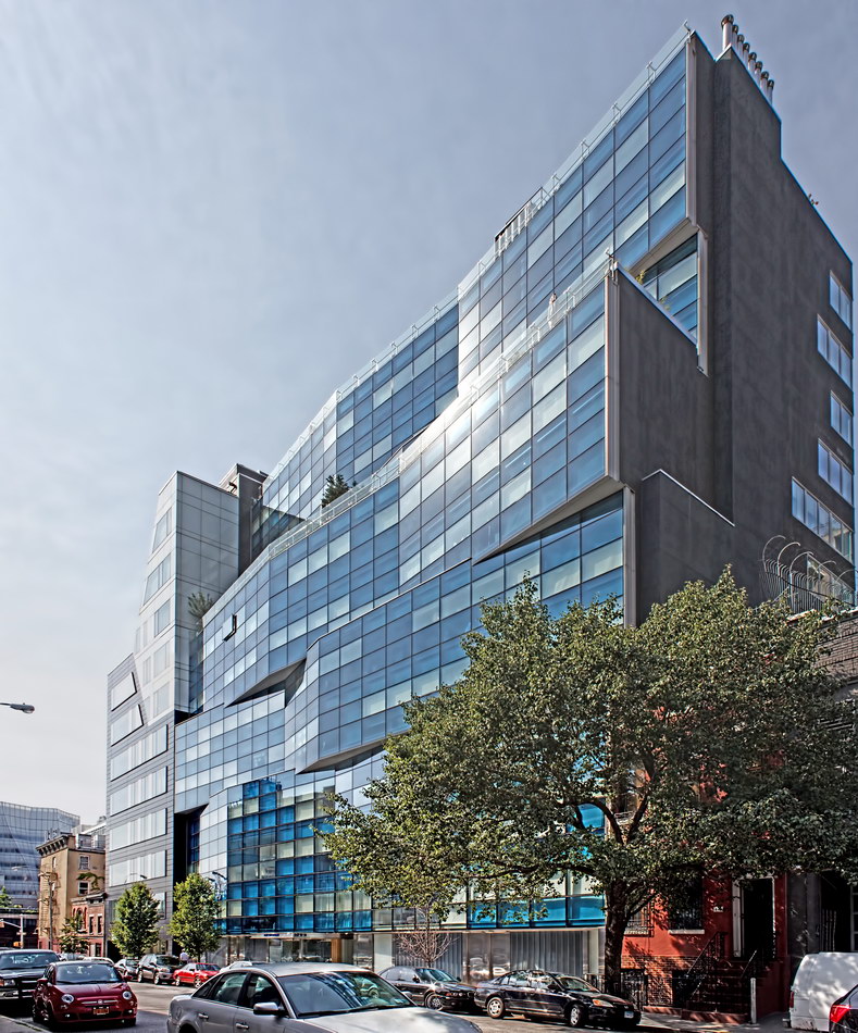
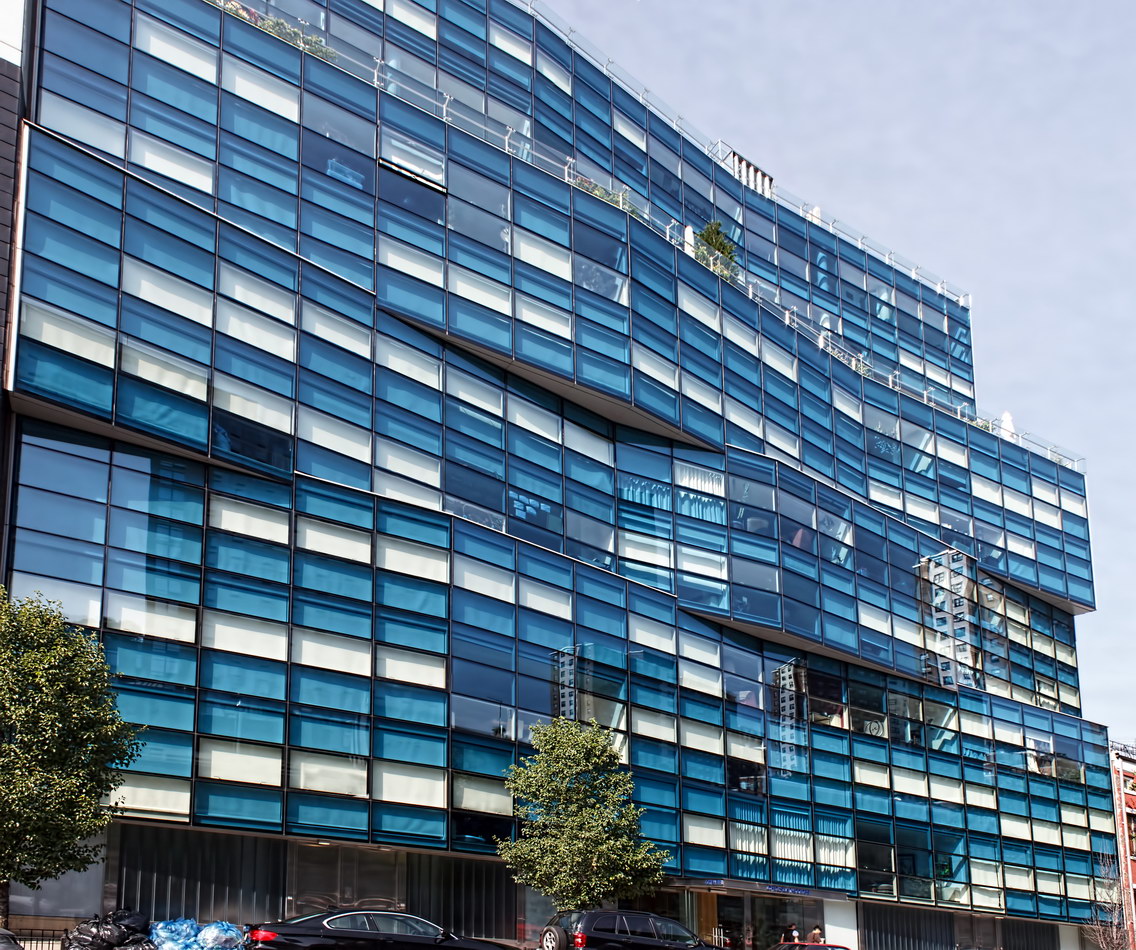
Chelsea Modern is a stunning, award-winning residential design with innovative features – and with a perfect companion building next door on West 18th Street. Even with its mid-block location, the 12-story zig-zagging blue glass facade stands out.

Architect Audrey Matlock took a page from Ludwig Mies van der Rohe’s Seagram Building – perfectly matched window blinds are built in, so that no one can destroy the symmetry or color of the facade by installing, say, calico curtains. But condo buyers can alter their floor plans somewhat – some of the bedroom walls are movable. Handy when you need to make the guest room less hospitable. You can open the windows at Chelsea Modern – but not by sliding or swinging the sash: It moves straight out, parallel to the side of the building. Fresh air enters (or your culinary excesses exit) around the sides of the sash.

As with anything radical, Chelsea Modern has its passionate detractors. They lament “there goes the neighborhood” as historic architecture is razed and glazed. (See the Jeremiah’s Vanishing New York blog. Even if you don’t agree with the author, you have to appreciate the writing.) Two warehouses died in the making of this building.

Chelsea Modern Vital Statistics
Chelsea Modern Recommended Reading

Google Map
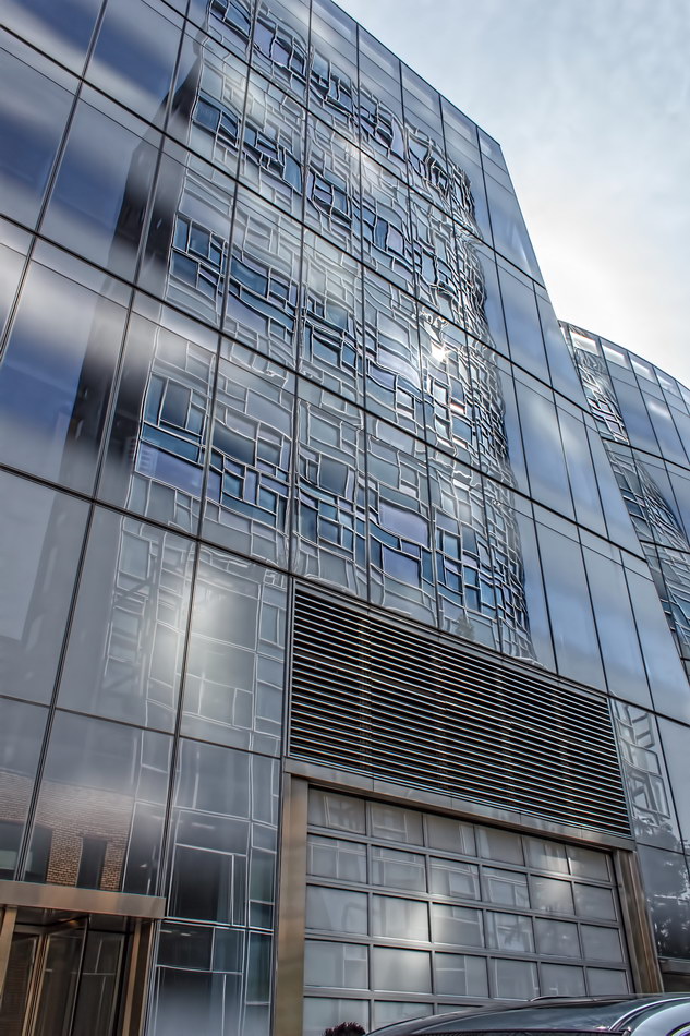
459 W 18th Street

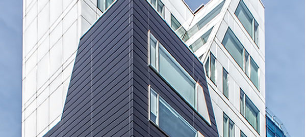
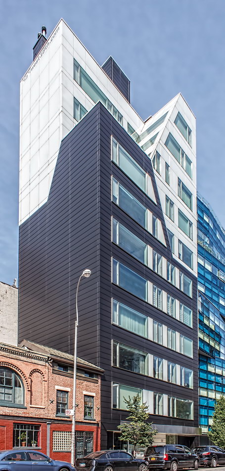
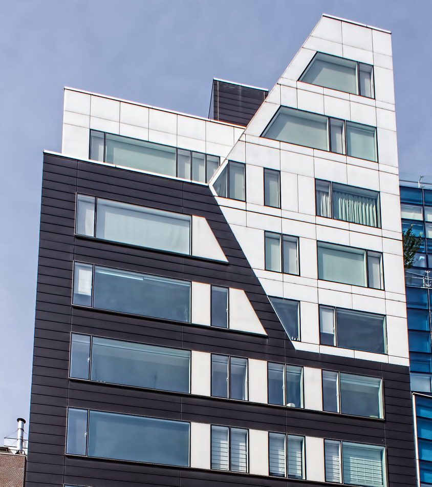
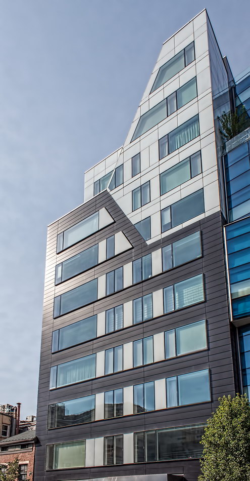
459 W 18th Street so perfectly complements Chelsea Modern, the condo next door, you might think that they were one building. That’s quite a trick, considering that the two structures have different heights, widths, orientations, colors and materials – not to mention architects.

But 459’s vertically-aligned angles and stark black and white aluminum panels paradoxically marry the blue and white glass and horizontal lines of Chelsea Modern.

459 W 18th Street Vital Statistics
459 W 18th Street Recommended Reading

Click to access architecture090615.pdf

Google Map
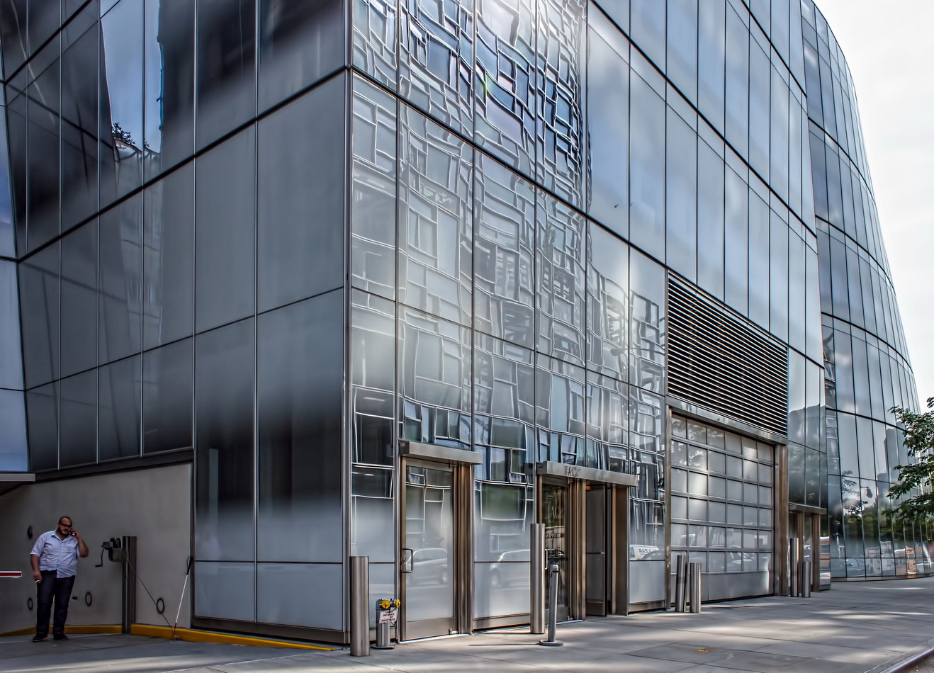
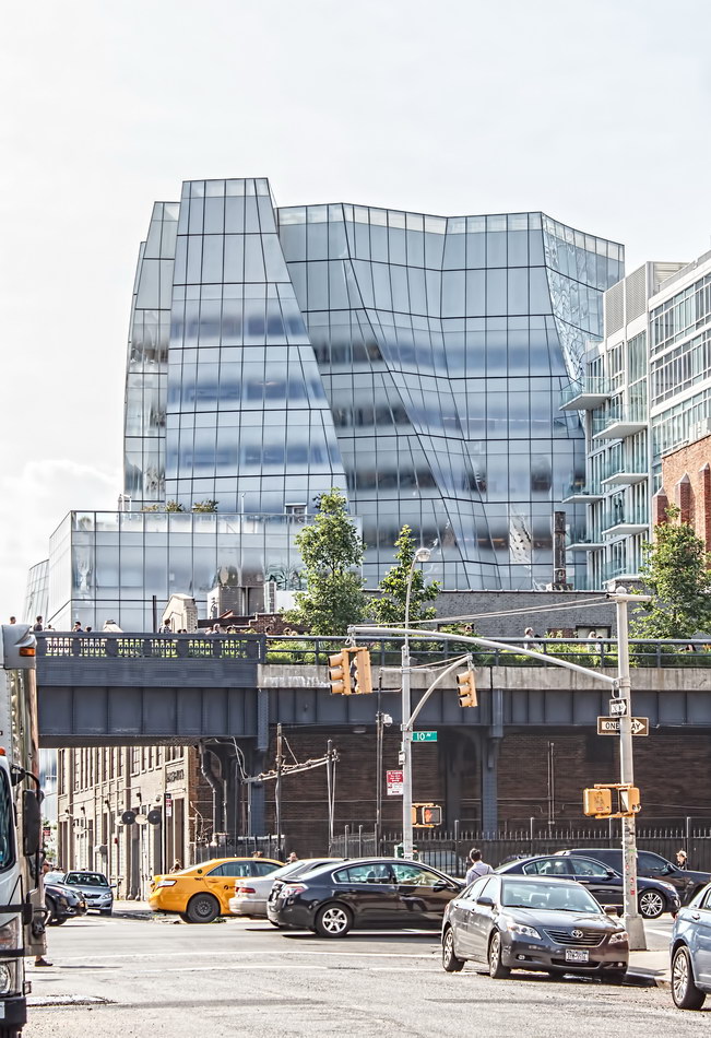
IAC Building

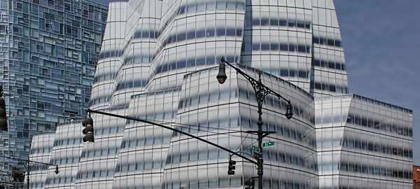
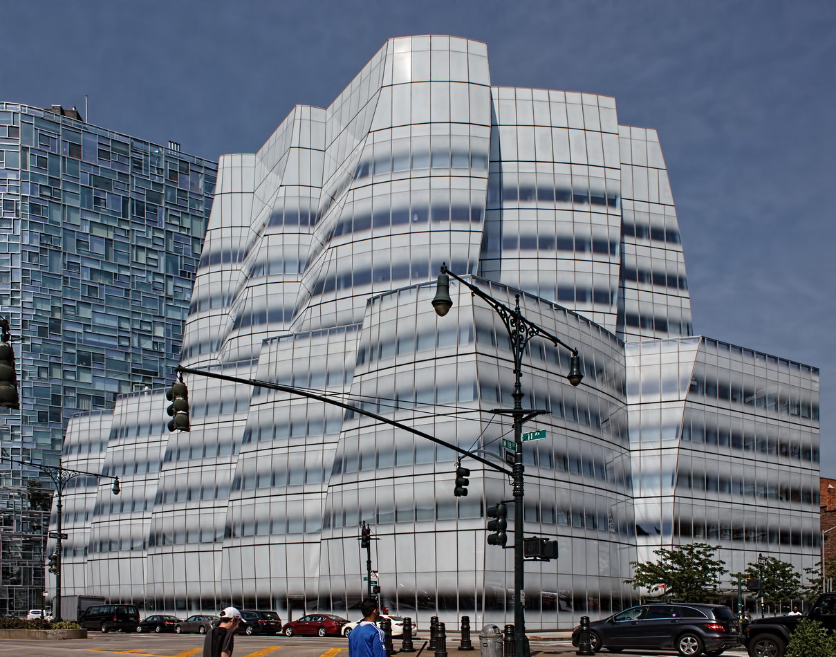
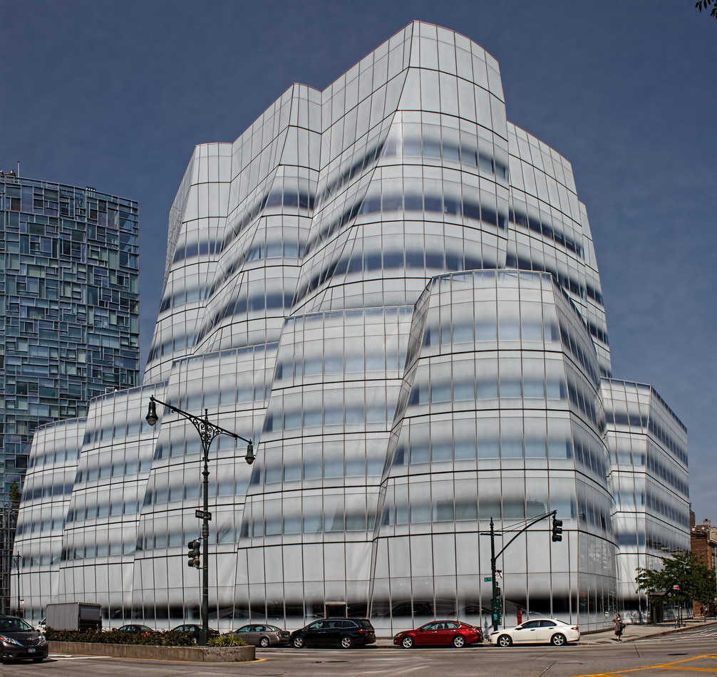
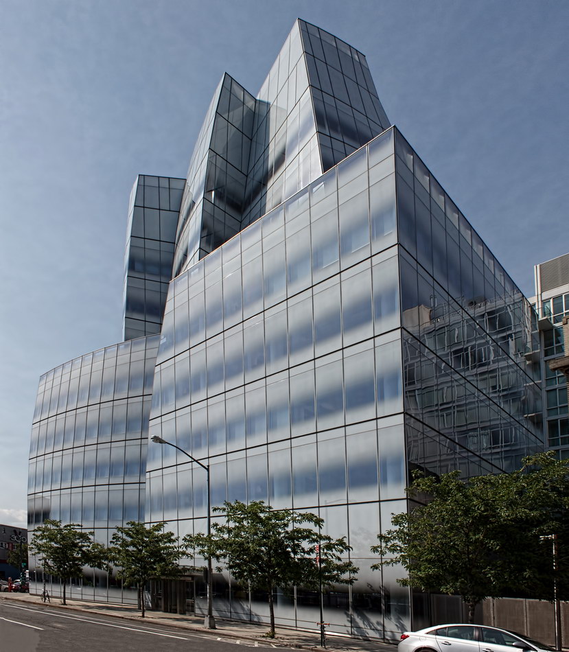
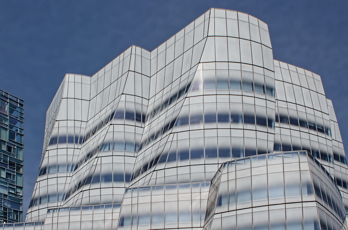
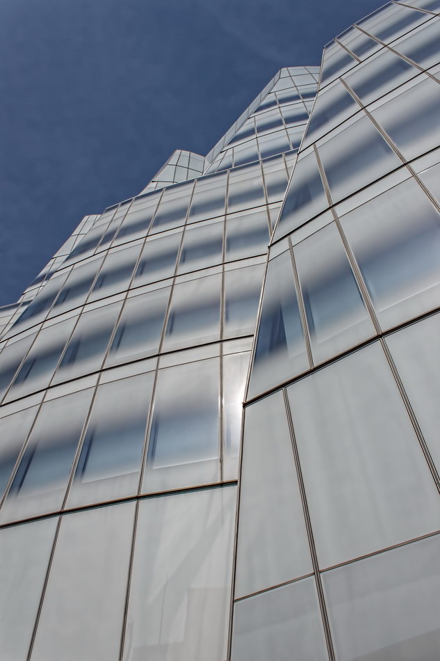
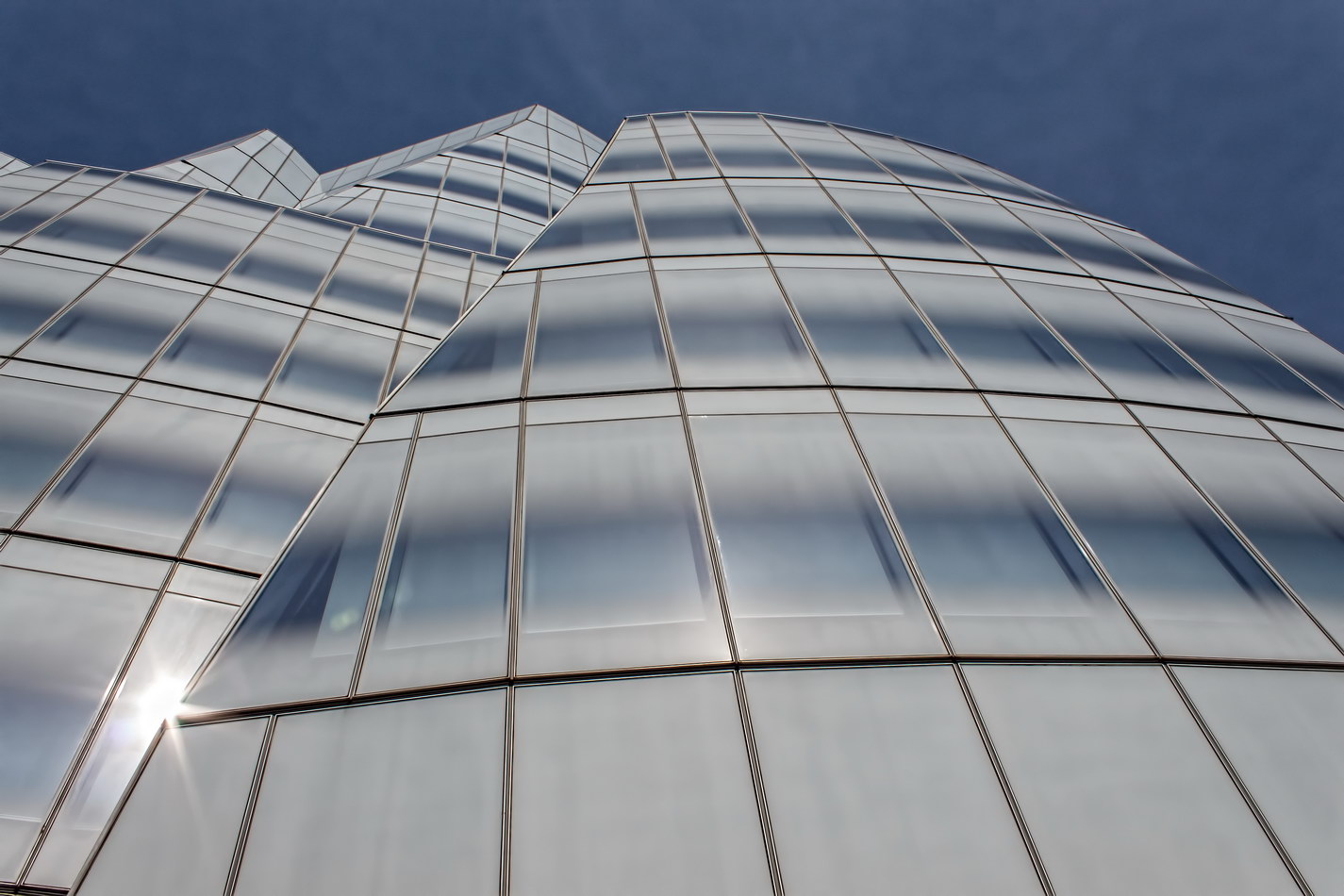
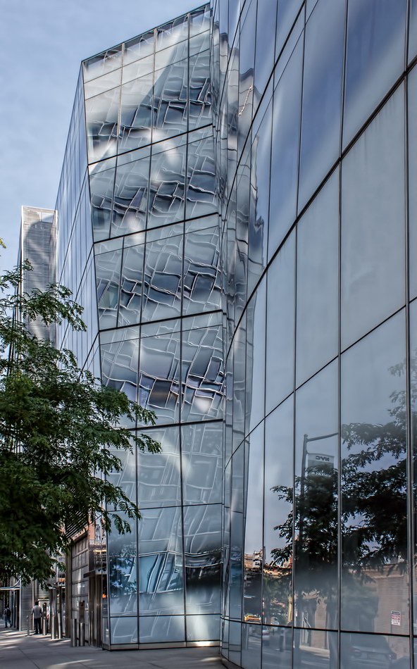
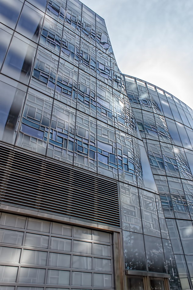
“Starchitect” Frank Gehry’s first New York building, IAC Building, resembles billowing sails – appropriate, just across 11th Avenue from the Hudson River.

The building’s skin is fritted glass – glass panels with ceramic paint heat-fused to the surface. This high-tech finish keeps the building cooler, but (at least in this application) looks a bit like it was spray-painted white. (Visit the IAC HQ website for short time-lapse construction videos; you’ll see the building’s concrete skeleton without the glass skin.)

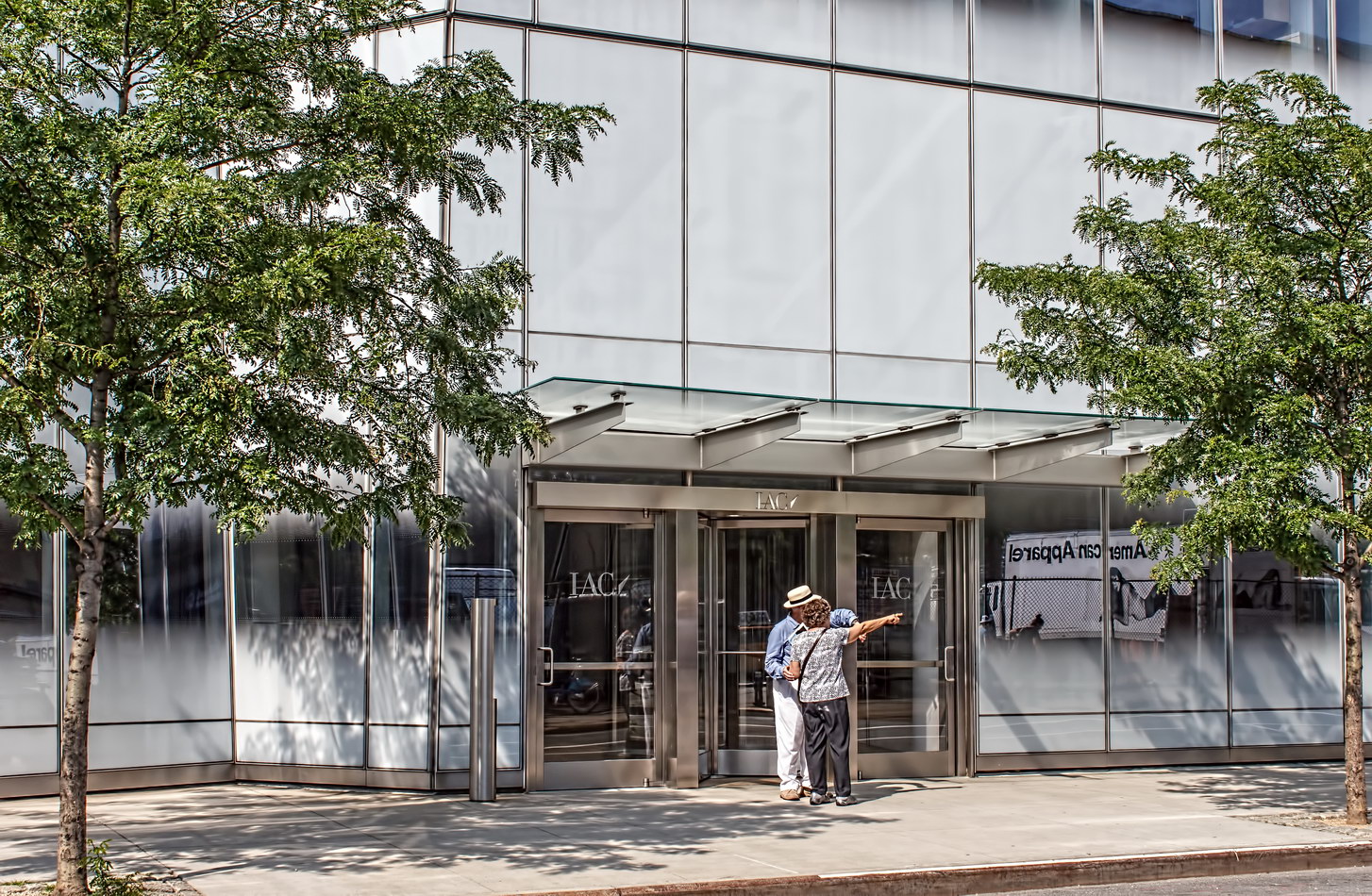
There are no windows with traditional frames – continuous ribbon windows are formed by the non-fritted band of glass on each floor. There very nearly are no exterior doors – the exterior openings are small, minimally framed glass doors. The main entrance, on W 18th Street, has a tiny flat glass canopy. The rear service and garage entrances have no canopy.

IAC Building Vital Statistics
IAC Building Recommended Reading

Google Map
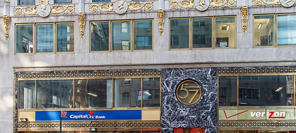
Medical Arts Building

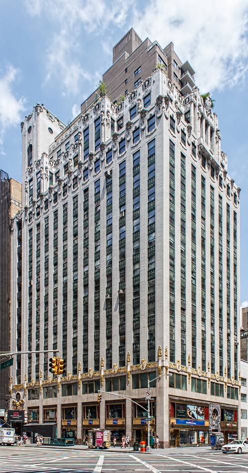
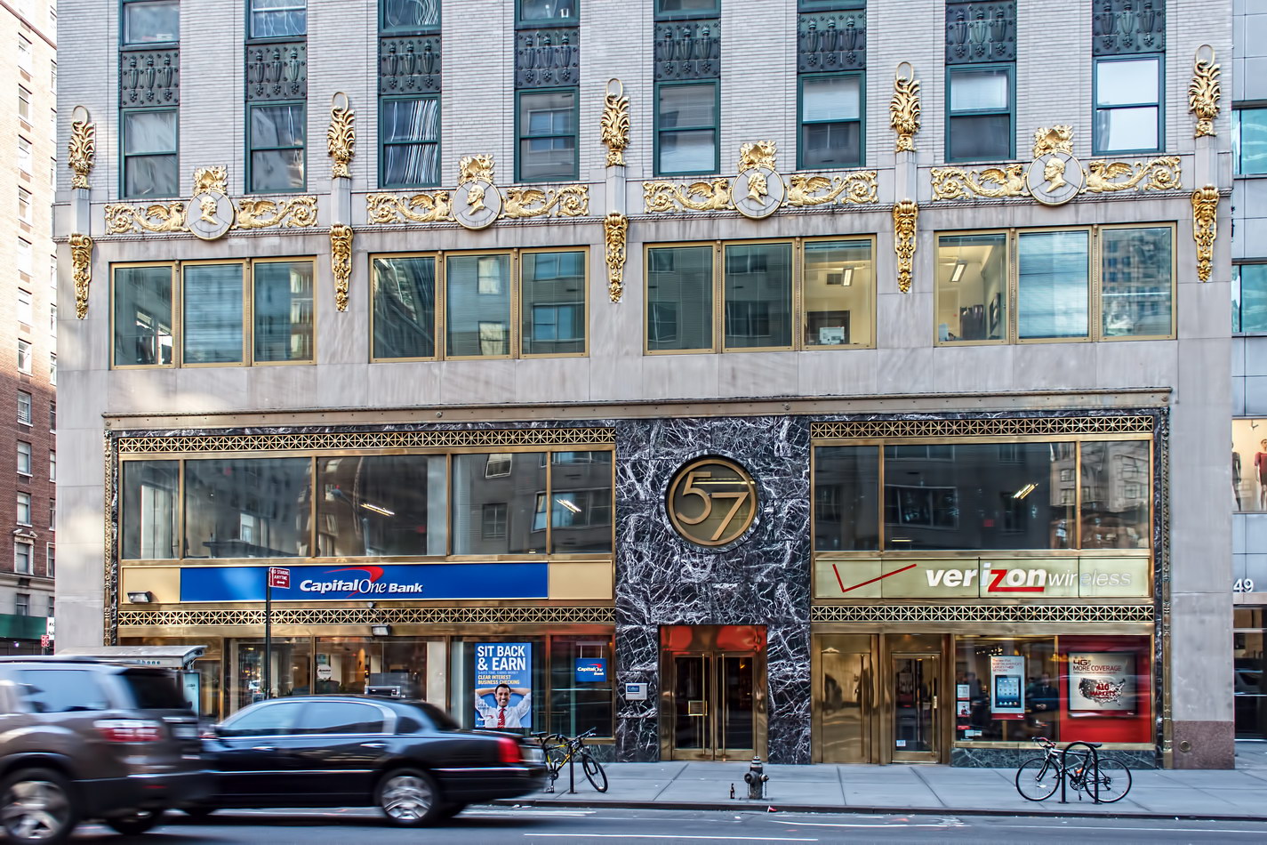
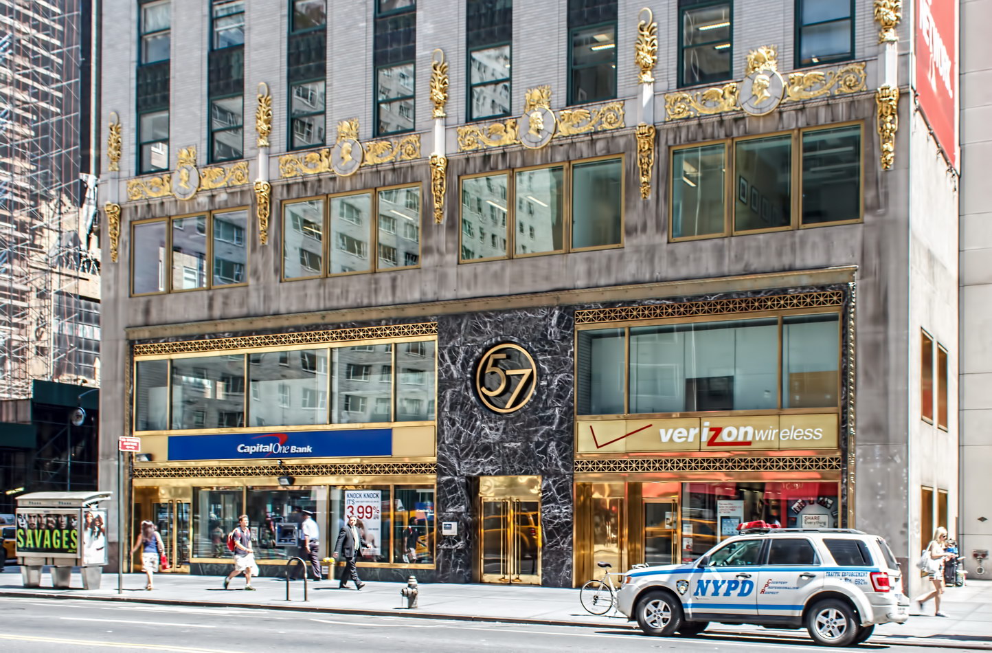
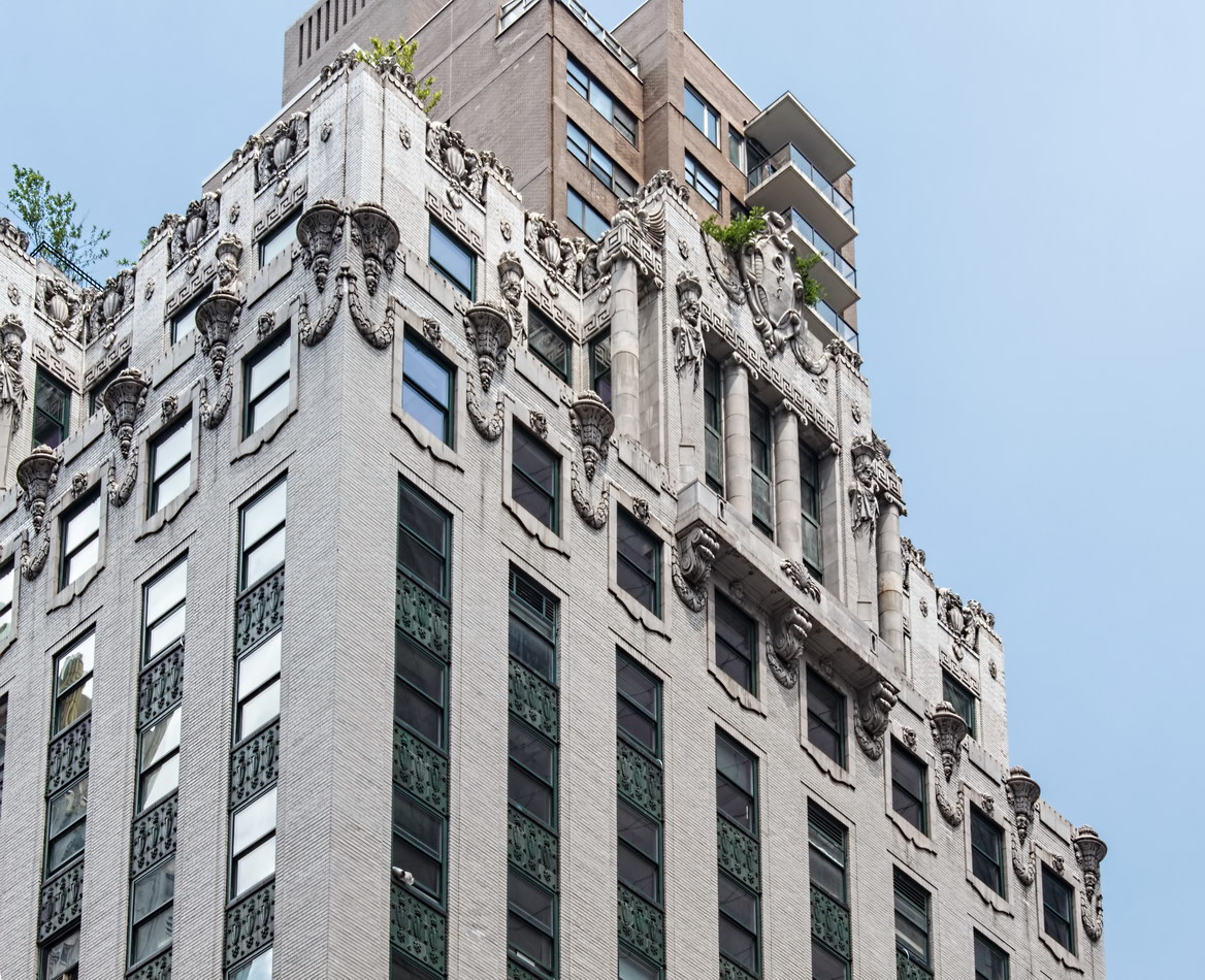
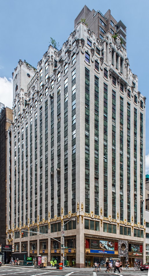
The Medical Arts Building, now known as simply 57 West 57th Street, was designed by Warren & Wetmore. That’s the same firm that designed nearby Steinway Hall and the Crown (originally Heckscher) Building – and New York landmarks Grand Central Terminal, Helmsley (originally New York Central) Building, Biltmore Hotel, and Grand Hyatt New York (originally Commodore Hotel), among others.

As the name suggests, the building was conceived as a center for doctors, dentists and other medical practitioners. Several whole-floor clinics and sanitoriums took residence here. But as the Daytonian in Manhattan blog tells it, medicine was not all that was practiced here! Must read!

The building’s new owner specializes in pre-built office space. The building has been redesigned internally with movable walls on tracks. (See The New York Observer article.) Several companies have set up shop to offer office leases by the month, day – or hour.

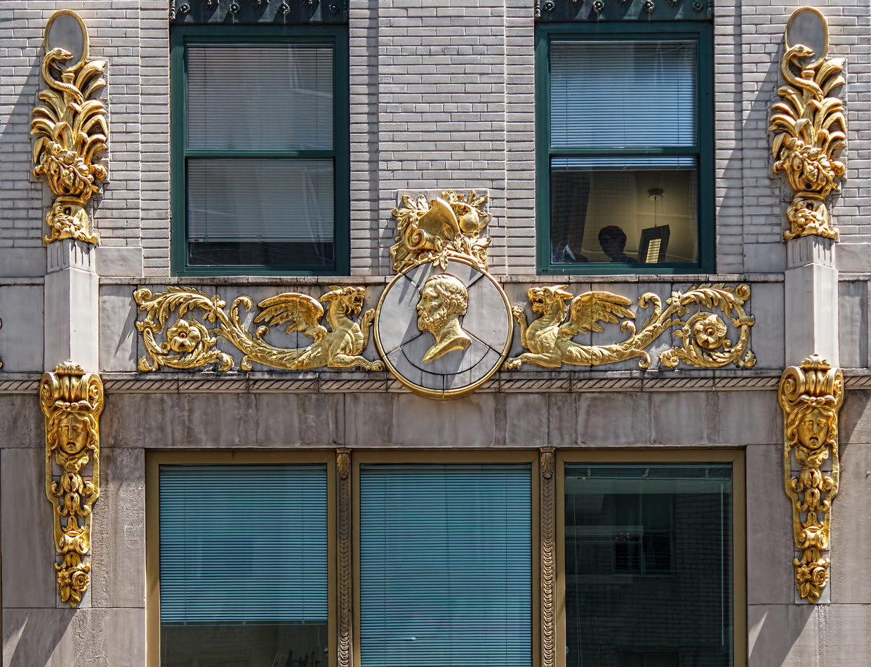
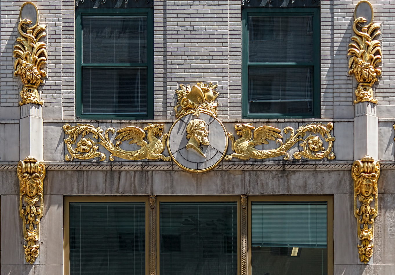
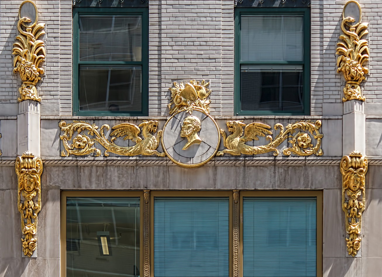
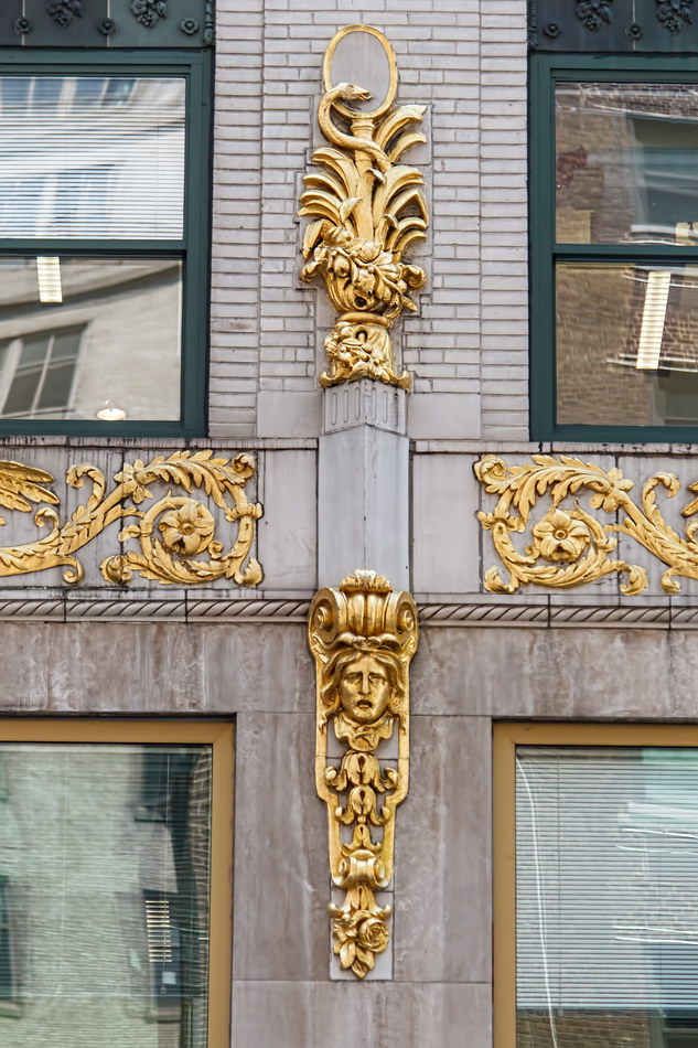
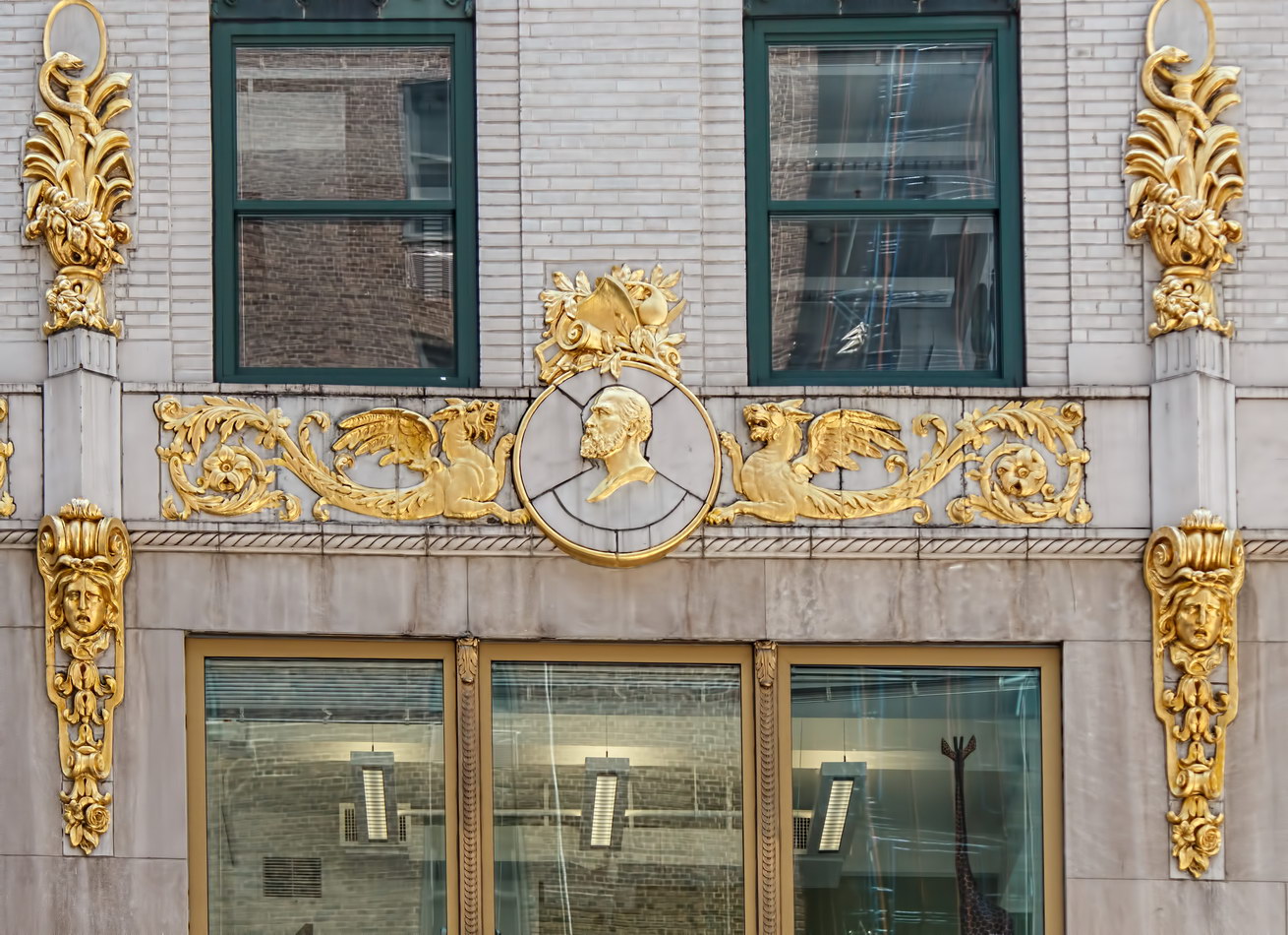
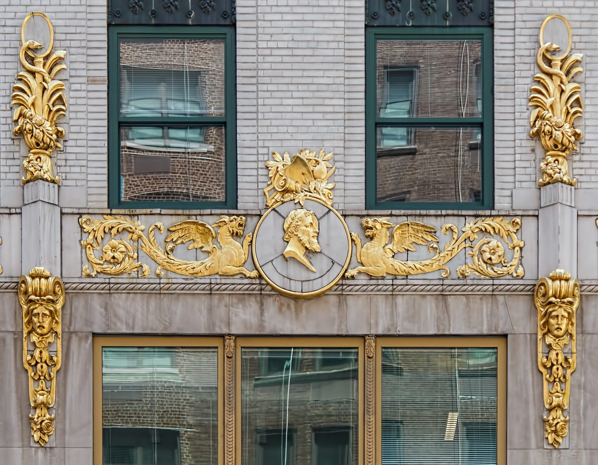
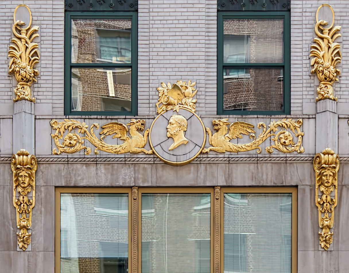
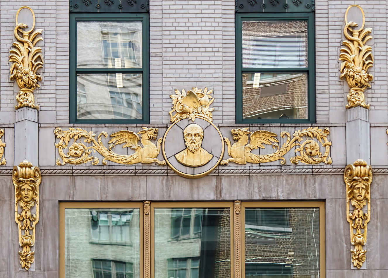
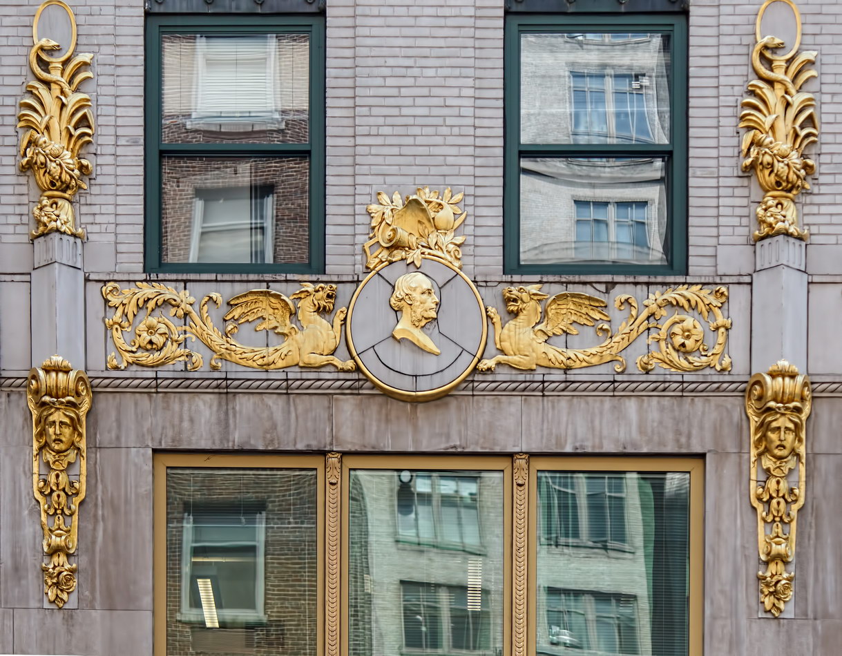
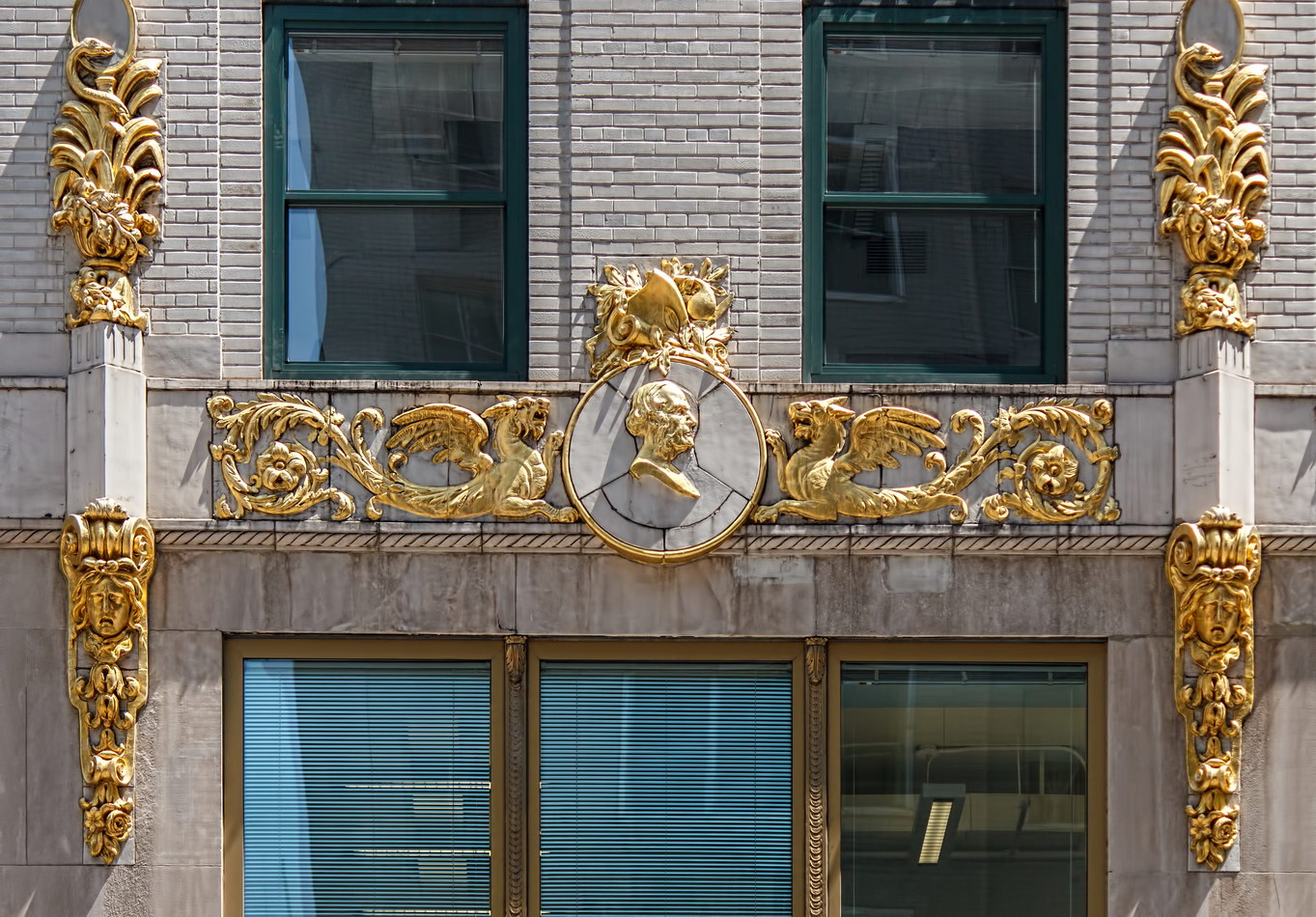
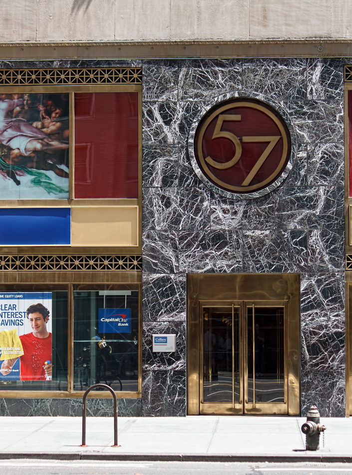
While the building has traded commerce for medicine on the inside, the decorative arts are alive and well on the outside: A string of gilt-painted terra cotta adorns the white brick facades on Sixth Avenue and West 57th Street; a massive columned “temple” crowns the building. The gilt medallions are supposed to picture notable physicians; I haven’t located the names. Also, at this writing the building’s Sixth Avenue art deco entrance was covered in scaffolding, so I couldn’t photograph it.

Medical Arts Building Vital Statistics
Medical Arts Building Recommended Reading

Google Map
Pershing Square Building

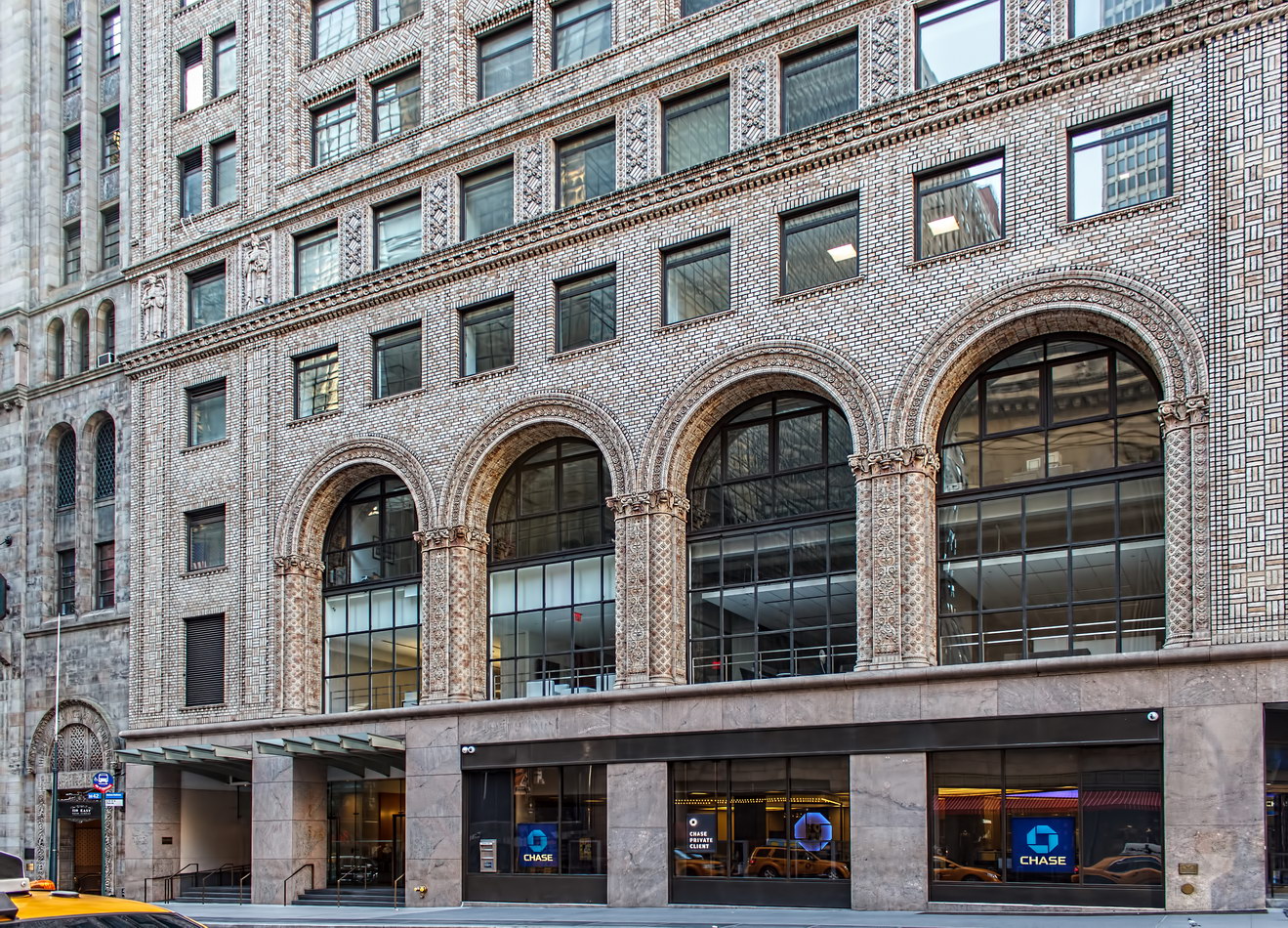
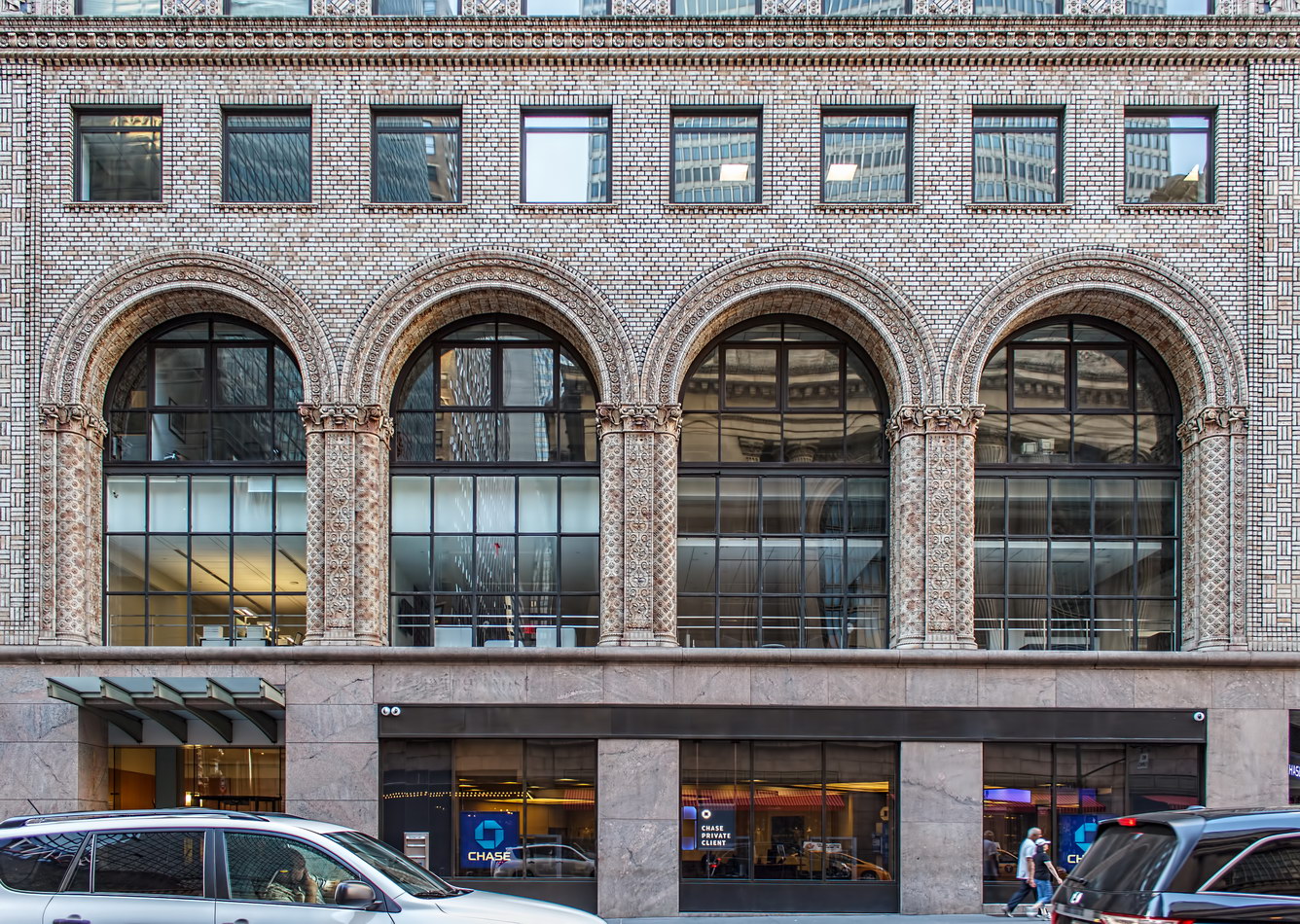
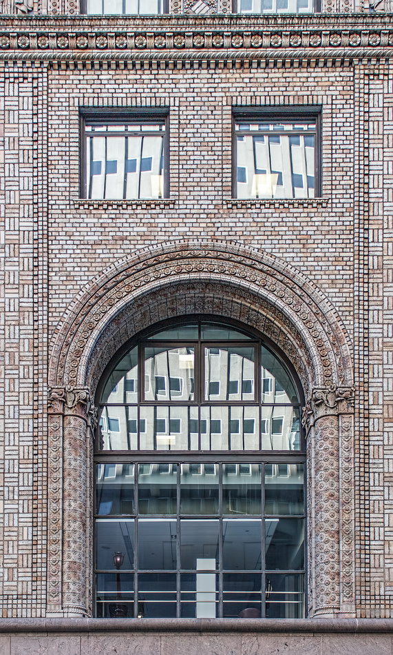
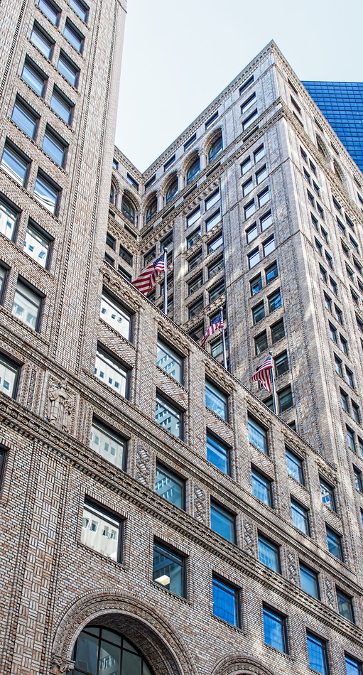
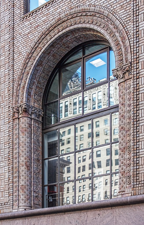
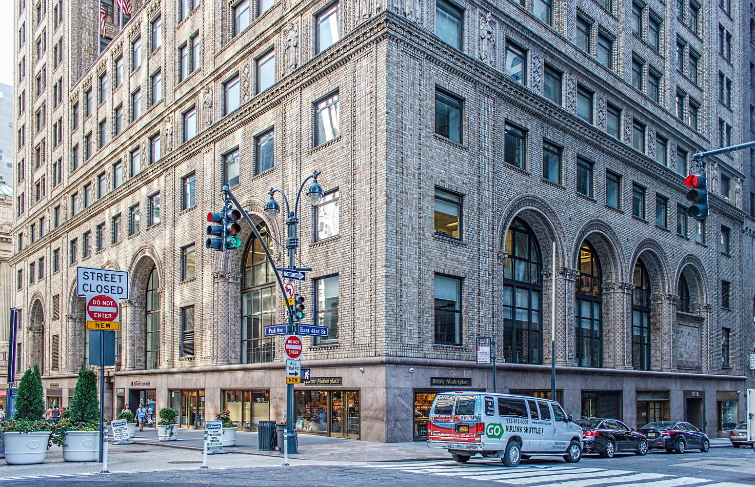
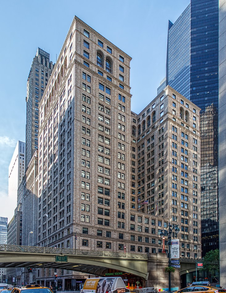
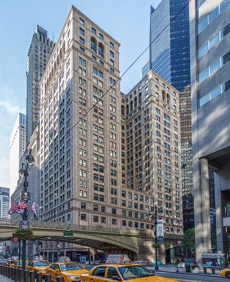
The Pershing Square Building’s days may be numbered. Unless the NYC Landmarks Preservation Commission intercedes, this tawny brick and terra cotta structure is in the path of the midtown rezoning proposal designed to encourage development of new office towers.

Although the building was completed in 1923, its foundations were laid in 1914 – thus escaping the 1916 zoning law that required setbacks on tall buildings. The polychrome brick and terra cotta was novel at the time.

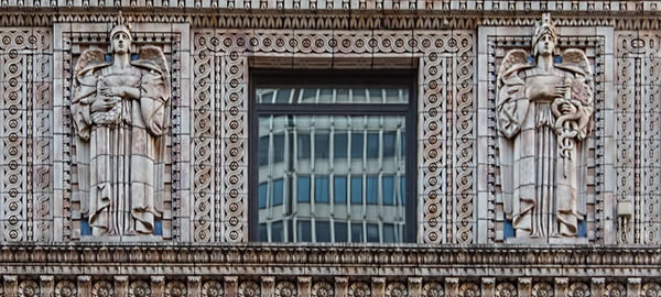
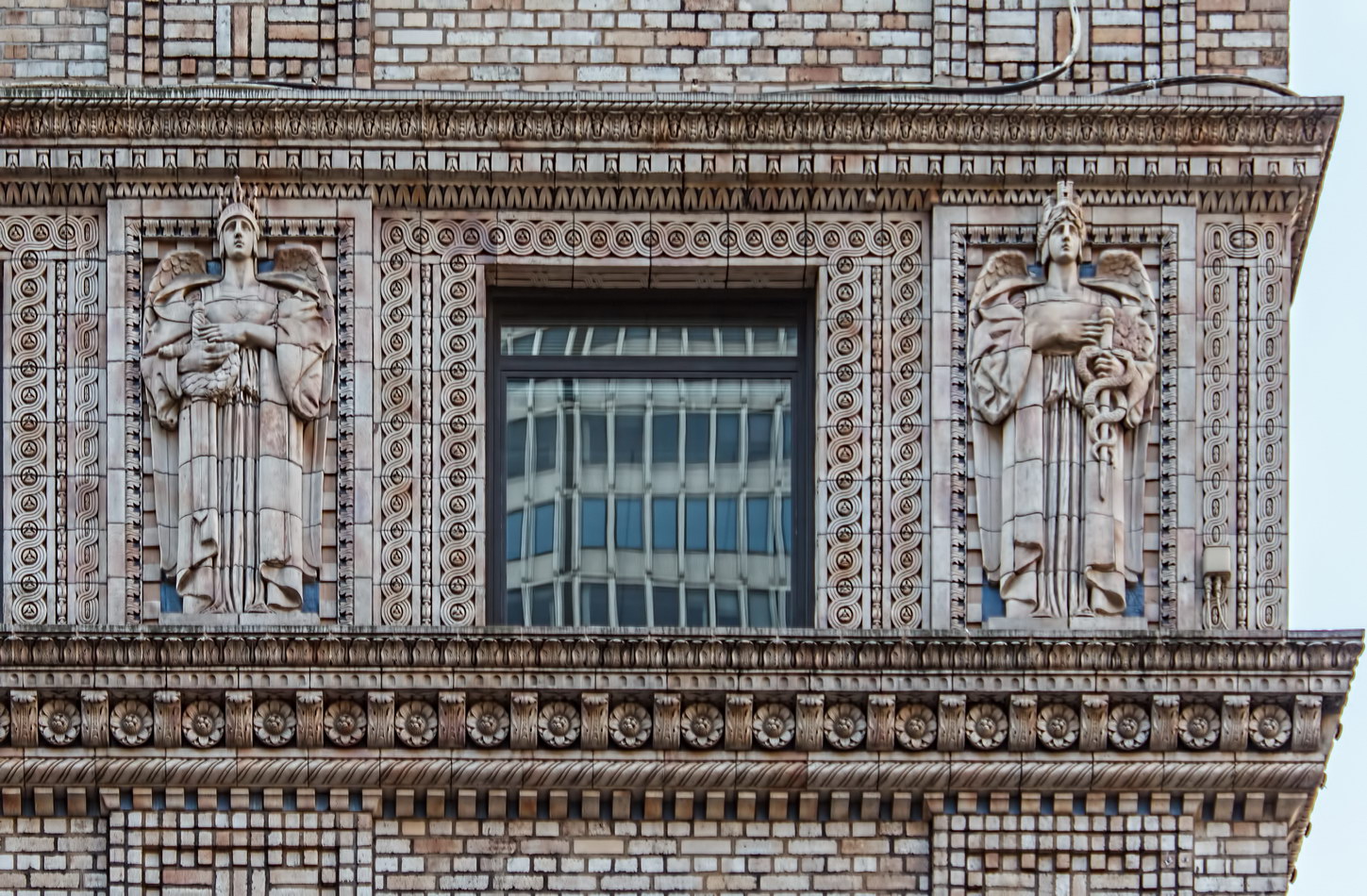
The large terra cotta figures at the fifth floor level are Roman caduceators, or peace commissioners; one version holds his caduceus, the other holds a cornucopia of peace. Nice touch, for a building named for a World War I general.

The Pershing Square Building stands on the site of the original Pershing Square – the former site of the Grand Union Hotel, which was demolished in 1914 for construction of the Lexington Avenue subway. The city sold the land instead of developing the park and memorial to General John J. Pershing. Pershing Square moved across the street to the site now occupied by the Pershing Square (aka Park Avenue) Viaduct ramp and Pershing Square Cafe.

You may note that the Pershing Square Building blends in very well with the neighboring Bowery Savings Bank. It’s no accident. The same firm designed the bank in a complementary style.

Pershing Square Building Vital Statistics
Pershing Square Building Recommended Reading

Google Map
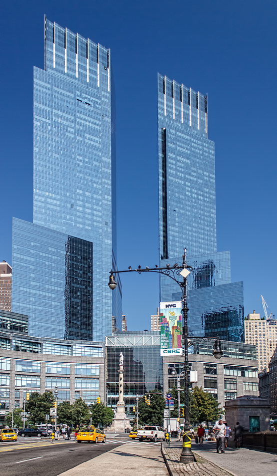
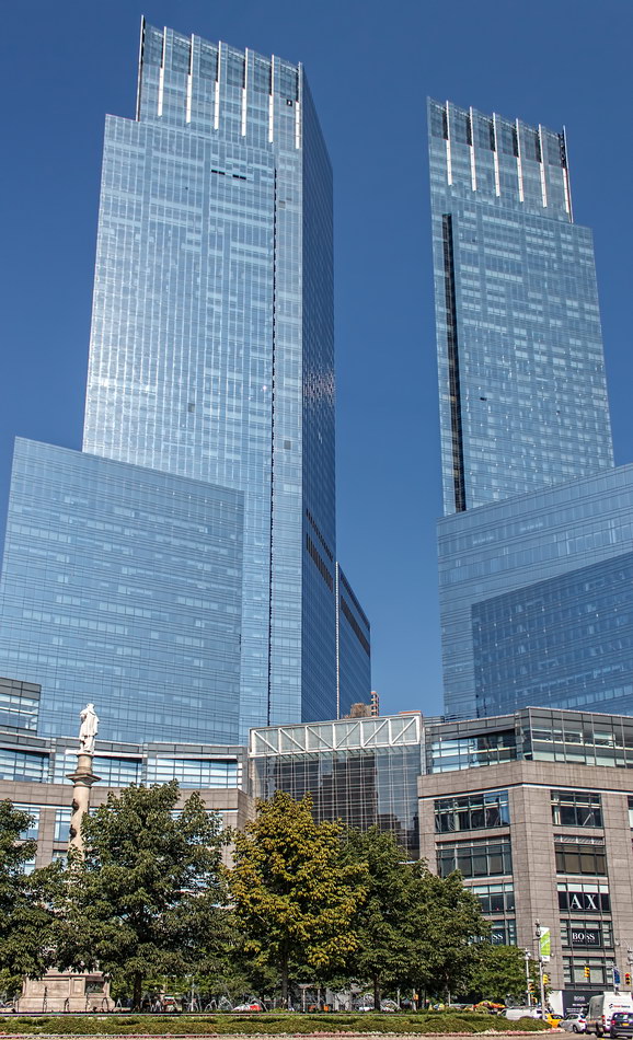
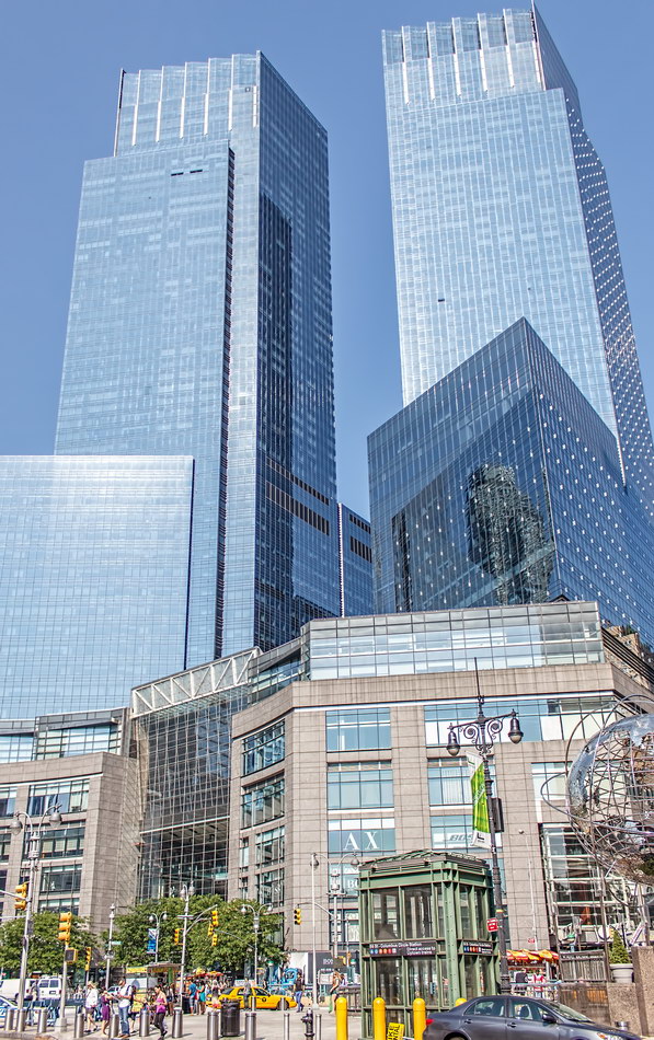
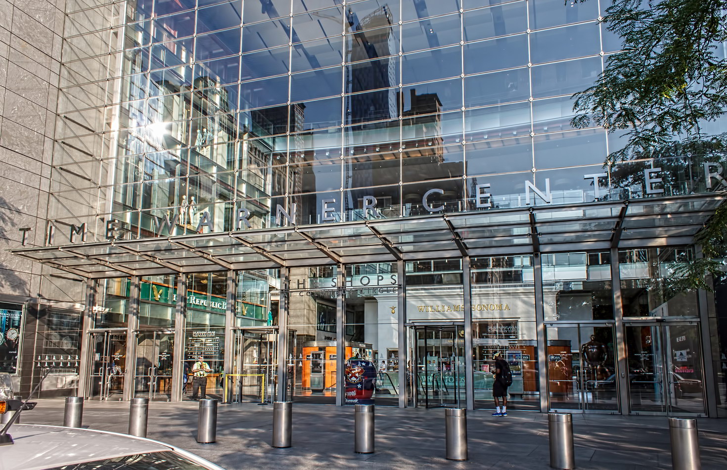
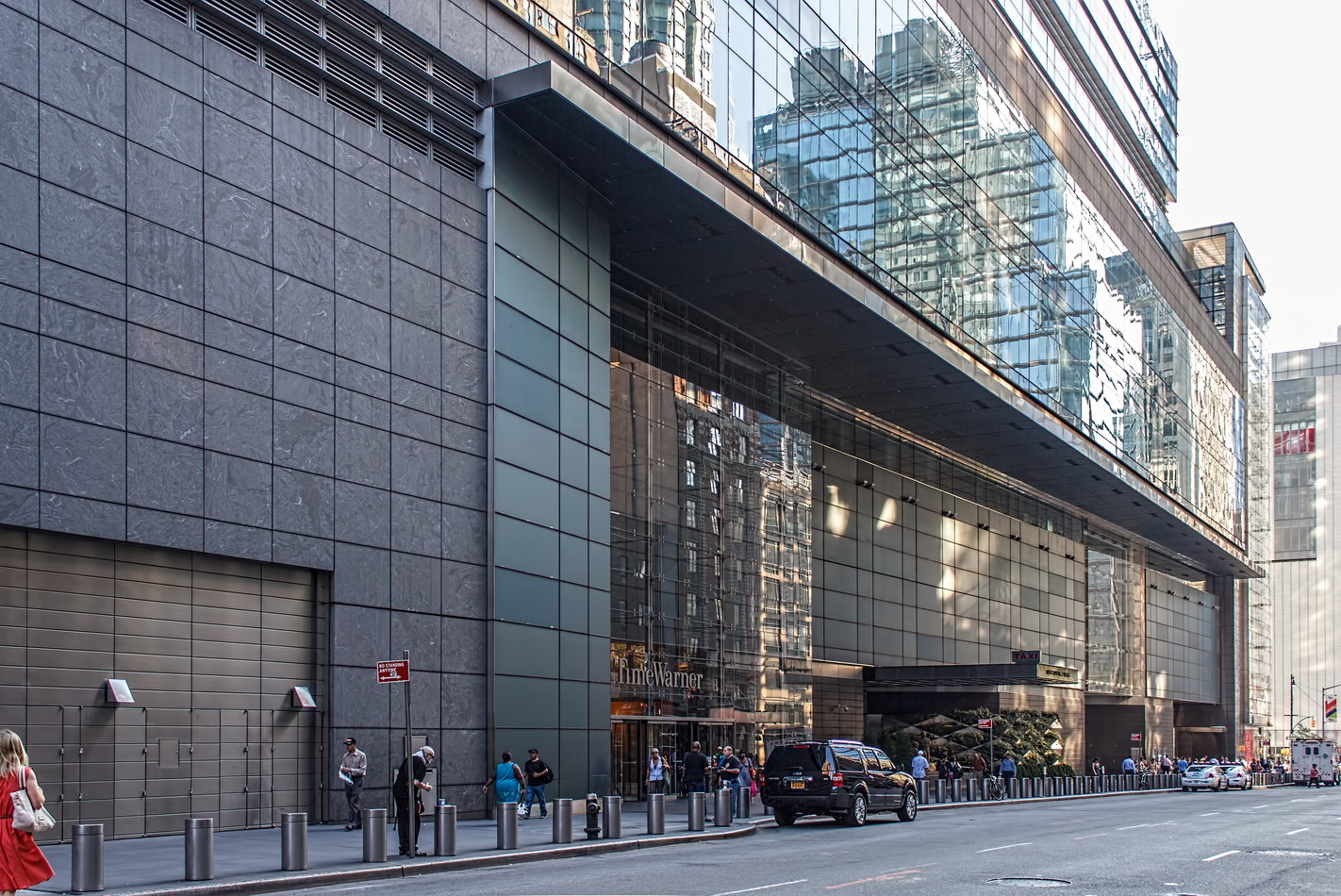
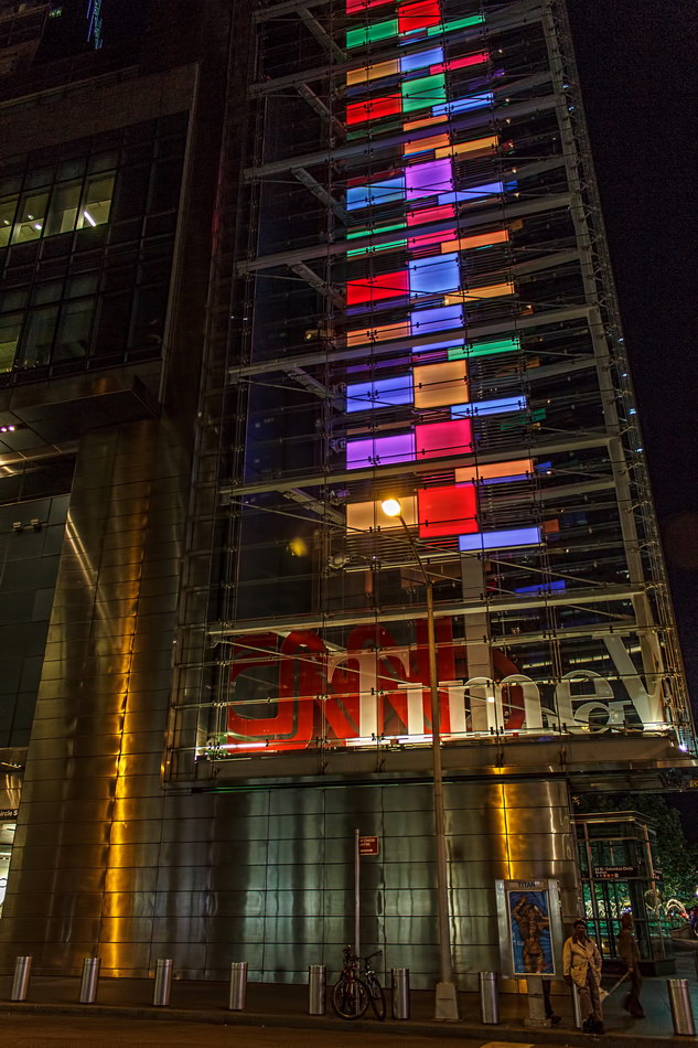
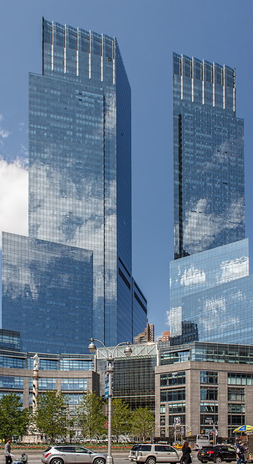
Time Warner Center

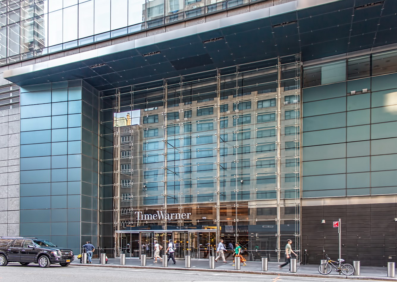
Time Warner Center was controversial from the moment it was conceived – years before that name was even attached. Now that Time Warner is moving downtown to the Hudson Yards, who knows what new controversies will arise.

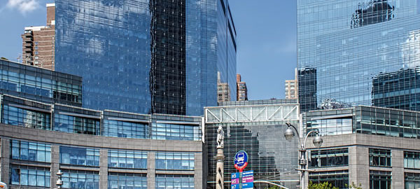
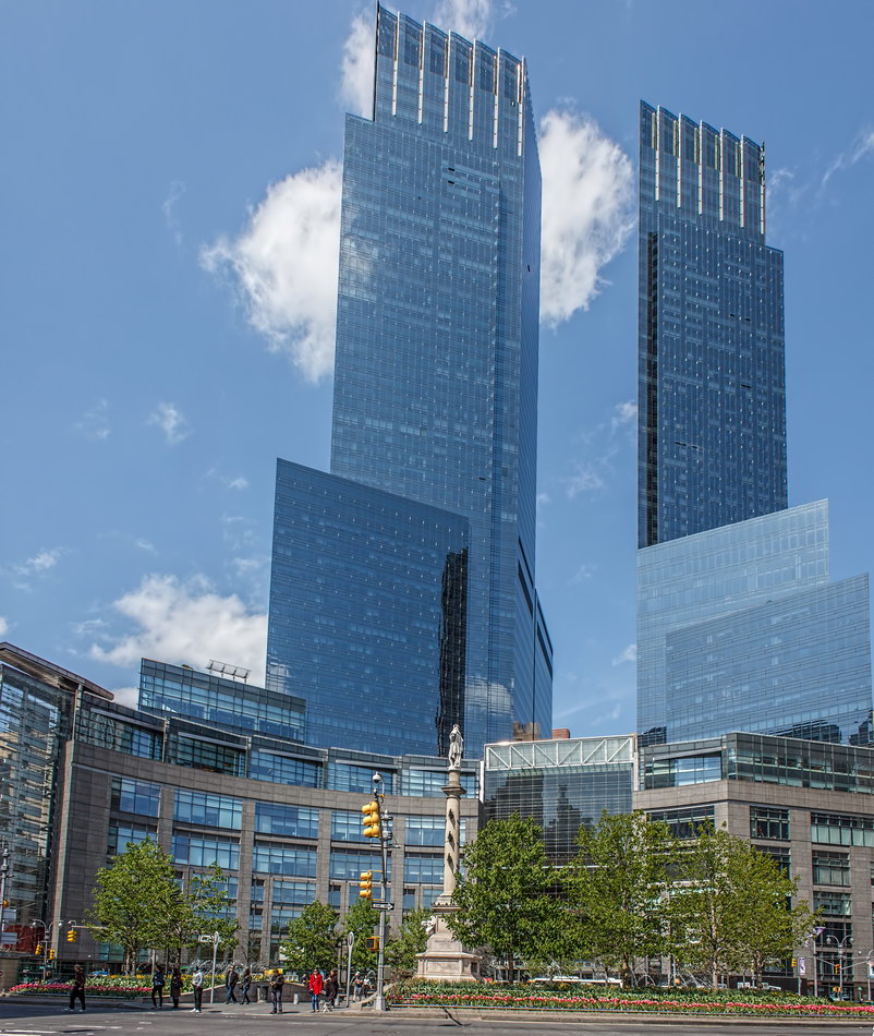
The oddly shaped site on Columbus Circle was inherited from the Coliseum, the Robert Moses-sponsored exhibition hall that was partly financed by federal slum clearance funds. Critics contend that the Coliseum was too small when it went up in 1956. In 1985 New York City and the MTA started shopping for a new developer. After nearly 14 years of design, political, and legal battles, Related Companies and Time Warner came up with the winning bid and design.

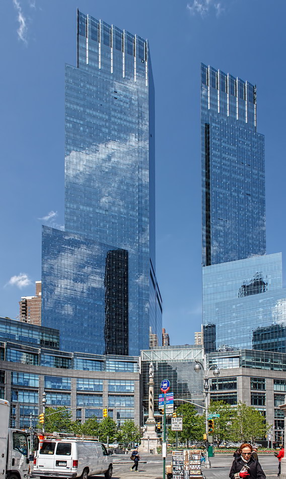
The project came with challenges: it had to follow the curve of Columbus Circle while aligning with the street grid – including angled Broadway; it had to include a “view corridor” of at least 65 feet; it had to contain less than 2.1 million square feet of space. (Like Grimm’s “Peasant’s Wise Daughter,” commanded to go to the king “neither naked nor clothed, neither walking nor riding, neither on the road nor off it.”)

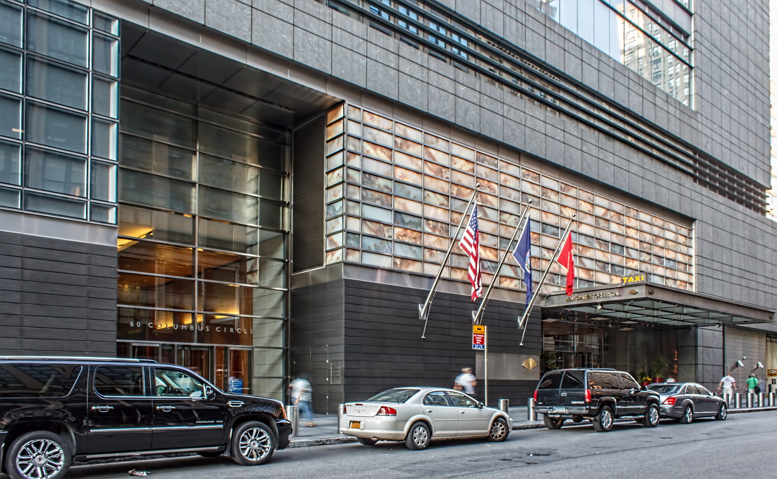
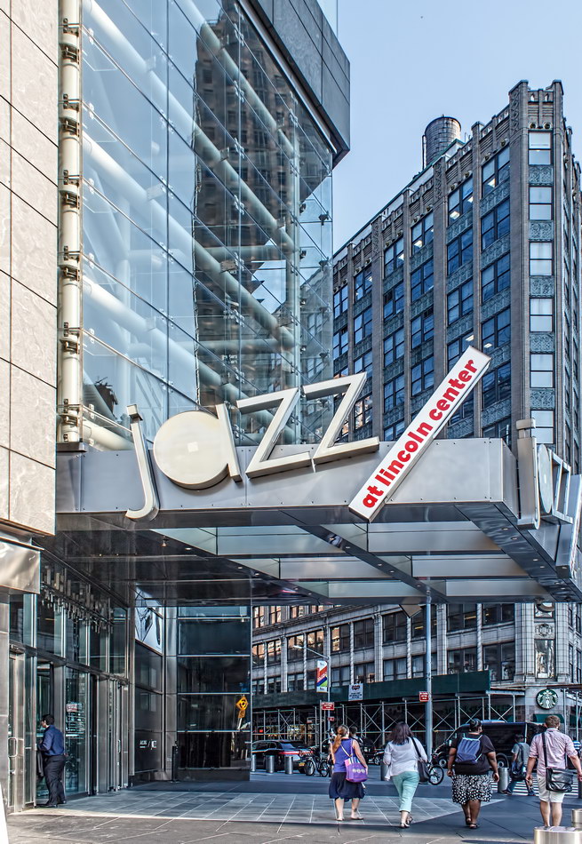
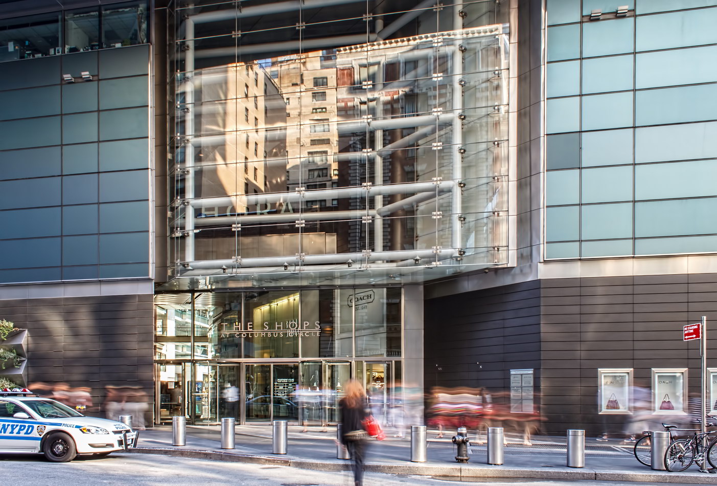
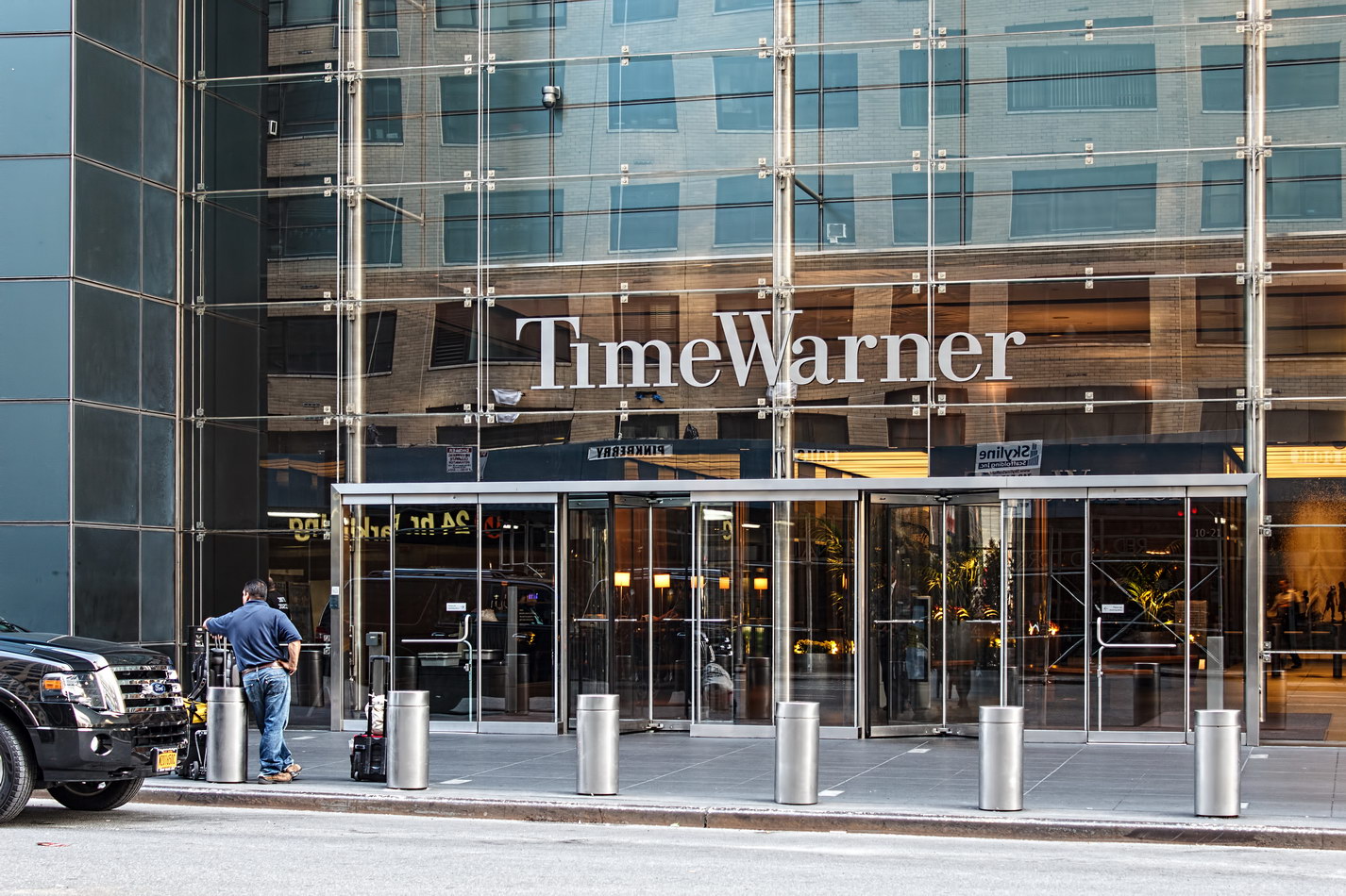
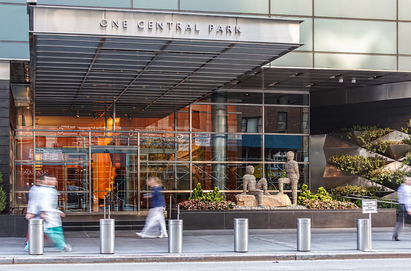
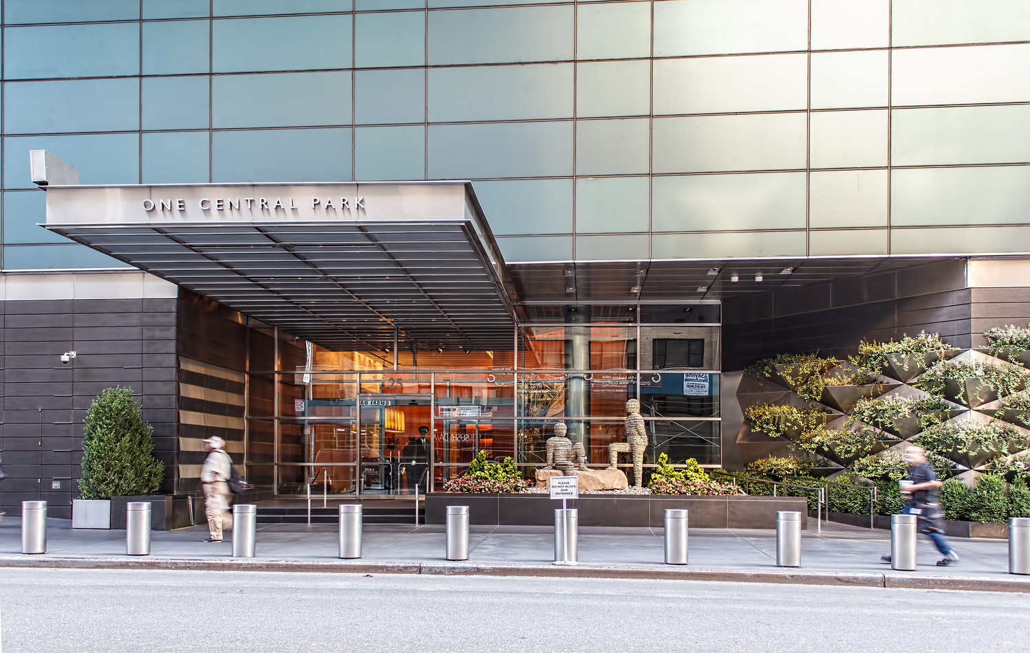
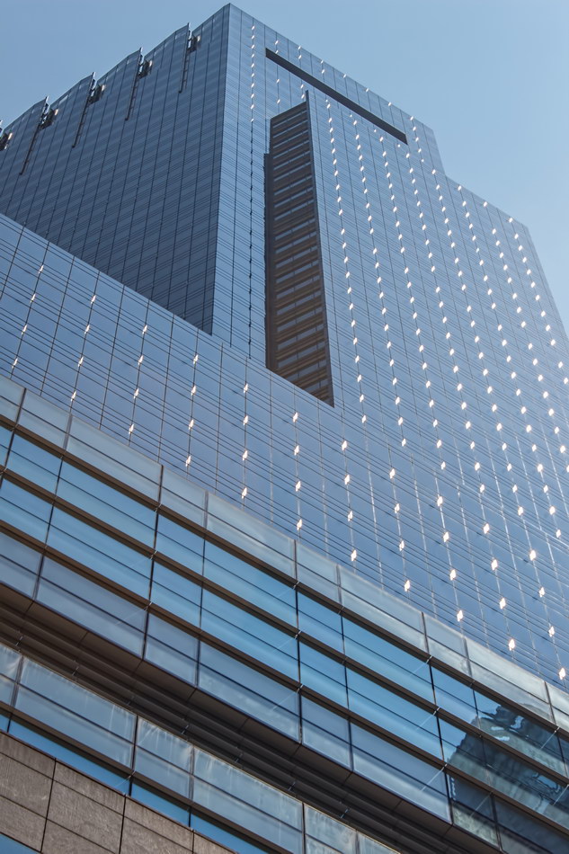
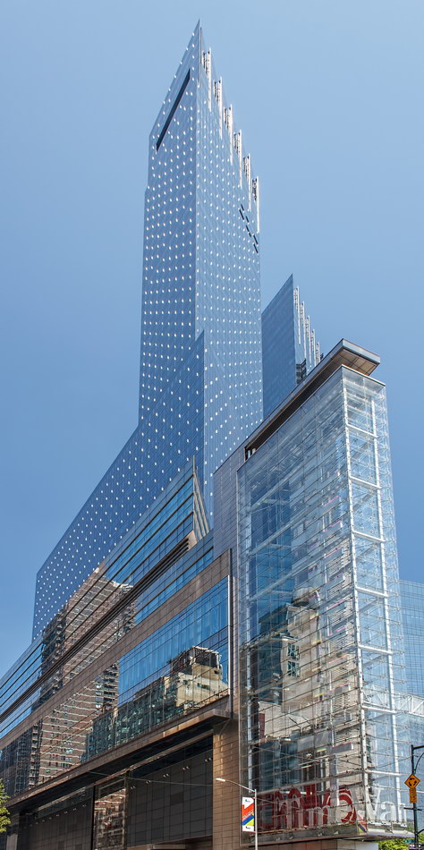
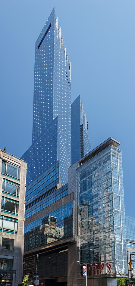
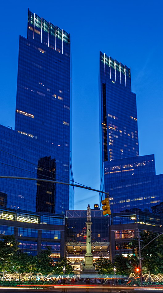
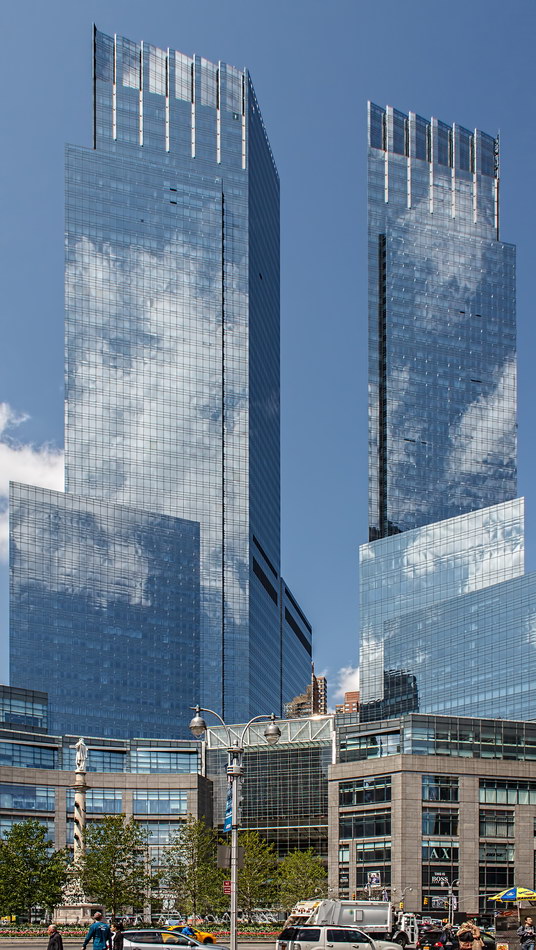
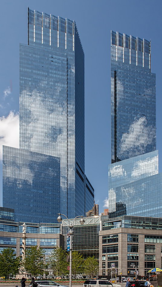
Time Warner Center is actually five buildings: Offices and television studios for Time Warner; the One Central Park residential condominium tower; the Mandarin Oriental hotel tower; the Jazz at Lincoln Center performance halls; and The Shops at Columbus Center (originally the Palladium). While David Childs of Skidmore, Owings & Merrill was responsible for overall design, each block had its own architectural team. As reported by The New York Times, Rafael Viñoly Architects designed Jazz at Lincoln Center; Perkins & Will, the Time Warner headquarters; Elkus/Manfredi Architects, the Palladium; Brennan Beer Gorman Architects and Hirsch Bedner Associates, the Mandarin Oriental Hotel; and Ismael Leyva Architects and Thad Hayes, One Central Park.

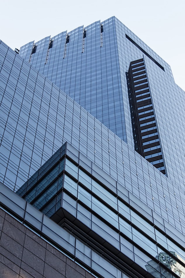
The result, which The New York Times in 2001 termed “like a giant tuning fork vibrating to the zeitgeist,” had mixed reviews. On completion in 2004, The Times gushed, “the building has great glamour. It is far more romantic than the Jazz Age tributes conceived by Mr. Childs in his wanton postmodern youth. With 10 Columbus, the mood is modern noir. The two towers are worthy descendants of Radio City.”

New York Magazine credited Skidmore, Owings & Merrill (SOM) with conquering the complexities, but picked apart the details. “SOM got the big, difficult moves right, but for the success of any building to be complete, design decisions must reinforce each other consistently down the drafting chain. Unfortunately, sometime after the conceptual stages, SOM suffered a failure of attention span.”

Probably all will agree that Time Warner Center (whatever its future name) is a massive improvement over Robert Moses’ Coliseum.

Time Warner Center Vital Statistics
Time Warner Center Recommended Reading

Google Map
Gainsborough Studios

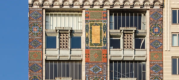
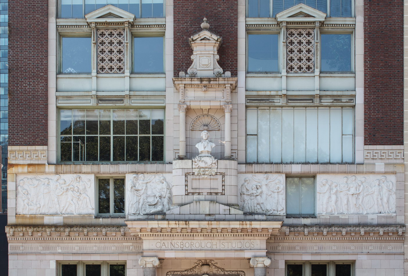
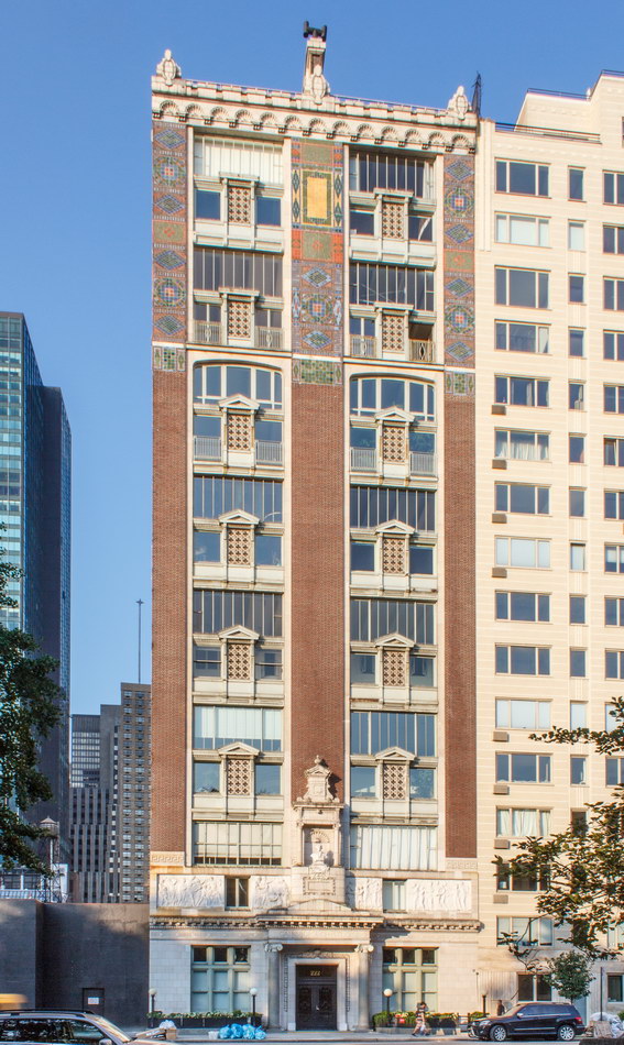
Gainsborough Studios is a distinctively detailed, colorful cooperative apartment building on a street sometimes termed bland.

The 1908 landmark was a cooperative in the original sense – intended for a community of artists – and designed for studios. The park-facing apartments are all duplexes, with double-height windows to capture the light. The rear apartments are all standard-height units. See floor plans (click plans for enlarged view). Alas, the apartments’ multi-million-dollar price tags are out of artists’ reach.

The facade was restored in 1988 – the same year the building was designated a NYC landmark.

The building next door (220 Central Park South) was demolished, and the lot will remain vacant and boarded up until the joint owners can settle their dispute. Vornado Real Estate Trust wants to build a new tower; Extell, which owns the underground parking garage (accessed via W 58th Street) won’t vacate. Extell also owns the new One57 tower and is building the 1,500-foot-tall Nordstrom Tower directly behind 220 Central Park South.

It seems that historic Gainsborough Studios will soon be dwarfed by its new neighbors east and south.

Gainsborough Studios Vital Statistics
Gainsborough Studios Recommended Reading

Google Map
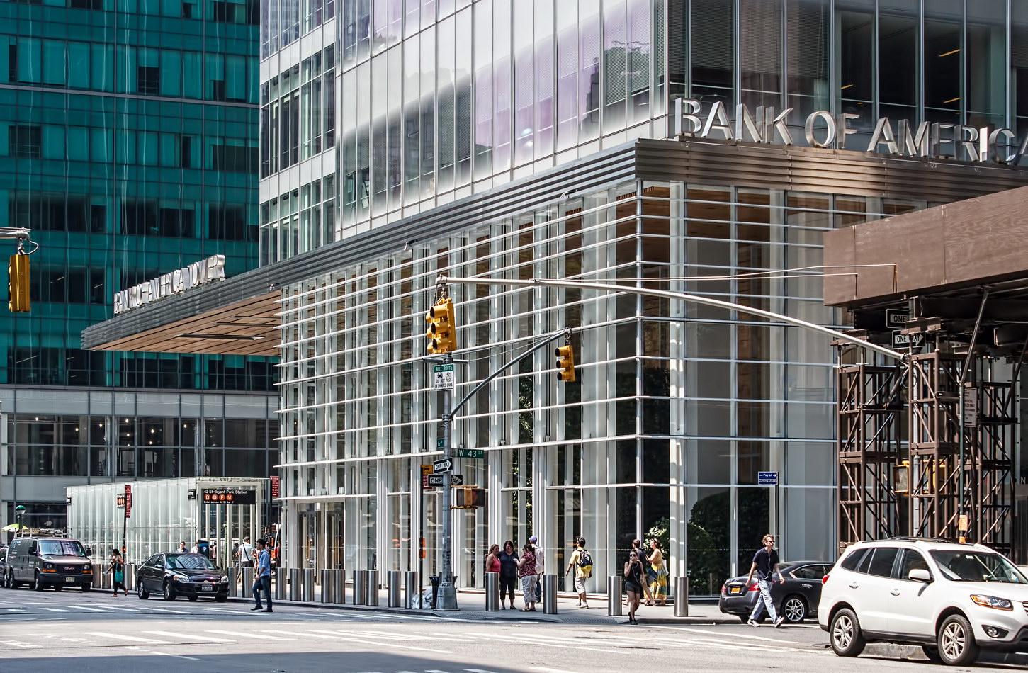
Bank of America Tower

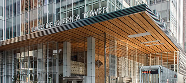
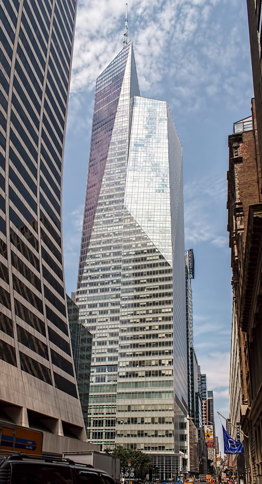
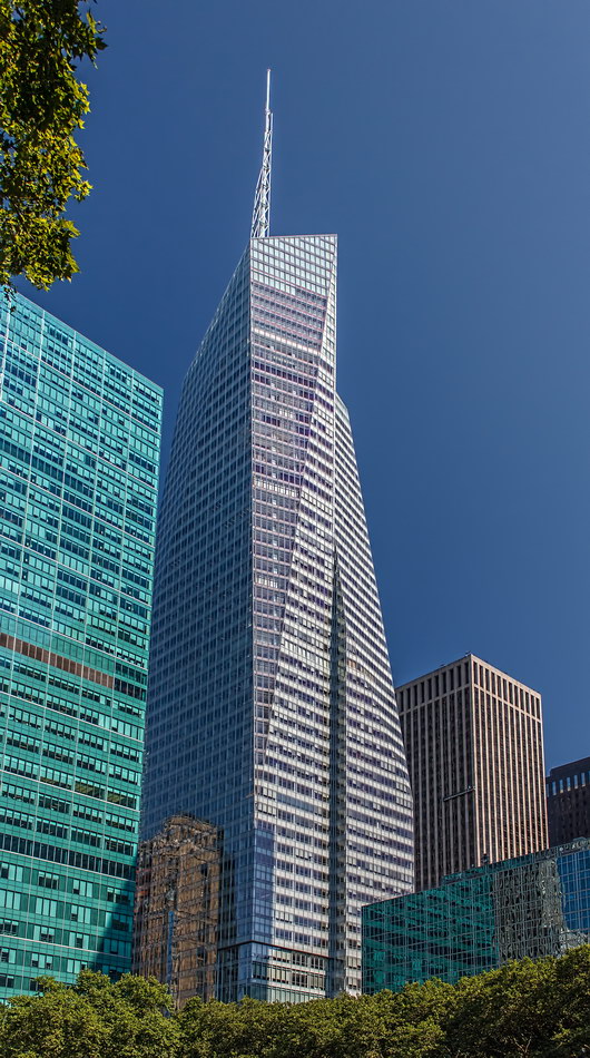
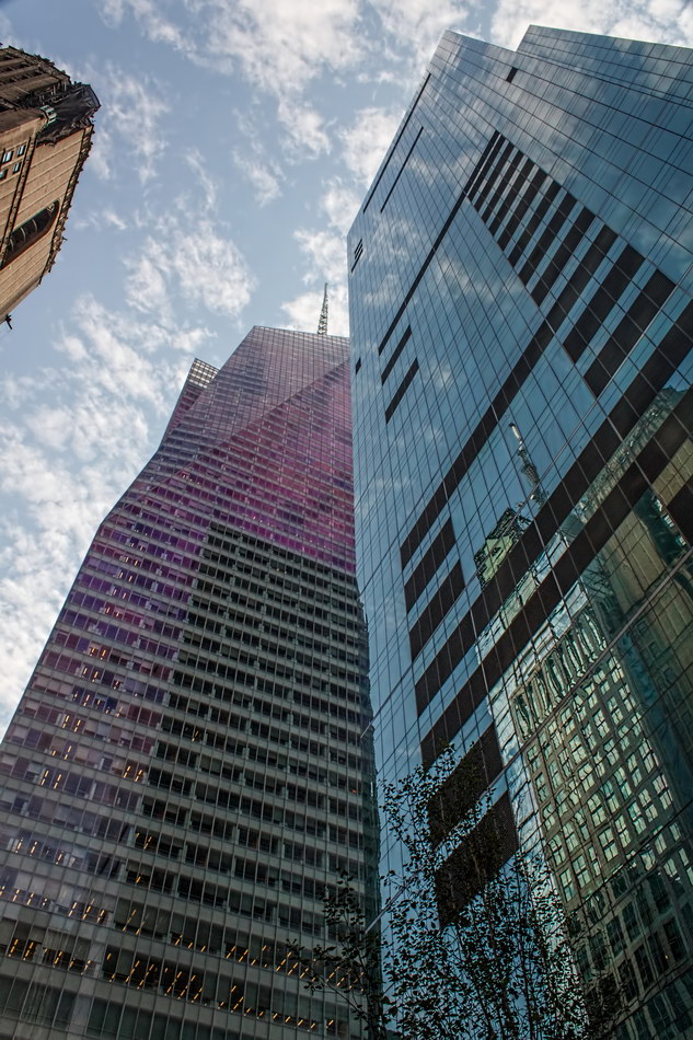
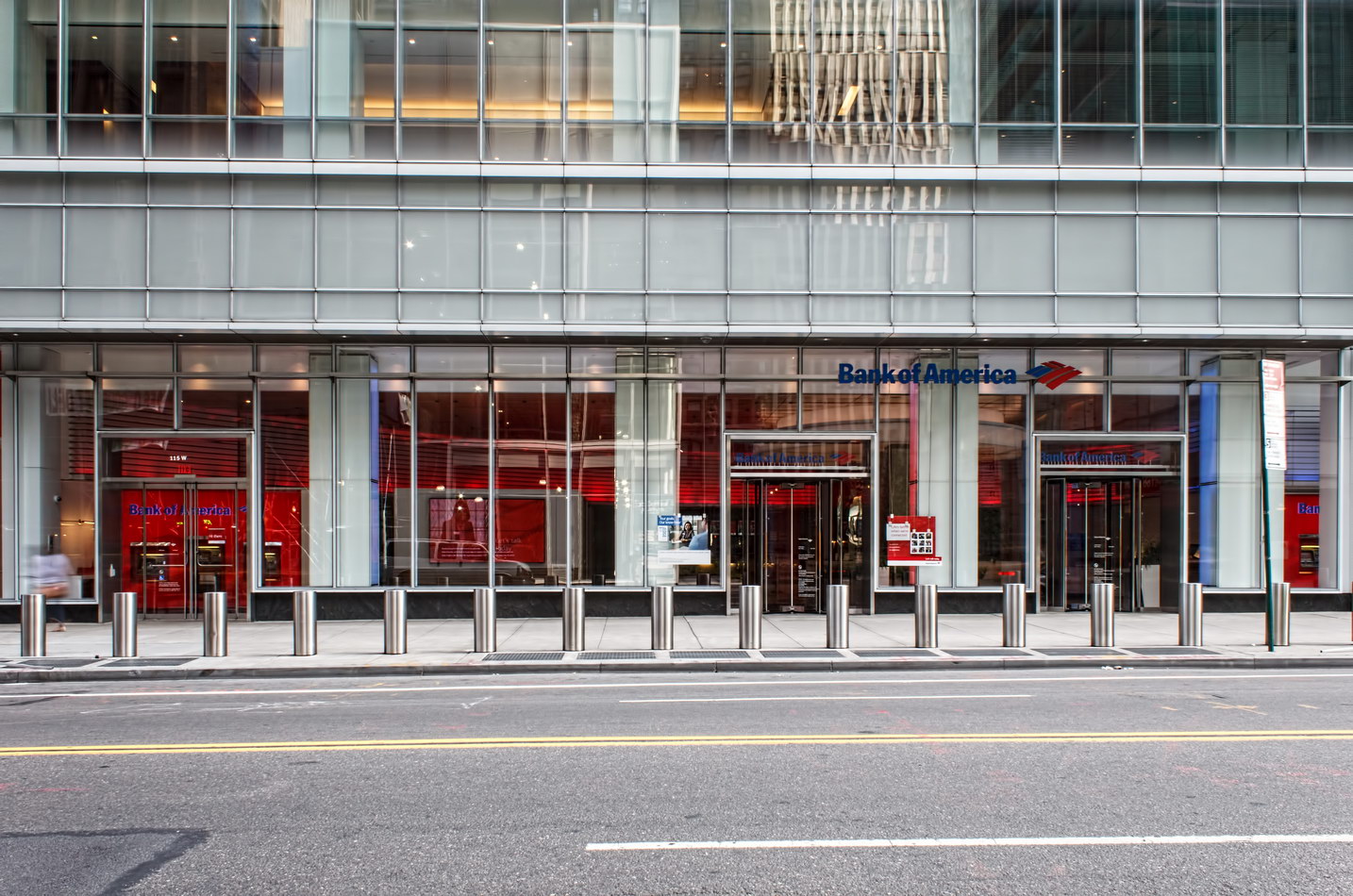
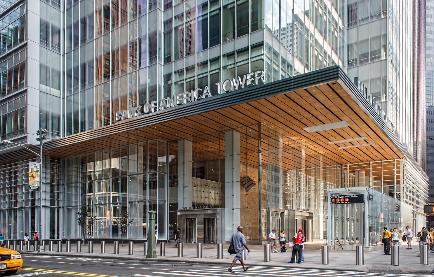
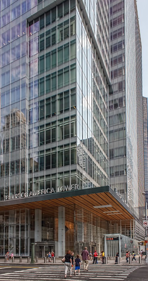
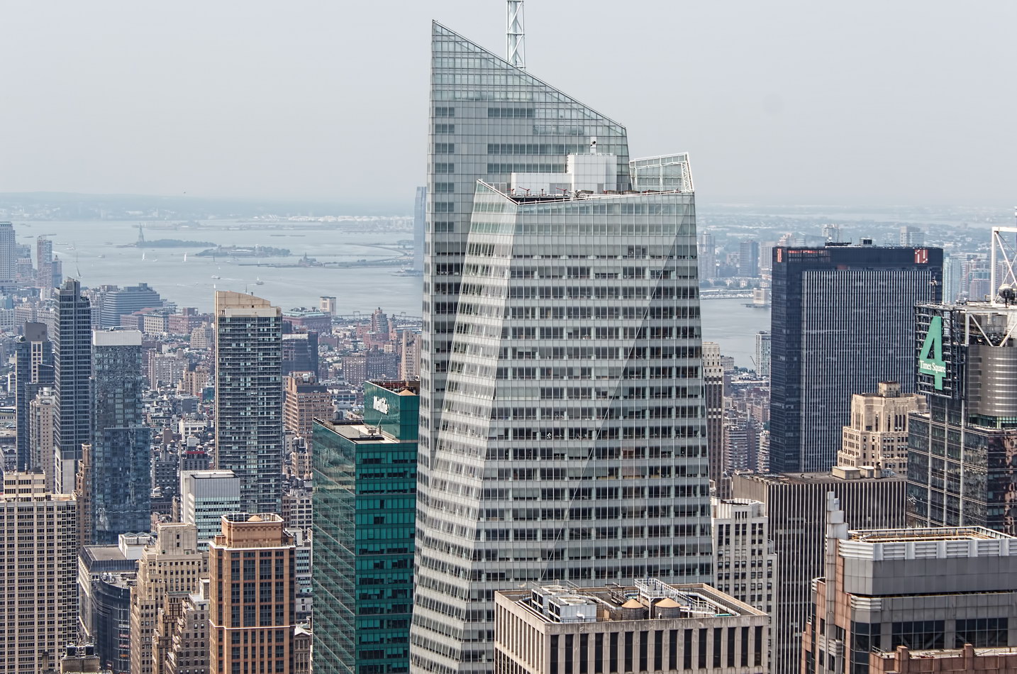
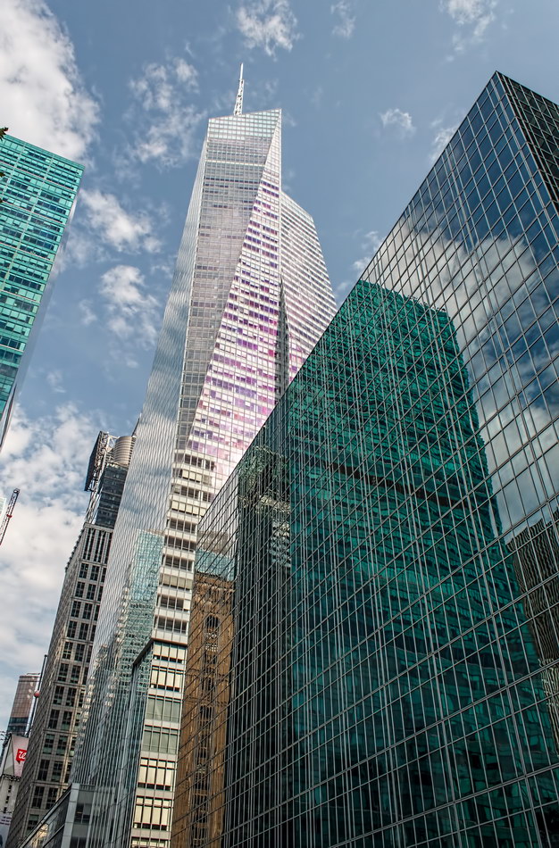
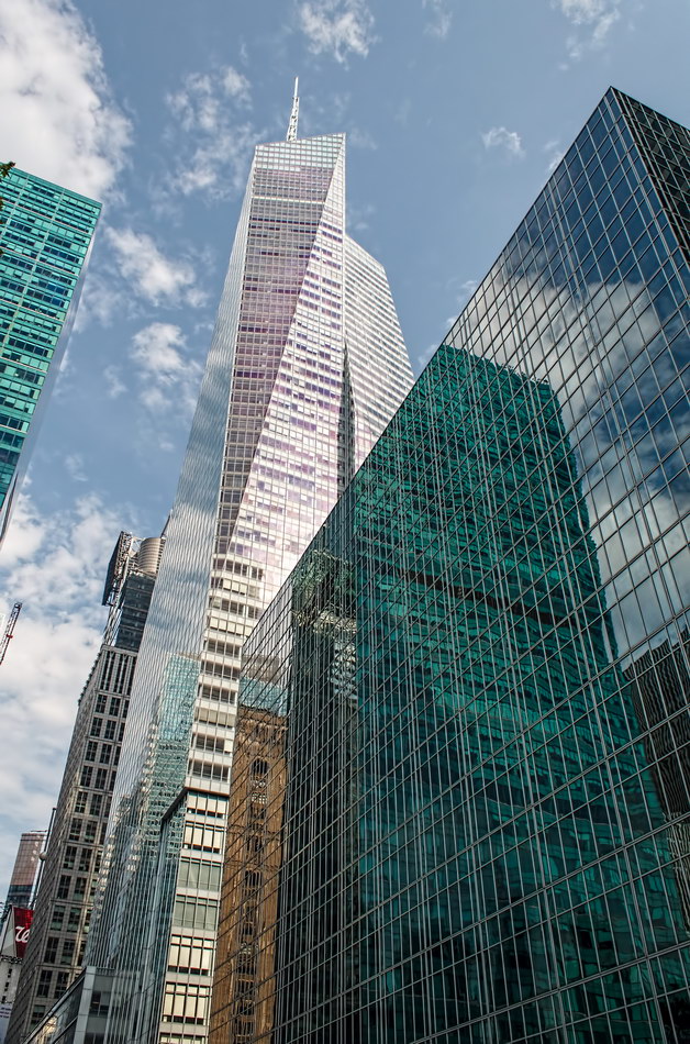
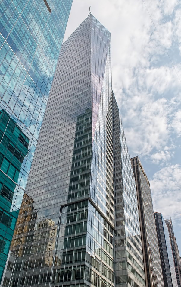
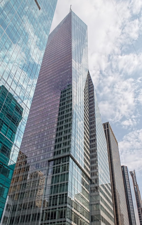
Bank of America Tower is a model architectural and environmental citizen, despite its height: Easy on the eyes and on resources.

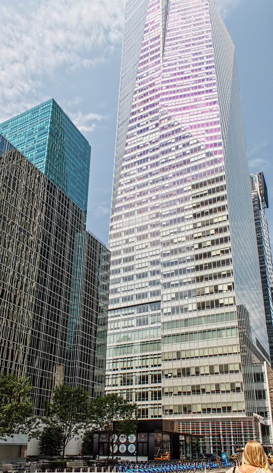
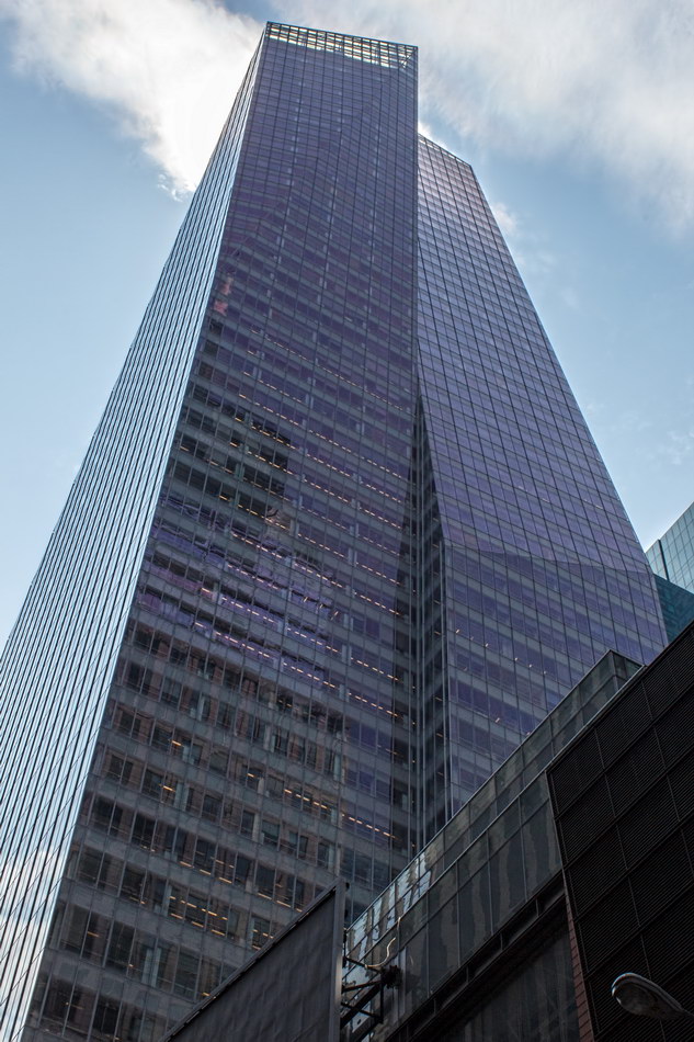
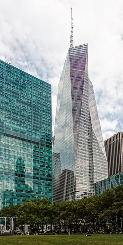
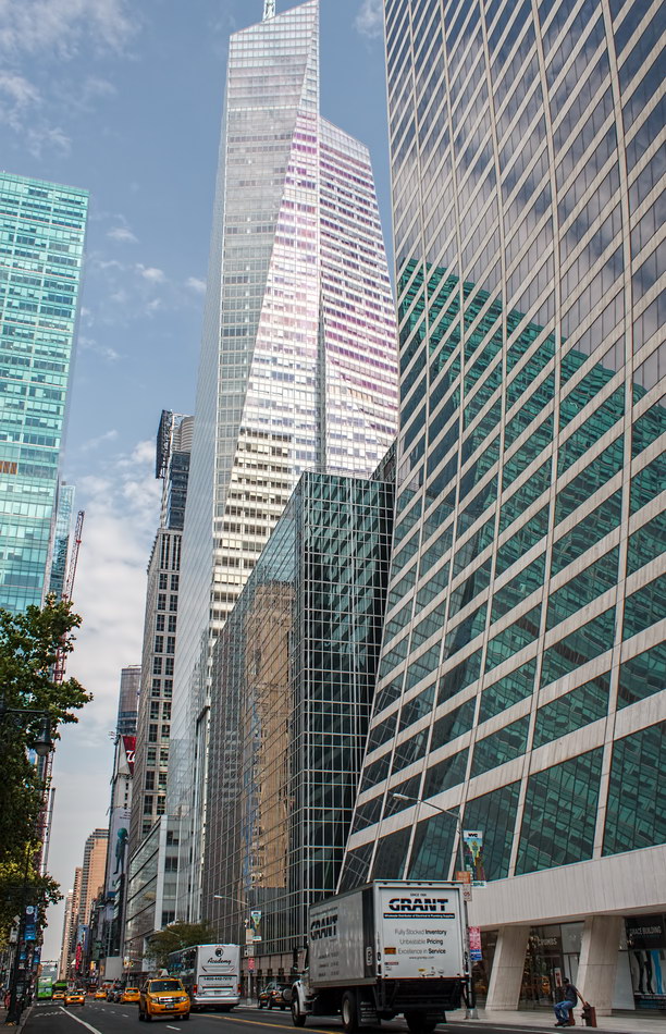
Although BoAT is New York’s third-tallest* skyscraper, it seems understated, just one of the crowd on 42nd Street.

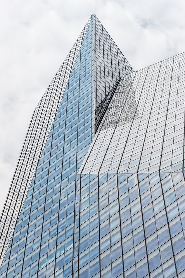
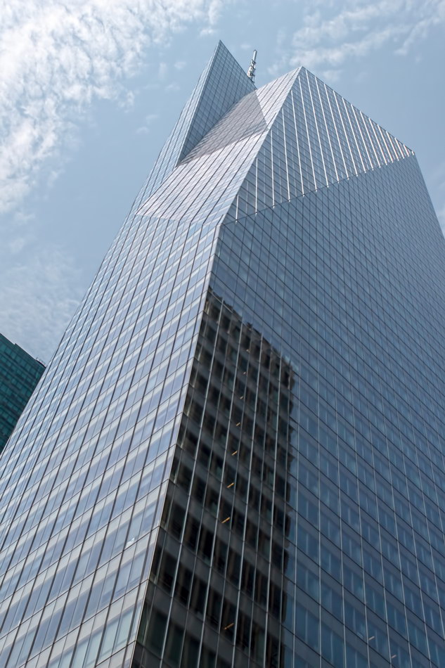
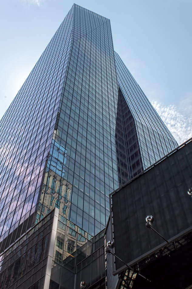
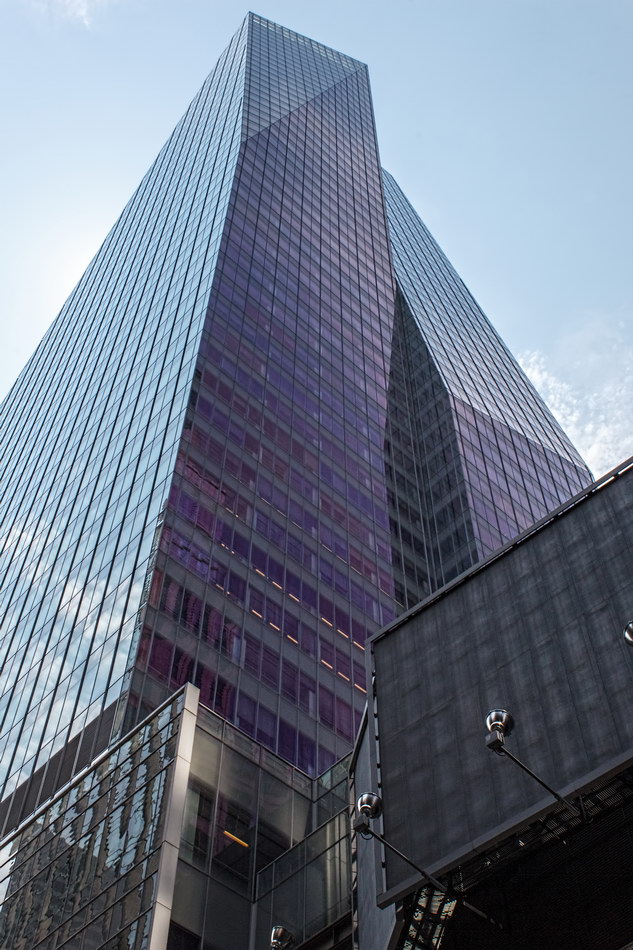
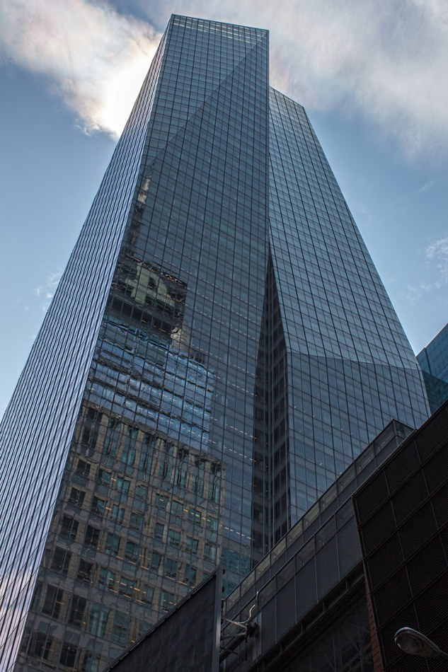
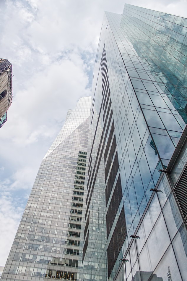
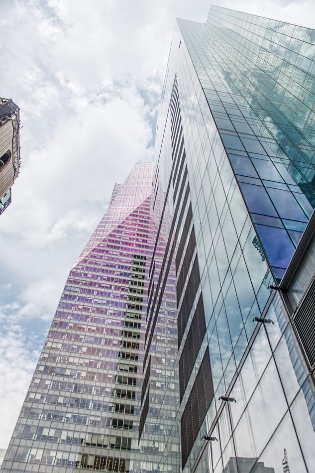
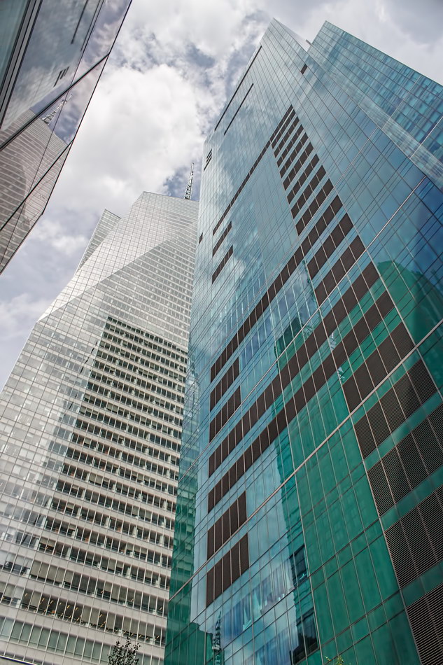
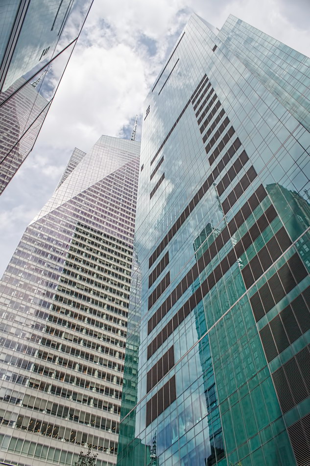
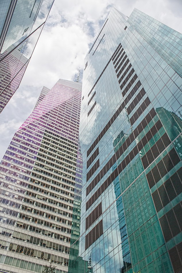
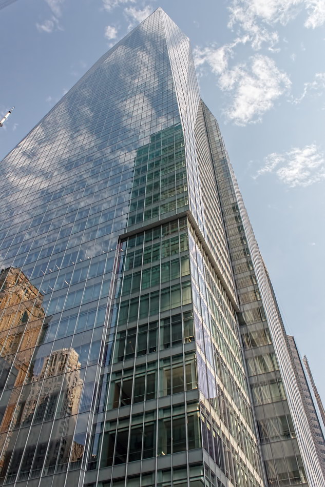
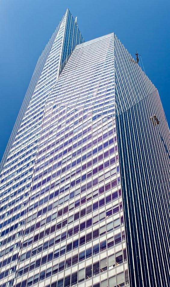
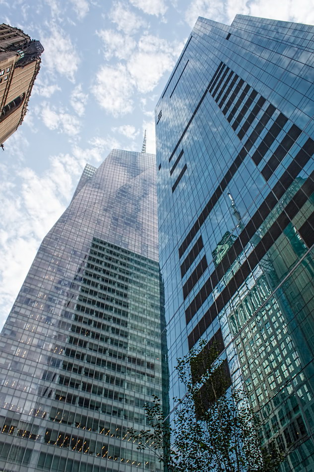
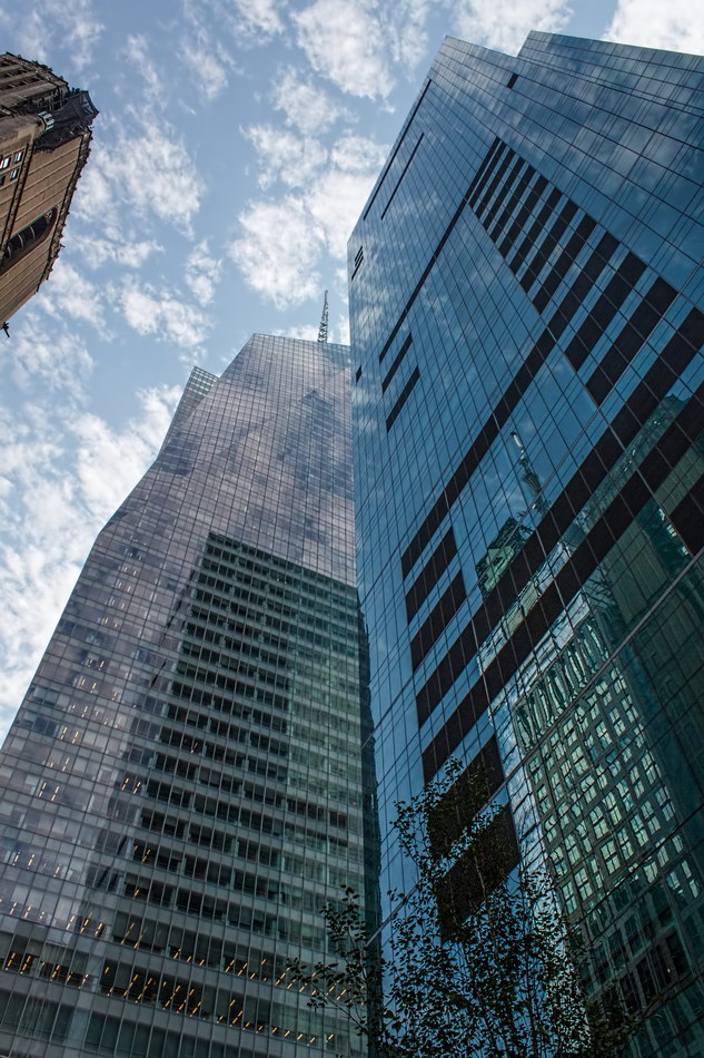
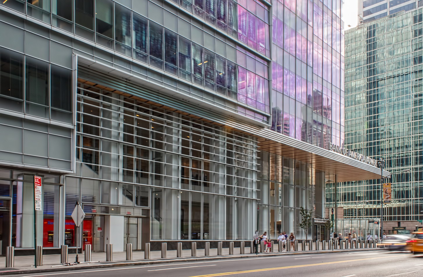
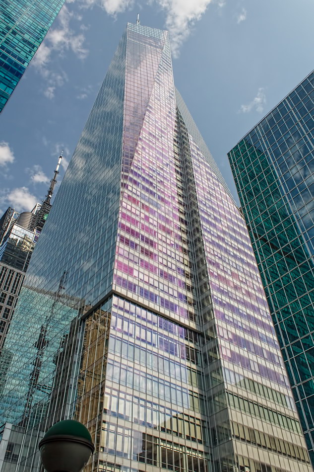
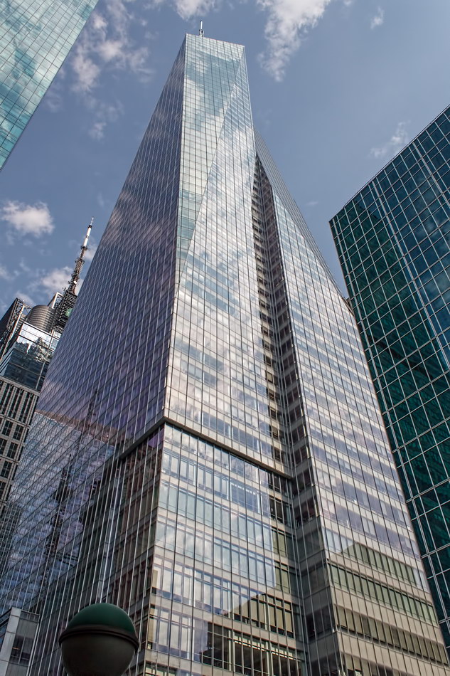
Where it does stand out is its reflective, faceted design, which looks different from every angle and minute-by-minute. Bank of America Tower is surrounded by other glass buildings in different colors and patterns; their constantly changing hues, reflections and intersections are like a massive mobile. Looking up along the skin is akin to looking through a kaleidoscope.
Under the skin, Bank of America Tower is impressive for its environment-friendly features. BoAT used massive quantities of recycled materials in its construction; the building captures and uses rainwater; it has its own power plant; at night, when electrical demand is low, the building makes ice to use for cooling during peak-demand daylight hours. There’s much more – explore the Recommended Reading links below!

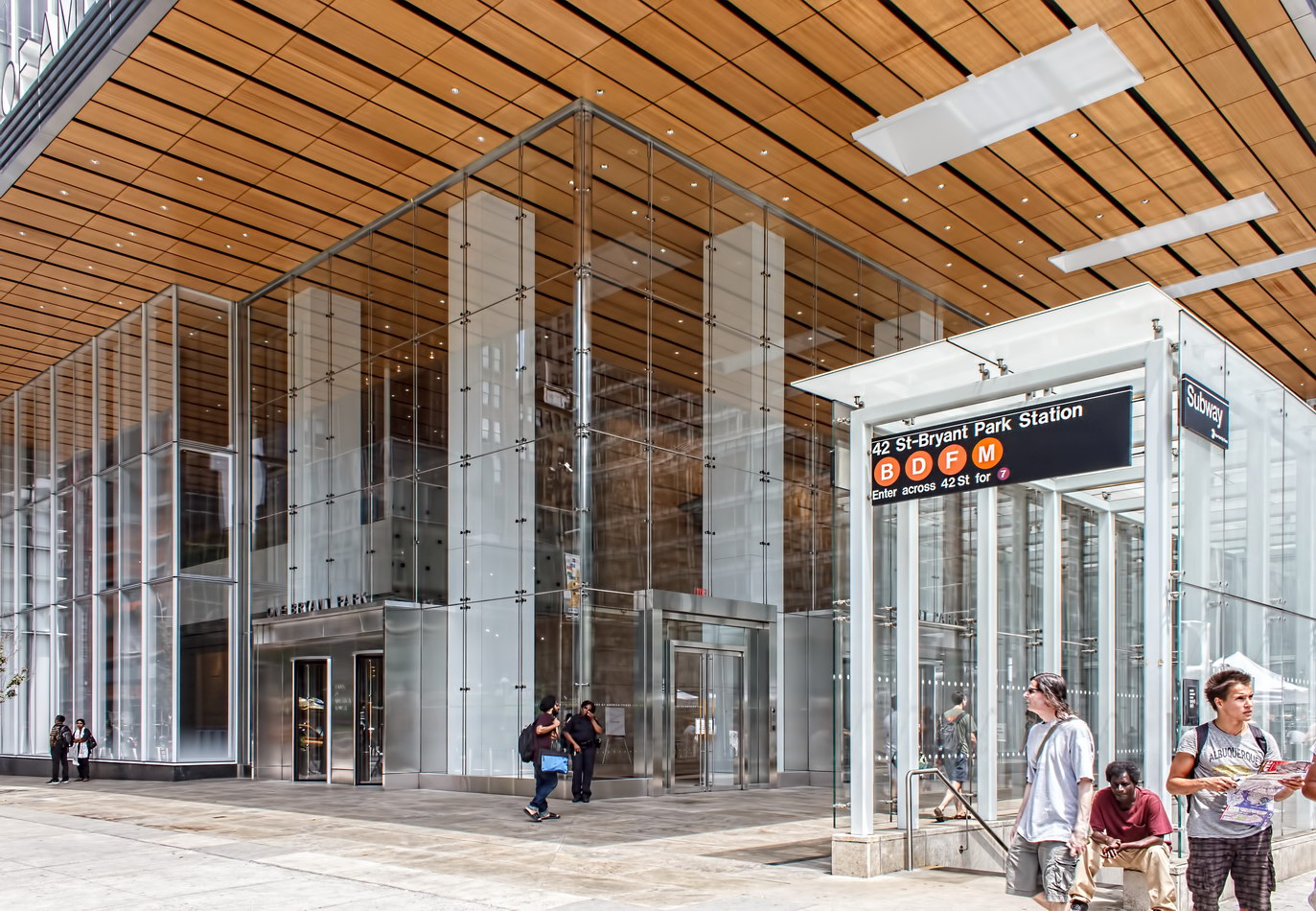
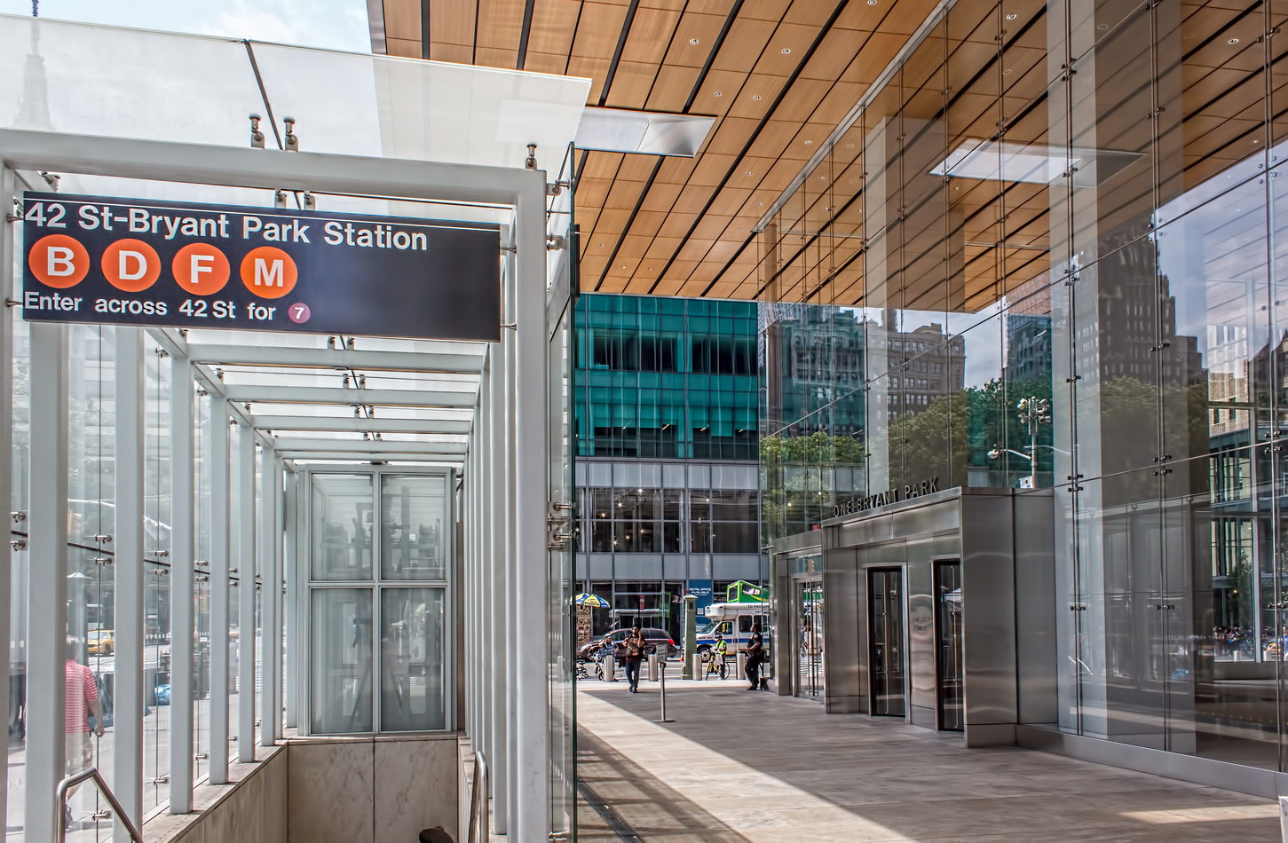
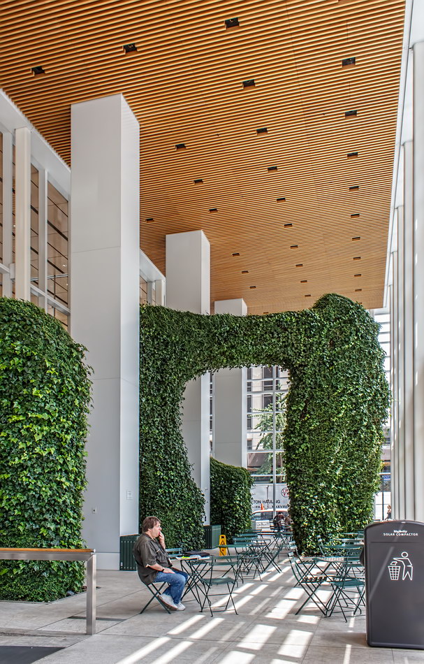
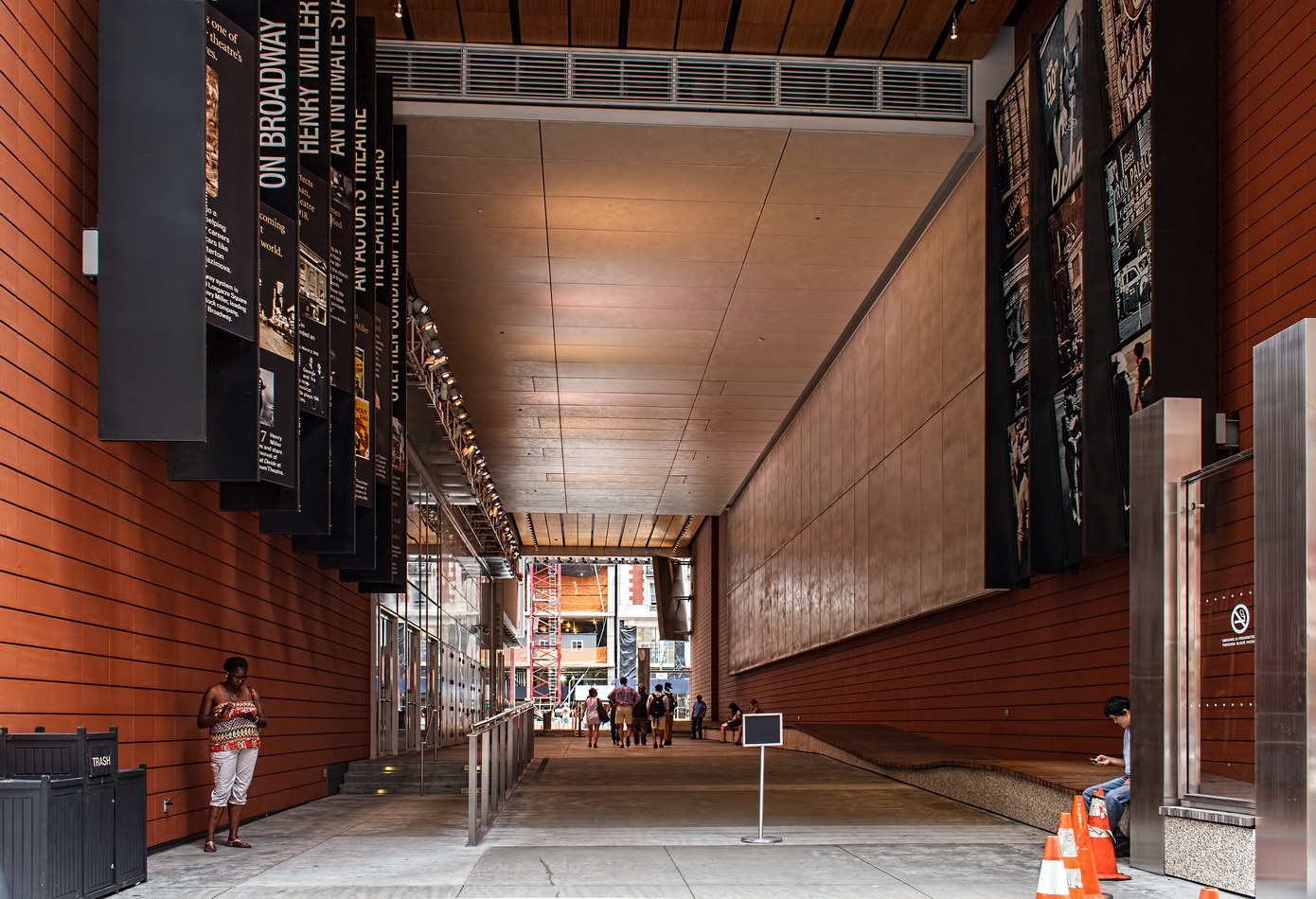
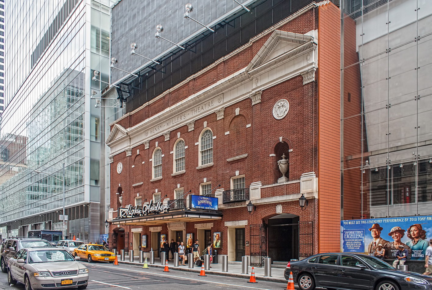
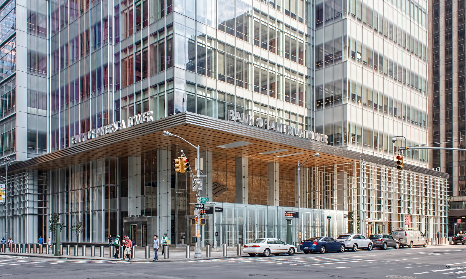
Bank of America Tower’s base includes the landmark Henry Miller’s Theatre (now named Stephen Sondheim Theatre) and Anita’s Way – a mid-block passageway between W 42nd and W 43rd Streets (named after Anita Durst, founder of Chashama, which transforms vacant properties into artists’ spaces). The southeast corner (6th Ave./W 43rd St.) includes an “Urban Garden Room” open to the public.

* Based on structural height, 1200 feet, which includes the spire.

Bank of America Tower Vital Statistics
Bank of America Tower Recommended Reading

Google Map