Tag Archives: FXFOWLE Architects

215 E 68th Street

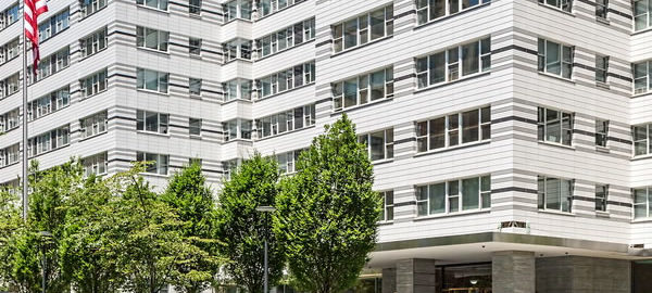
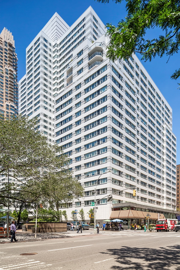
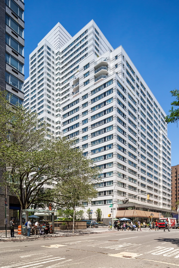
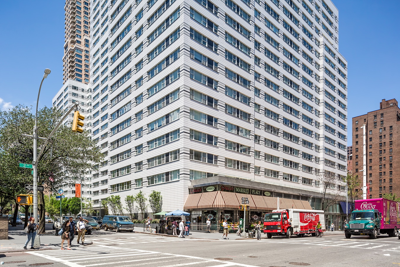
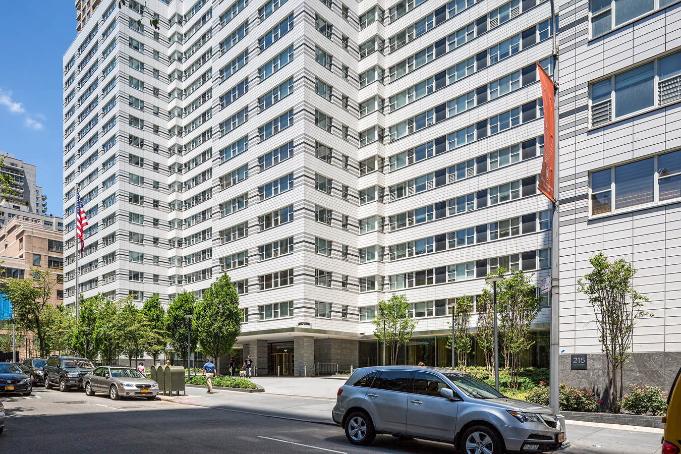
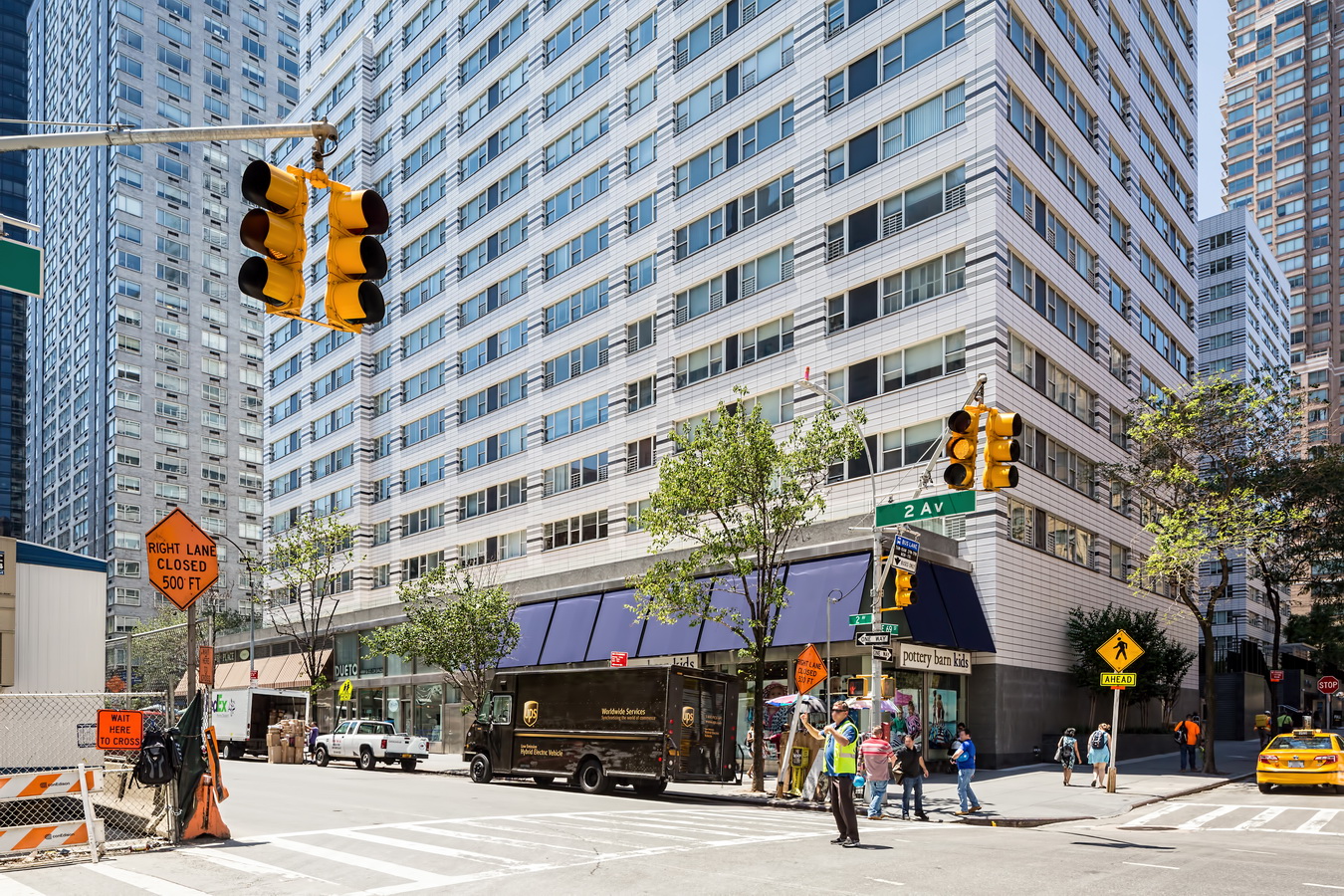
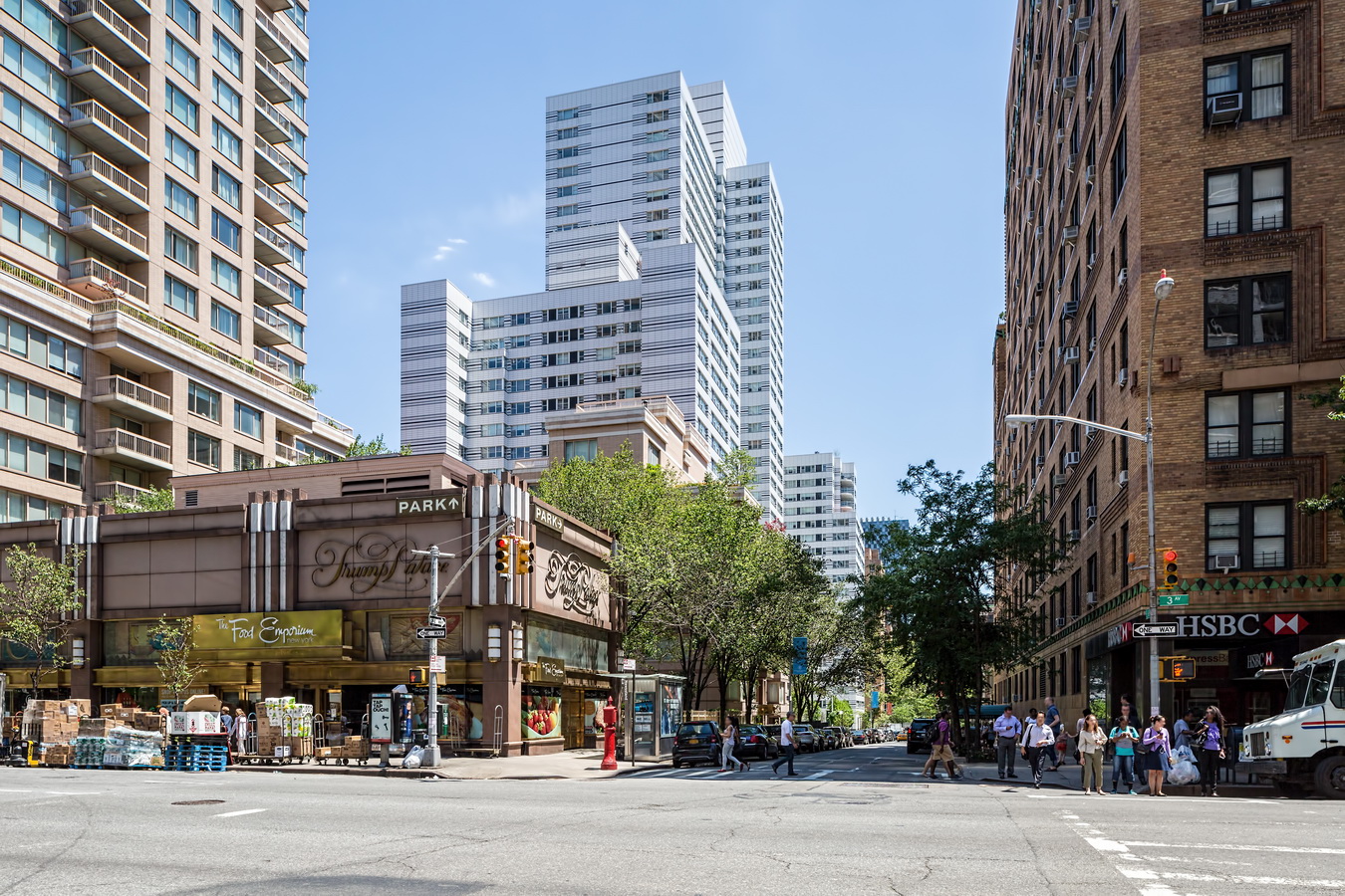
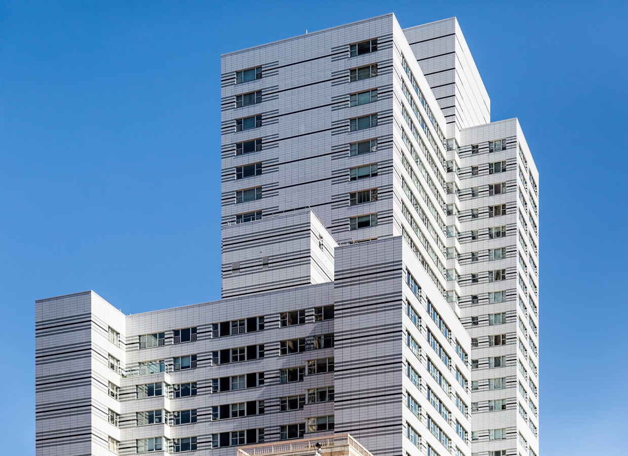
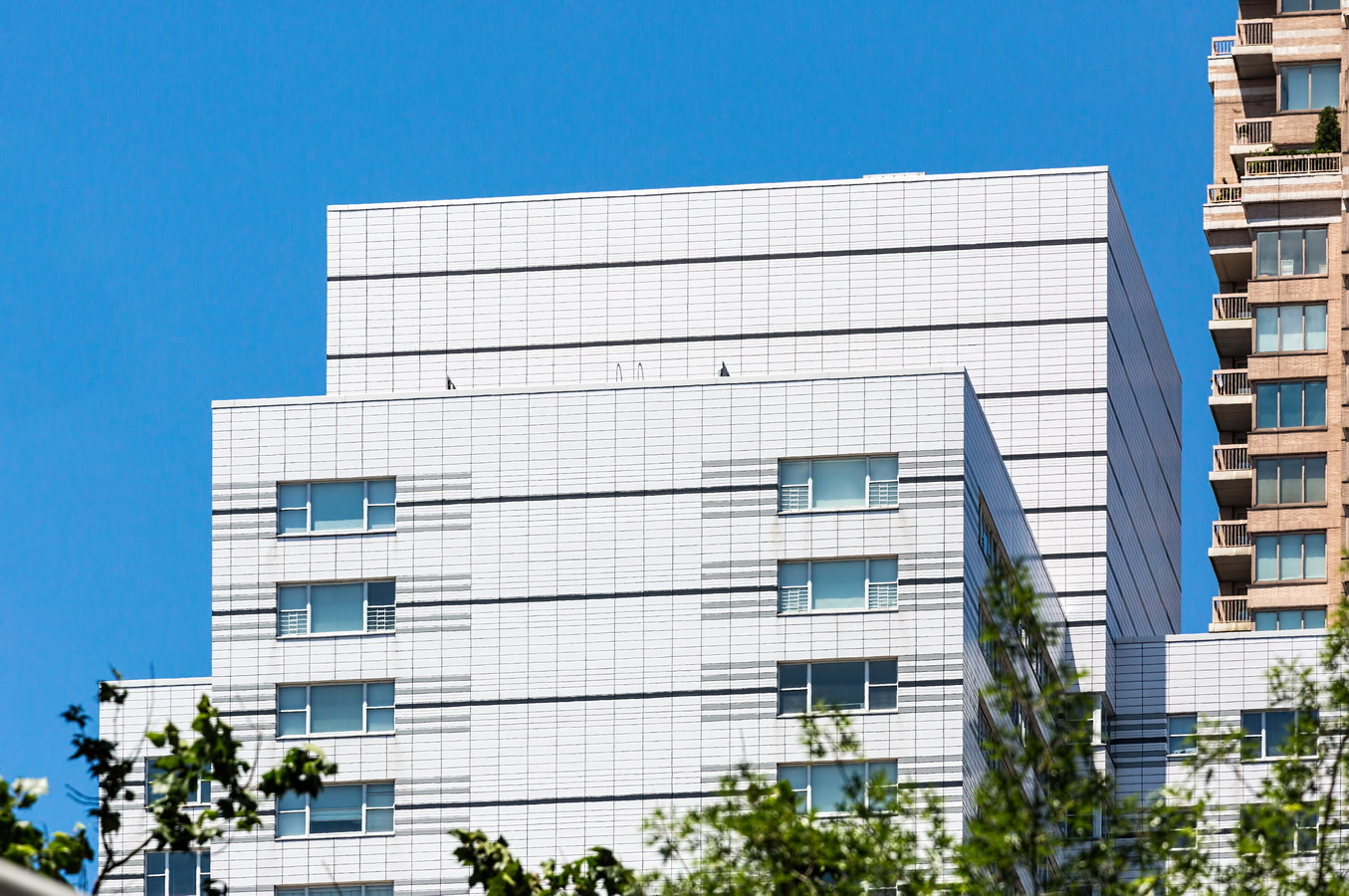
215 E 68th Street found the Fountain of Youth. The 33-story apartment tower was built in 1962 with a then-popular white brick facade. But time was not kind. Not only did white brick become passé; after 50 years, the brickwork needed extensive repair or replacement. Owners opted to tear down the brick and replace it with white terra cotta panels accented by bands of black and gray.

Terra cotta reigned as the decorative material of choice from 1880 through the 1950s. Sometimes whole buildings – notably the Woolworth Building and Alwyn Court Apartments – were clad in the material. Then International Style and Postmodernism replaced masonry with glass and steel, and terra cotta all but disappeared.

In 215 E 68th Street, the material finds a second life – as a replacement for brick. Facade designer BCRA explained, “New terracotta cladding is approximately 1/3 the weight of new brick and has no mortar joints or seals that will require future maintenance. The new system design reduced the amount of fasteners by 50%, which helped to keep construction noise during installation to a minimum for residents. The cavity within the new overcladding uses an air gap and 3″ insulation that greatly improved the thermal performance of the new wall by over three times the original.”
The result is a distinctive apartment building with the appearance of new construction. Now if only we aging apartment dwellers could change our skin….

215 E 68th Street Vital Statistics
215 E 68th Street Recommended Reading

Google Map

767 Third Avenue

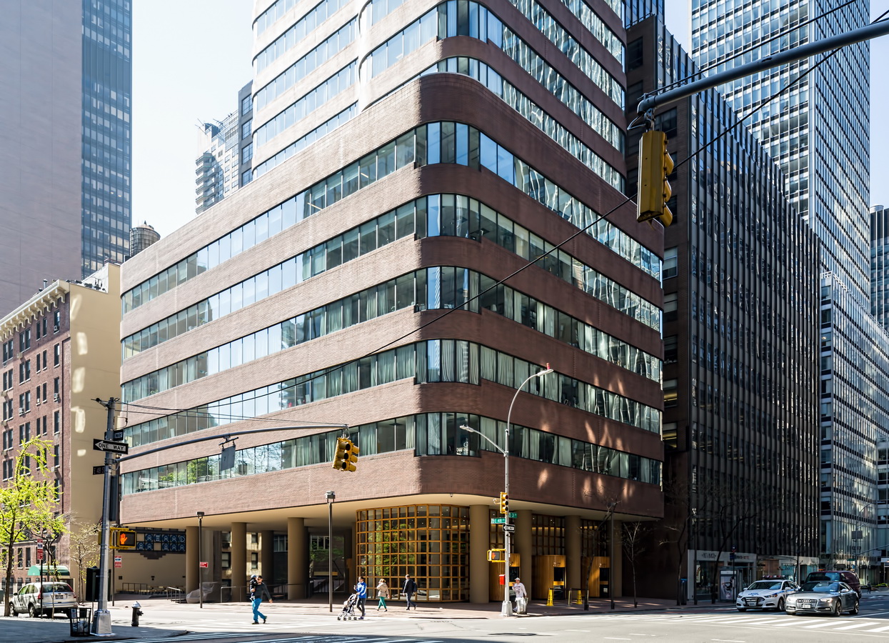
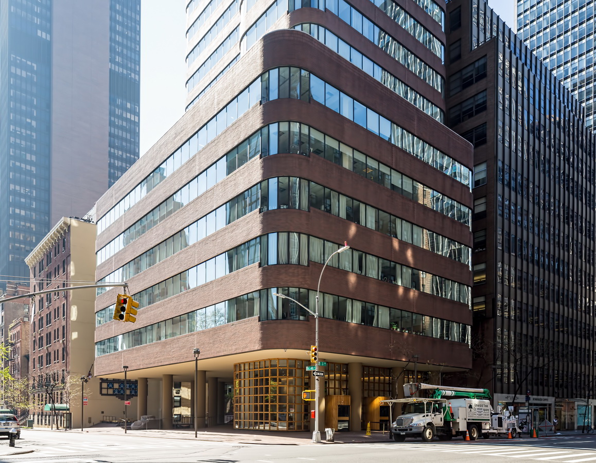
767 Third Avenue represents the personality of developer Melvyn Kaufman more than it stands for an architect or style of architecture.

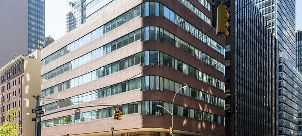
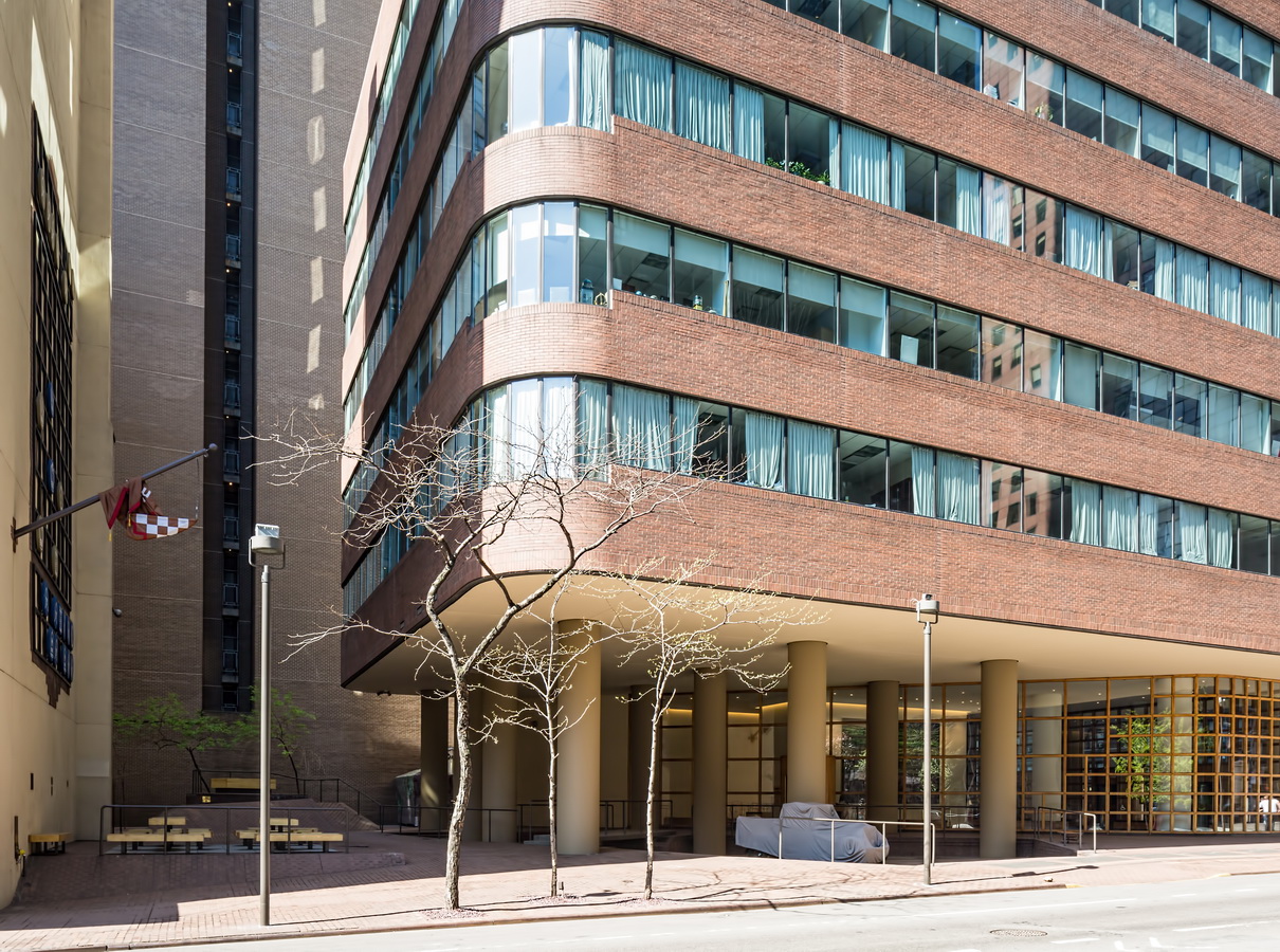
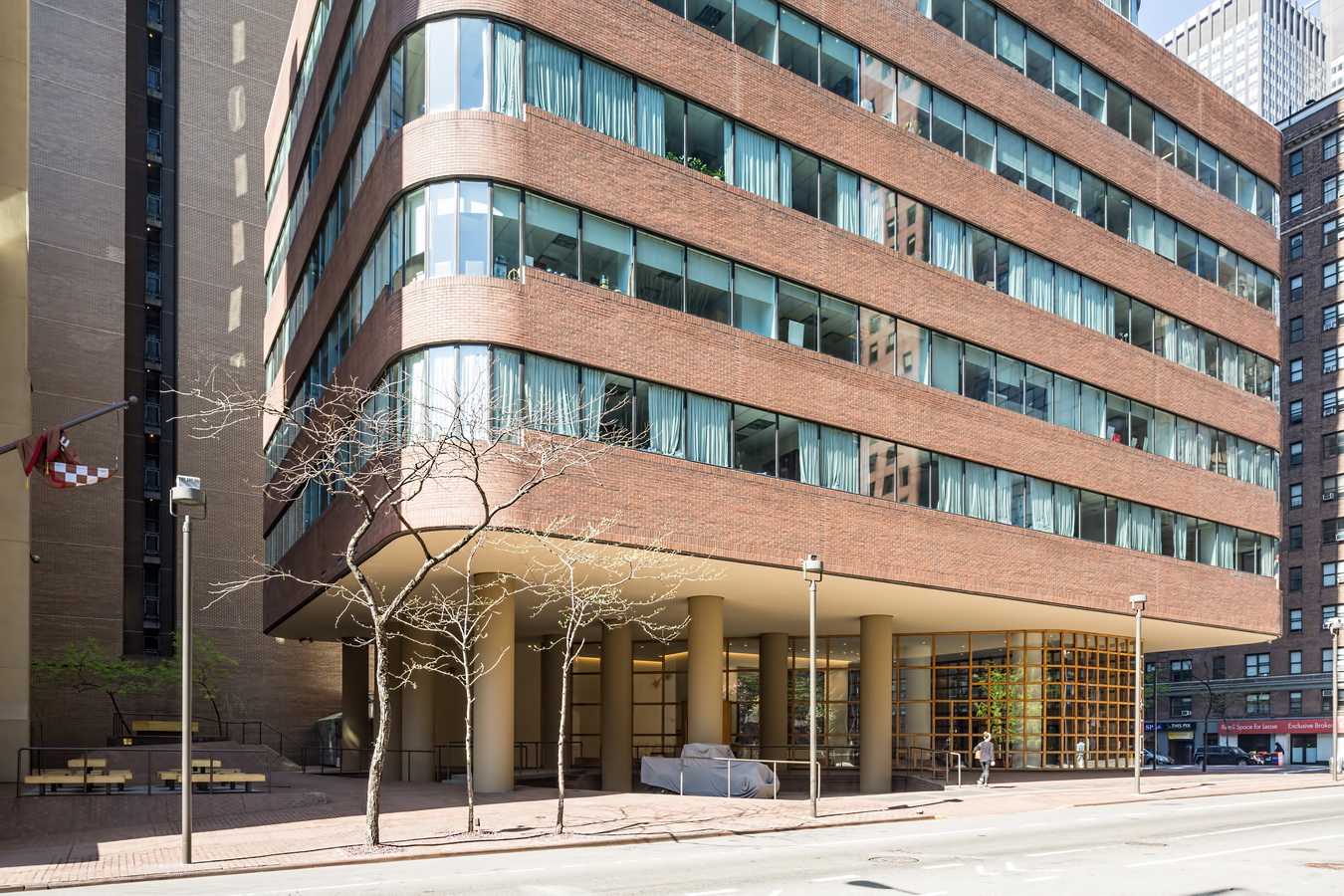
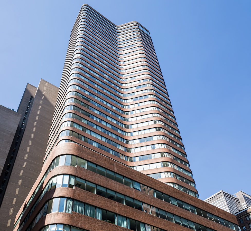
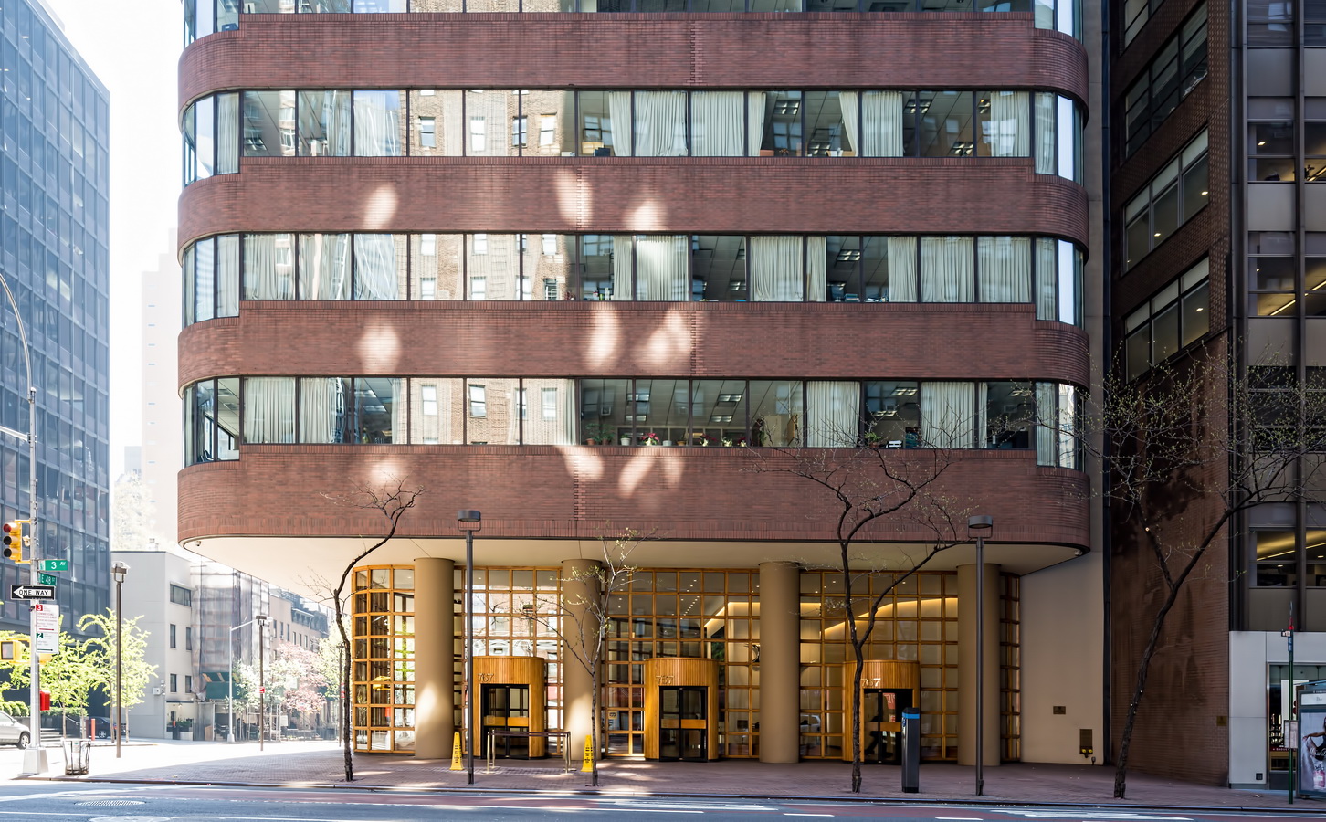
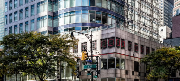
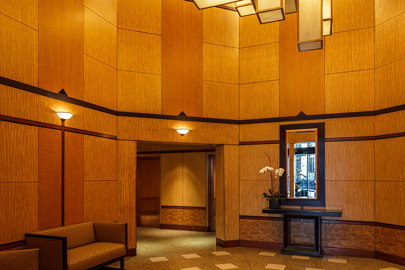
FxFowle Architects designed a beautiful building, to be sure. Subtle brick detailing outlines the ribbon windows; corners are sinuously rounded; the whole tower is raised on pilotis, revealing a lobby sheathed in oak-framed glass (instead of metal or stone). The more playful details are on E 48th Street, in the courtyard behind the building. A three-story chessboard adorns the wall of 212 E 48th Street; huge steel footprints are welded to the sidewalk utility grates; a stage coach and a 1929 Ford truck are parked in the plaza.

The New York Times’ obituary for Melvyn Kaufman noted, “Though he was not an architect, his buildings were generally acknowledged to have sprung as much from his own vision as from the architect of record’s — a vision Mr. Kaufman realized with the aid of designers like Pamela Waters and Rudolph de Harak.”

The Times continued, “Mr. Kaufman had a lifelong fascination with office buildings as public spaces with which tenants and passers-by could engage. If one was going to erect a leviathan, his design philosophy seemed to go, at least make it leviathan with levity.

“He deplored lobbies, the sine qua non of office buildings since the dawn of recorded history. ‘Marble and travertine mausoleums are bad for the living and terrific for the dead,’ Mr. Kaufman told The Times in 1971.”

Kaufman seemed fond of this stretch of Third Avenue: He built other office buildings at 711, 747, and 777.

767 Third Avenue Vital Statistics
767 Third Avenue Recommended Reading

Google Map

The Epic

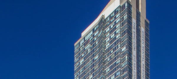
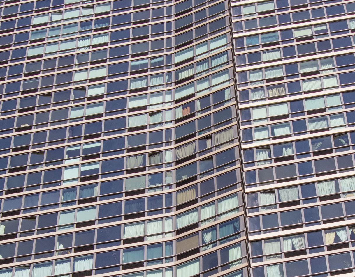
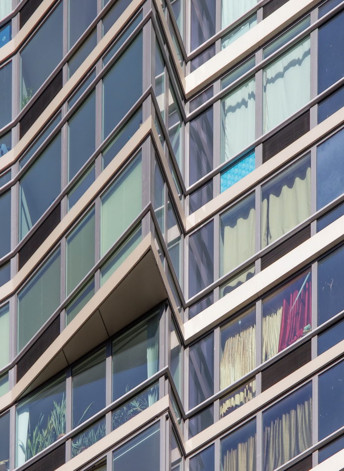
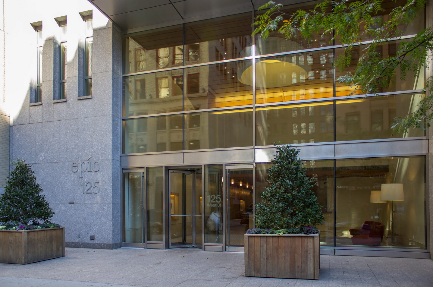
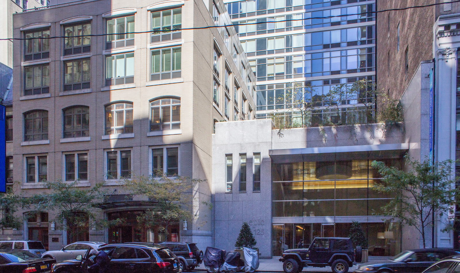
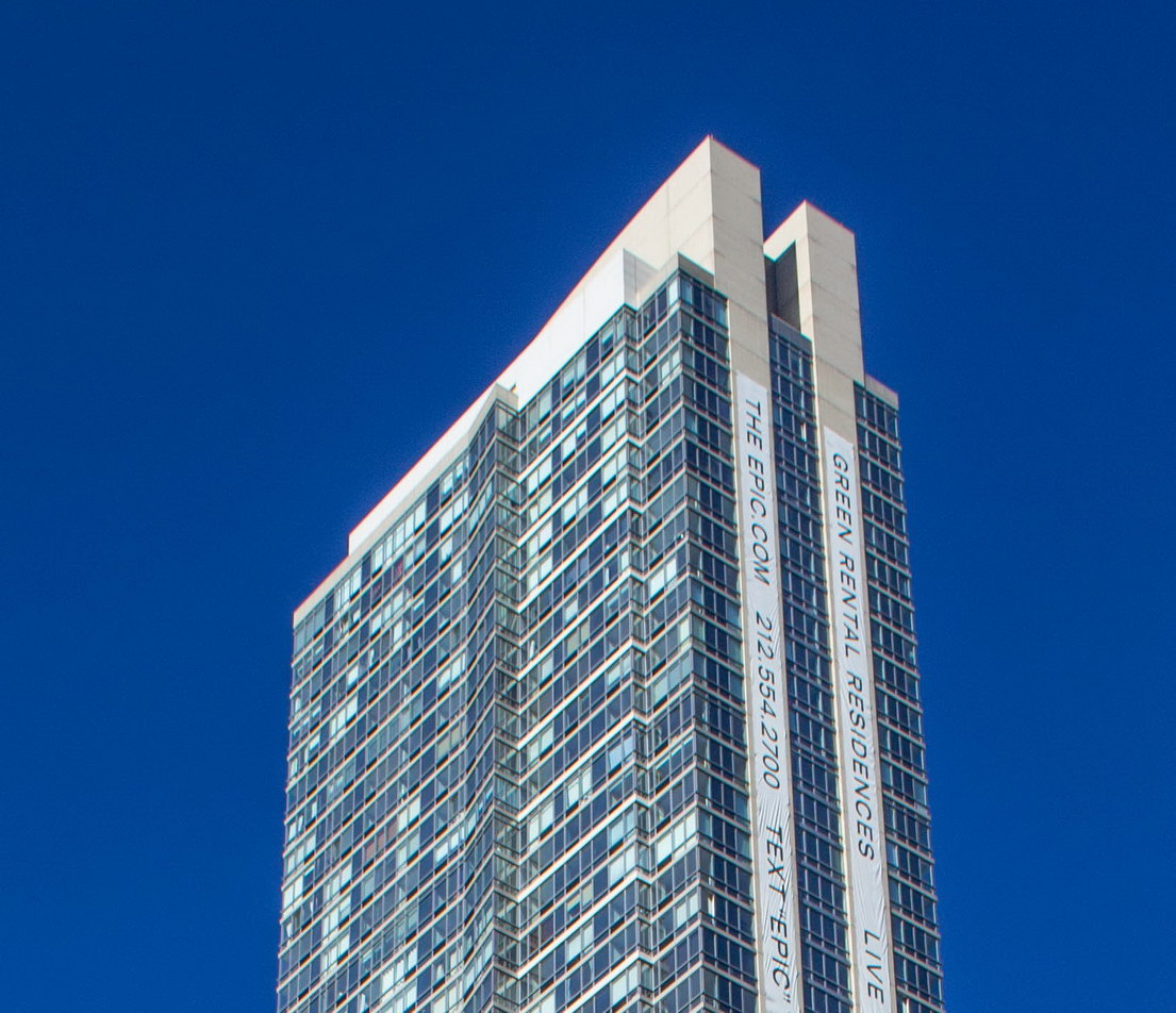
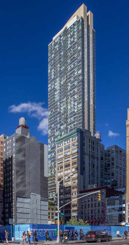
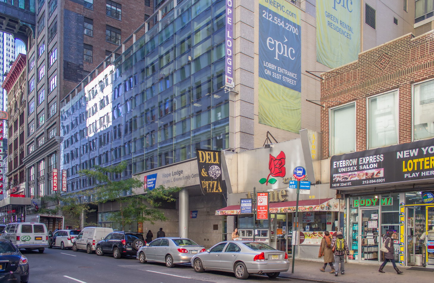
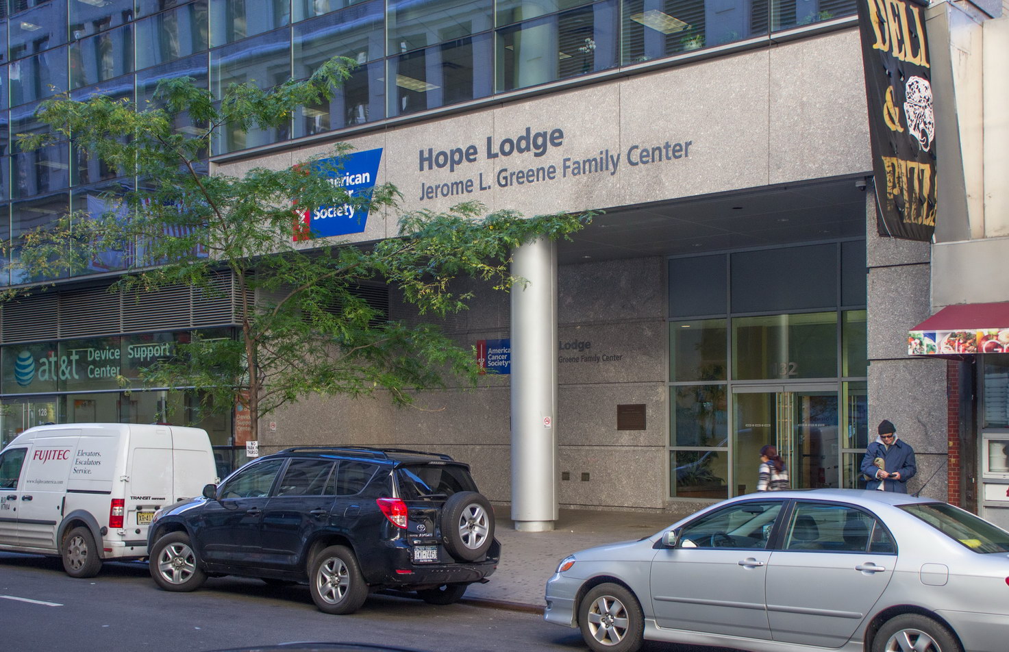
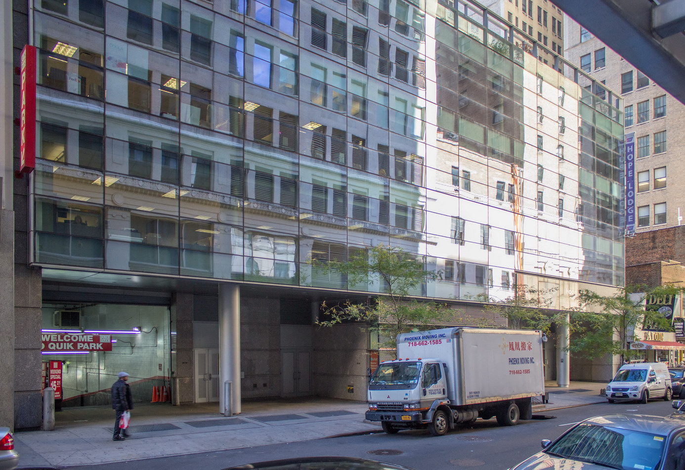
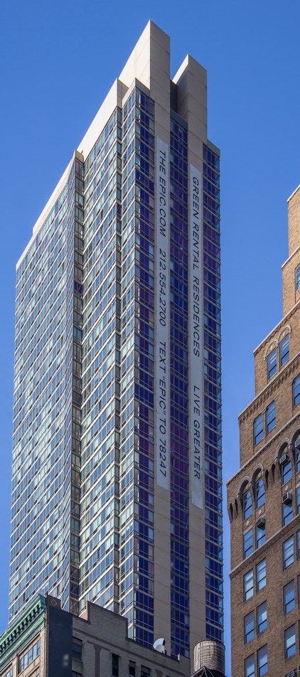
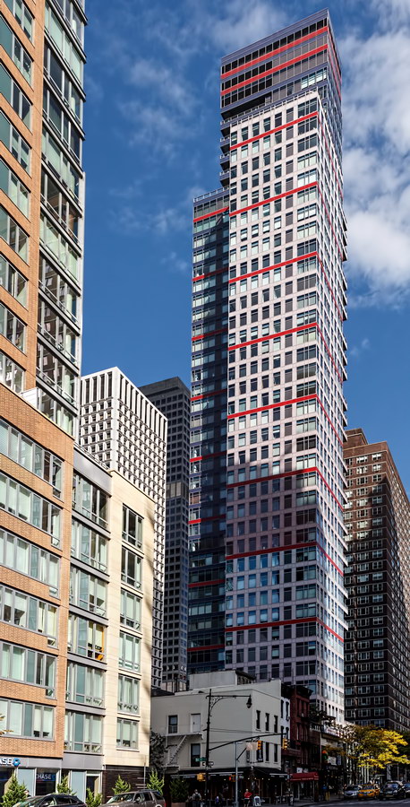
The Epic is controversial for its height and glass curtain wall construction amid a neighborhood of predominantly 1900s low-rise masonry. But its innovative design is the answer to many prayers: The 59-floor tower contains a friary, a lodge for cancer patients, a garage, and 459 apartments – including 92 reserved for low-income tenants. The friars and the American Cancer Society own their portions of the building, and the friars also have part-ownership of the apartments, which provides the church with regular income. To top it all, the building is certified “green.”

The Epic dwarfs its next-door-neighbor, the Church of St. Francis of Assisi. But that’s OK with the church – in fact, the tower was their idea.

The existing friary needed expensive repairs; the church opted to replace rather than repair the building. The friars bought adjoining land and invited developers to come up with plans. The winning proposal seemed to have something for everyone. NewYork.Construction.com has an excellent feature describing the project’s challenges and solutions.

In its website, architects FXFOWLE explains: “As the design architects, FXFOWLE have elegantly resolved varying programs and identities for The Epic, a residential tower. The project uses the air rights of the St. Francis of Assisi Friary to create a mixed-use tower, with an extension of offices, a chapel, a library, and housing for the Friars at the base. The building also includes a new headquarters for the American Cancer Society and the Hope Lodge treatment center and hospice. The four story façade on 32nd Street incorporates an expansive glass and shadow box curtain wall to give the Society its own strong identity. Above the base, the tower consists of 460 units of luxury housing. The varying façade layers respond to the program elements on the interior, rationalizing the irregular footprint with a gradation from a solid inner armature to a perforated colonnade and a transparent, flared outer layer. A terrace, with an open brick colonnade that frames the iconic Manhattan views, creates a unique amenity for the building’s residents.”

The Epic Vital Statistics
  • Location: 125 W 31st Street between Sixth and Seventh Avenues
  • Year completed: 2007
  • Architects: Schuman, Lichtenstein, Clamon & Efron; FXFOWLE Architects
  • Floors: 59
  • Style: Postmodern
The Epic Suggested Reading

Google Map

New York Times Building

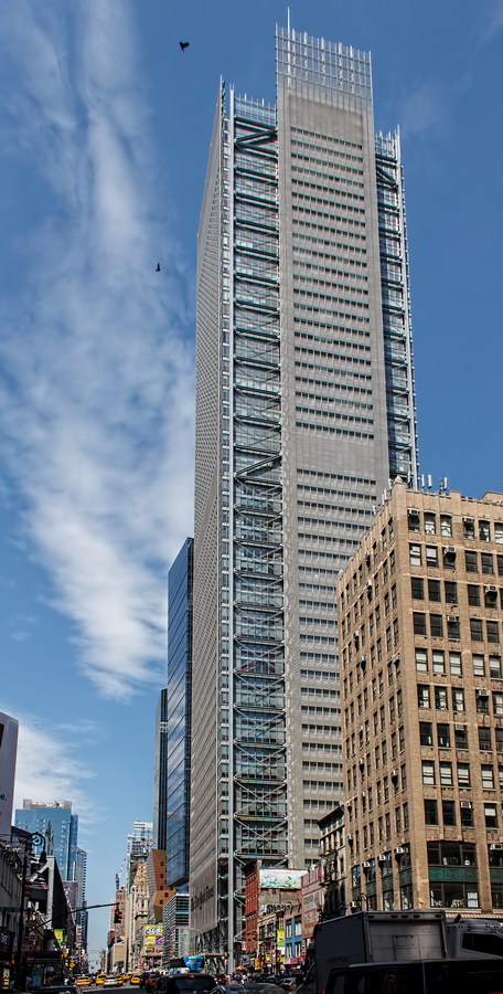
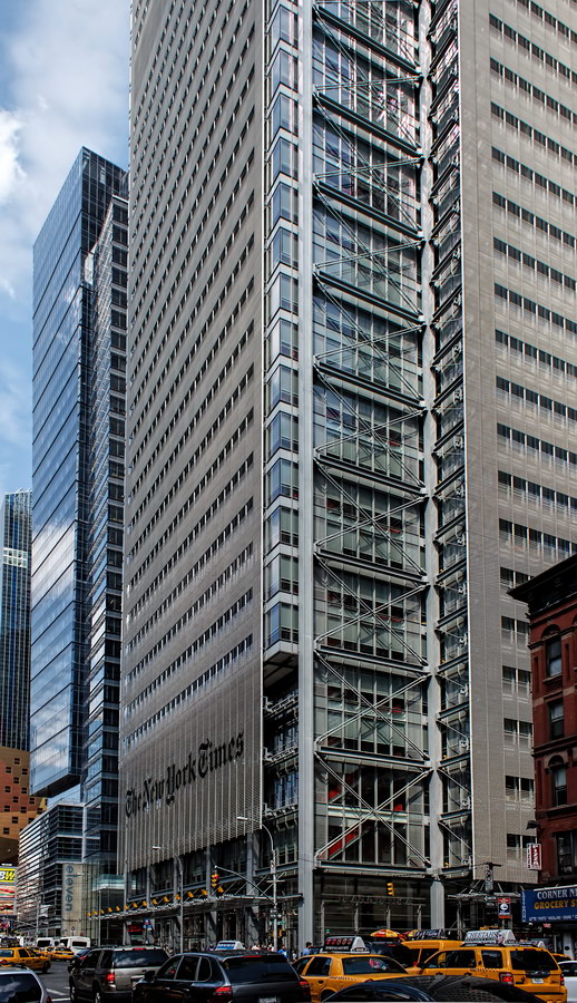
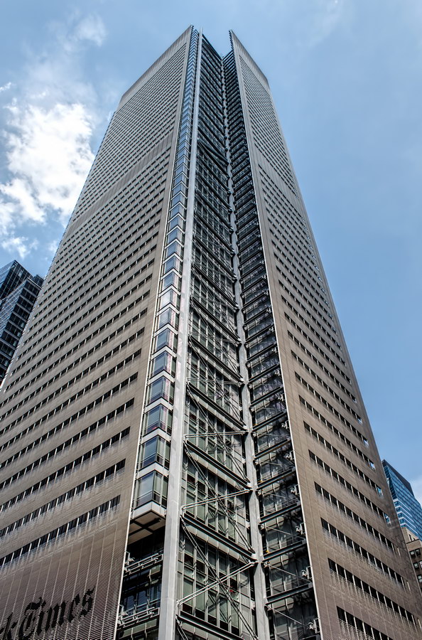
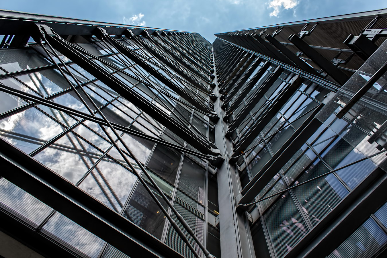
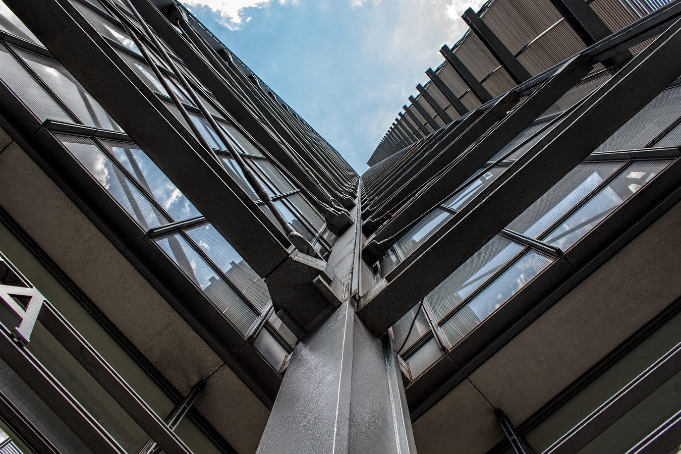
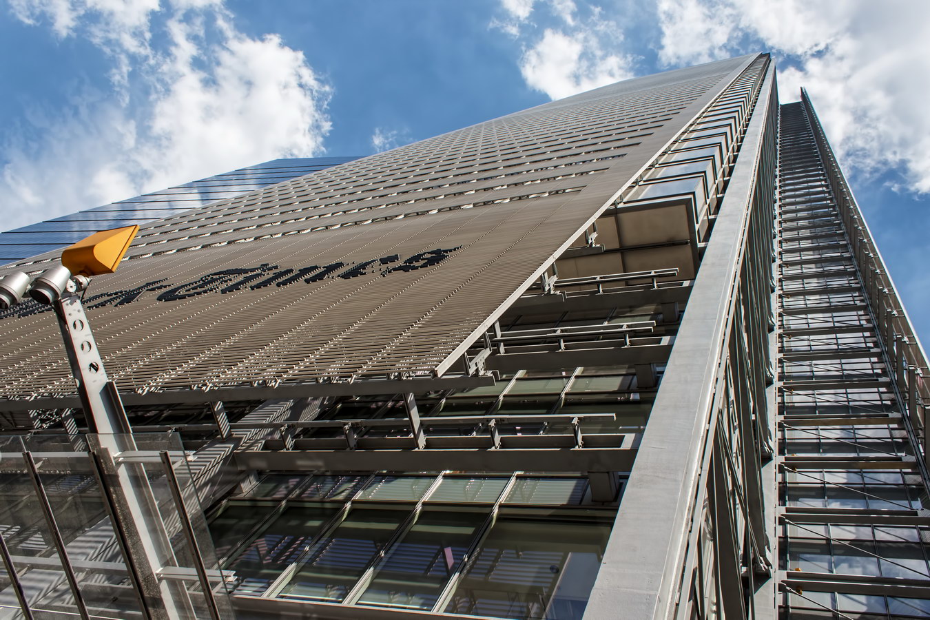
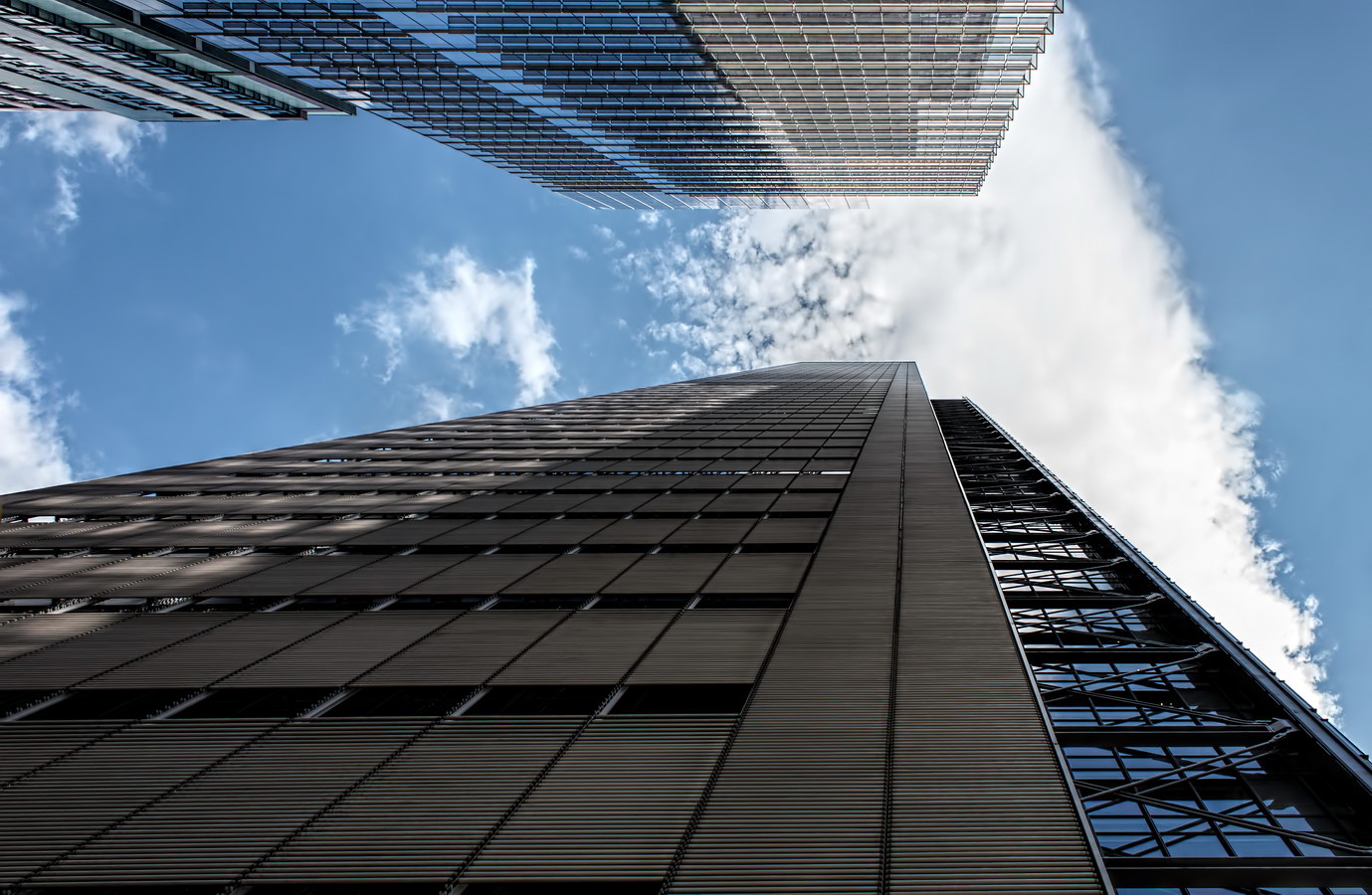
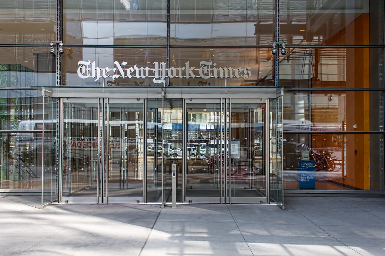
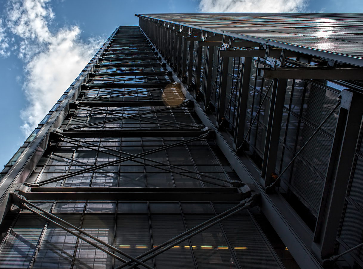
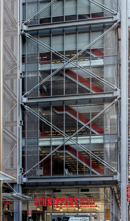
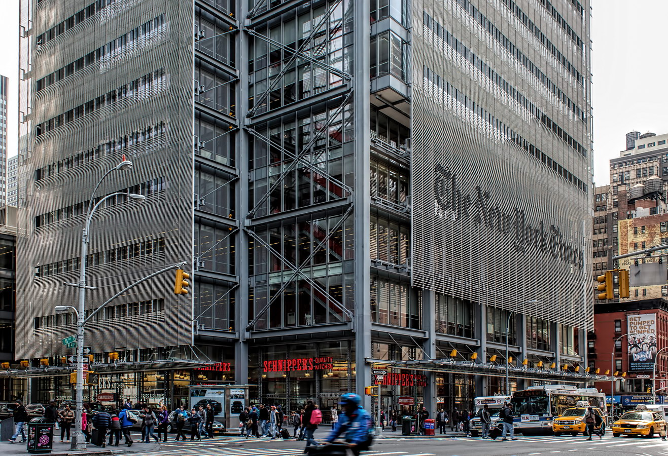
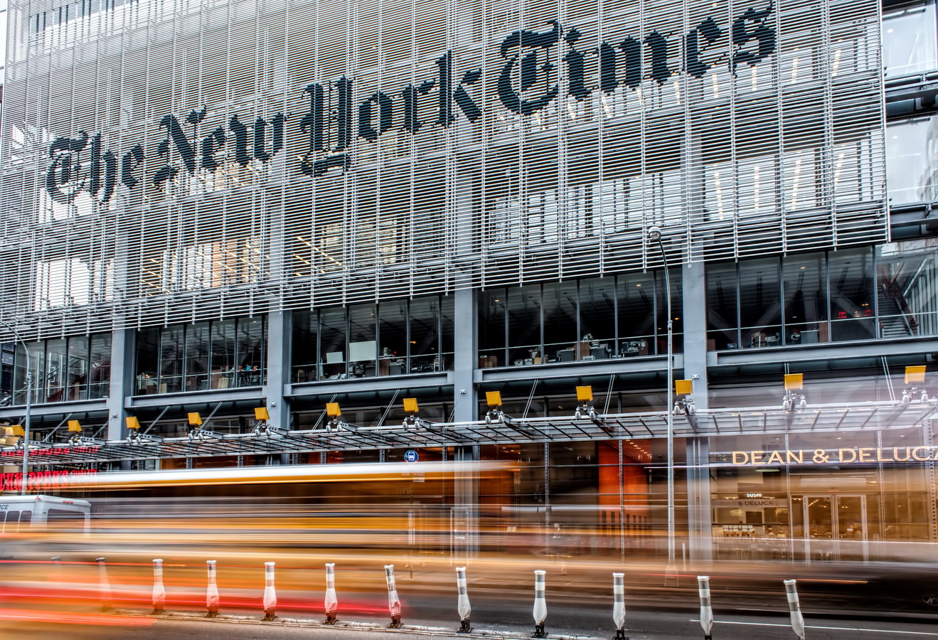
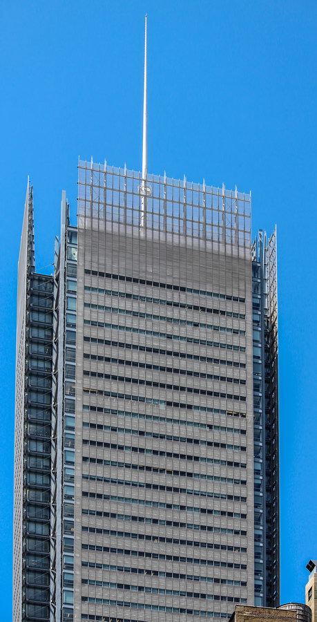
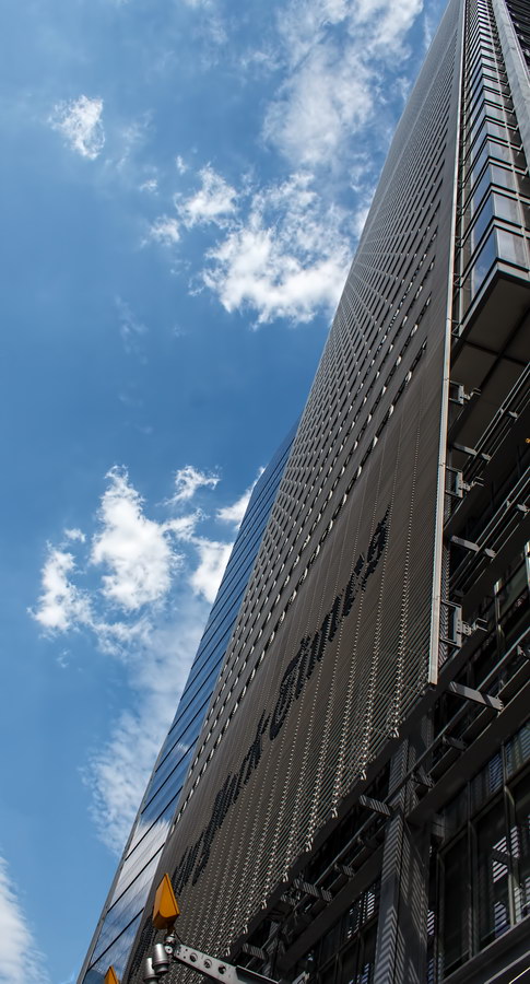
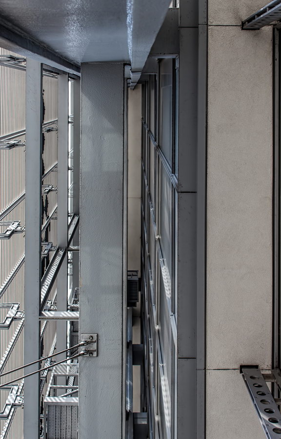
New York Times Building, called the ugliest building in New York City by the American Institute of Architects, is nonetheless impressive in many ways. The exposed frame, ceramic-rod screen, monumental logo and sheer height make it stand out even in a neighborhood filled with buildings that scream for attention.

(Some critics say it was crazy for the Times to spend nearly half a billion dollars for a new headquarters (58% ownership of the $850 million cost) while the paper’s fortunes are shrinking – but that’s neither an architectural nor an aesthetic argument.)

The New York Times Building’s innovative ceramic rod screen – which dramatically cuts energy costs by blocking solar heat – became an embarrassment: Four climbers (so far) have used the screen as a ladder to scale the 52-story facade. The first climber said he did it to protest global warming: Ironic, as his action discourages use of this technology to cut greenhouse gas emissions.

The high-tech lobby, meanwhile, revives and updates an old newspaper tradition: the news is on display for passers-by.

New York Times Building Vital Statistics
New York Times Building Recommended Reading

Google Map

Mondrian

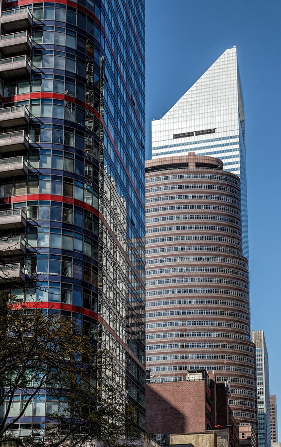
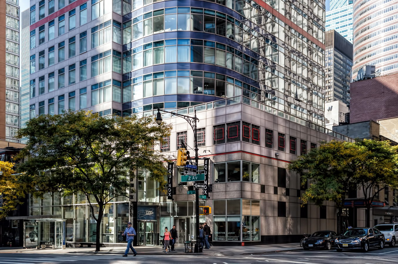
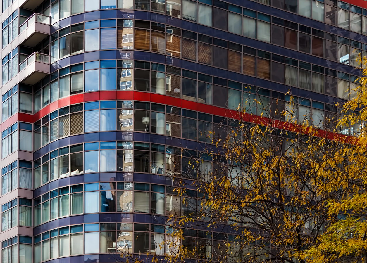
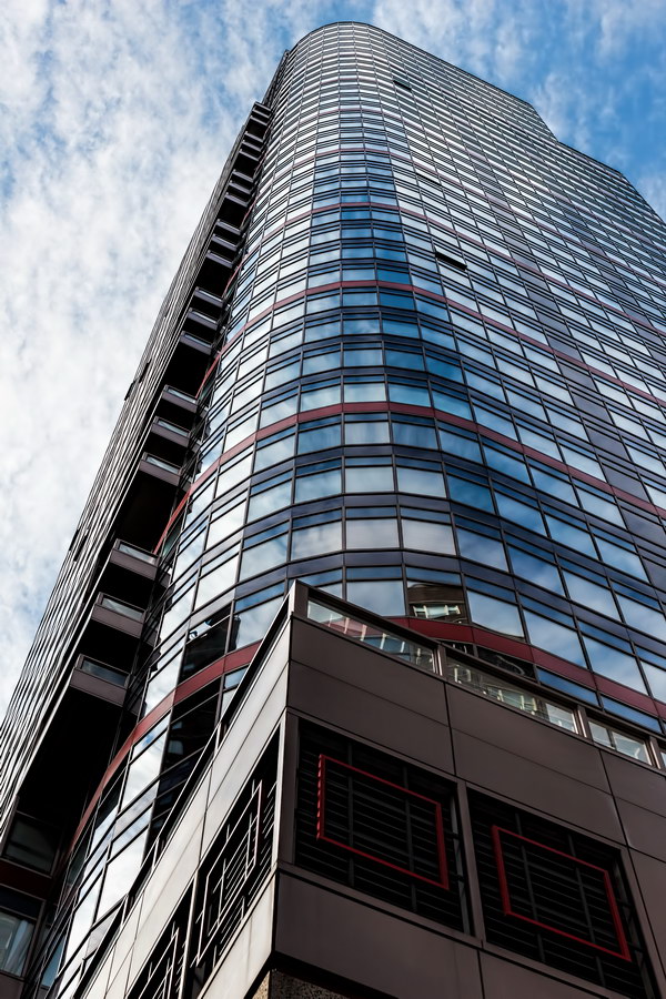
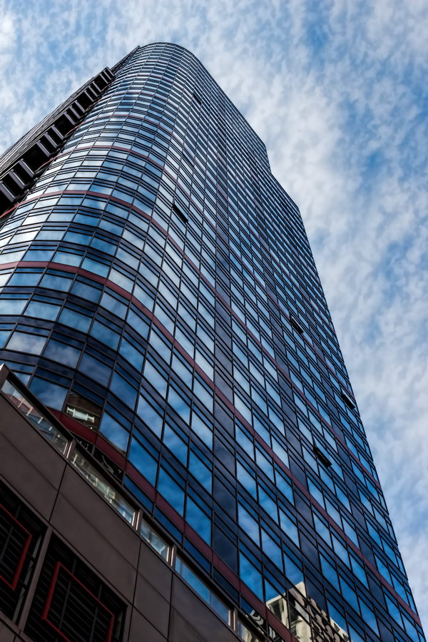
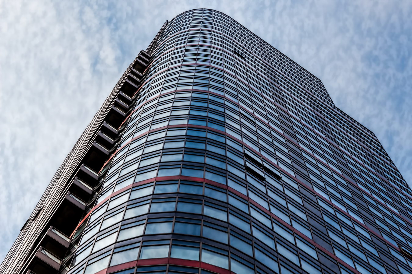
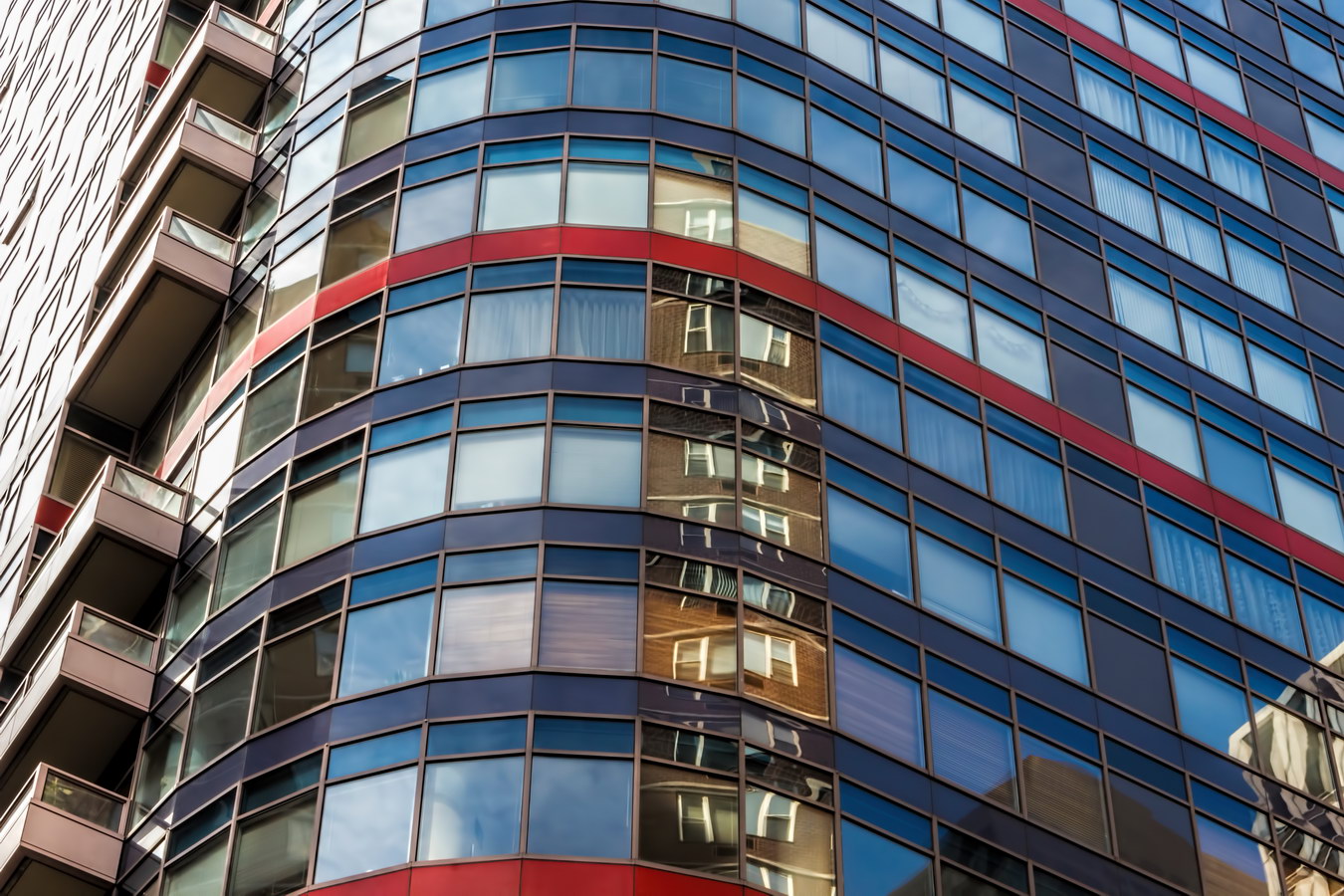
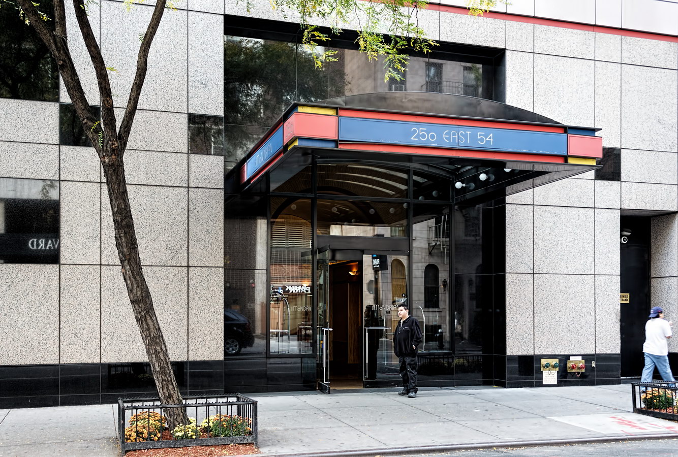
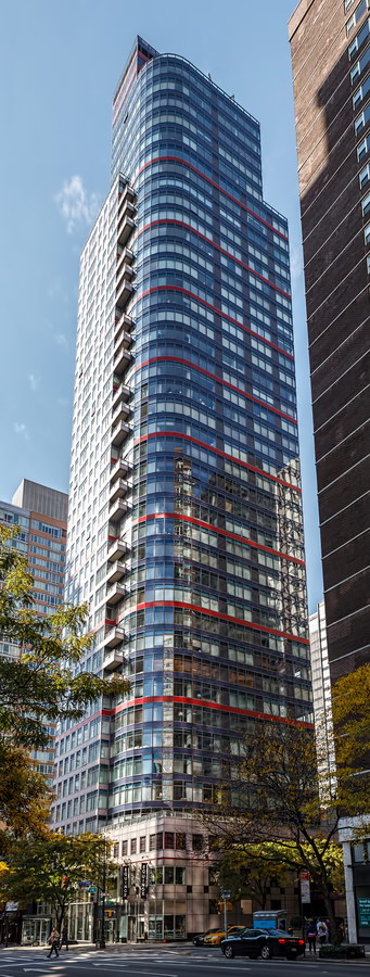
Le Mondrian – now Anglicized to The Mondrian – wears a colorful grid that lives up to its name despite the rounded corner. The tower is certainly among New York’s most colorful pieces of architecture.

The name came years after the glass-enclosed condo was finished, however. The 1992 structure was originally Le Palais – an unluckily timed condo that sat vacant for two years. New owners held a naming contest, and Le Mondrian was the winner. “Music Box” might be an equally appropriate name, for the way that balconies intersect the tower’s curved northeast corner.

But by any other name, this eye candy would look as sweet in a neighborhood known for its polished geometric icons: Lipstick Building, CitiGroup Center, and 599 Lexington Avenue are just down the block.

Mondrian Vital Statistics
Mondrian Recommended Reading

Google Map