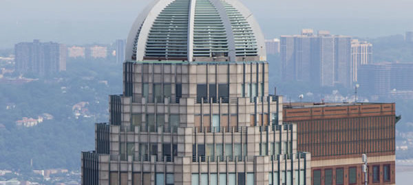
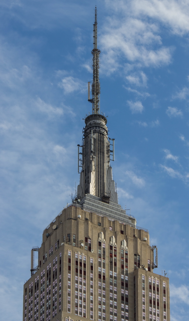
Landmark skyscrapers are often topped by elaborate cornices, spires, crowns and cupolas.
It’s always fascinated me that architects put so much design up where most people won’t – or can’t – see it. Why not impress at street level?
There are at least three reasons, it turns out.
First, as buildings got taller it became less practical – and less affordable – to decorate an entire building’s facade. Decorative elements, whether simple brick patterns or terra cotta or carved marble, cost money to design, manufacture and install. So this “problem” of tall buildings was solved by equating the building with a classical column: base, shaft and crown. The shaft is undecorated, the base and crown contain the flourishes.
Second, architects and owners want their creations to stand out at a distance – to be a recognizable part of the skyline. A plain roof, no matter how lofty, is rather anonymous. The Donald would not approve.
Third, tall buildings need water tanks, elevator and ventilation machinery on the roof; all are ugly enough to warrant hiding behind a decorative screen.
In some cases, the crowns might also be designed to alleviate aerodynamic stresses. Wind speed increases with height, so turbulence can be a factor.
A few spires have practical functions – even if the idea is ultimately found impractical. The Empire State Building’s mast was designed for mooring dirigibles, before it was proved unworkable (and dirigibles became extinct). Now the mast is used to mount television broadcast antennas.
And in more than one case, a spire or cupola has been added simply to increase the building’s height, for “tallest” bragging rights. The Chrysler Building’s spire was designed that way.
Here are a few of my favorite spires, crowns and cupolas. Enjoy!

![[Crowns & Cupolas] IMG_5309 [7/7/2012 11:03:57 AM] [Crowns & Cupolas] IMG_5309 [7/7/2012 11:03:57 AM]](https://www.newyorkitecture.com/wp-content/gallery/spires-crowns-cupolas/img_5309_resize.jpg)
![[Crowns & Cupolas] IMG_5347 [7/7/2012 11:13:07 AM] [Crowns & Cupolas] IMG_5347 [7/7/2012 11:13:07 AM]](https://www.newyorkitecture.com/wp-content/gallery/spires-crowns-cupolas/img_5347_resize.jpg)
![[Crowns & Cupolas] IMG_5337 [7/7/2012 11:10:27 AM] [Crowns & Cupolas] IMG_5337 [7/7/2012 11:10:27 AM]](https://www.newyorkitecture.com/wp-content/gallery/spires-crowns-cupolas/img_5337_resize.jpg)
![[Crowns & Cupolas] IMG_5334 [7/7/2012 11:10:17 AM] [Crowns & Cupolas] IMG_5334 [7/7/2012 11:10:17 AM]](https://www.newyorkitecture.com/wp-content/gallery/spires-crowns-cupolas/img_5334_resize.jpg)
![[Crowns & Cupolas] IMG_5329 [7/7/2012 11:07:35 AM] [Crowns & Cupolas] IMG_5329 [7/7/2012 11:07:35 AM]](https://www.newyorkitecture.com/wp-content/gallery/spires-crowns-cupolas/img_5329_resize.jpg)
![[Crowns & Cupolas] IMG_5322 [7/7/2012 11:06:00 AM] [Crowns & Cupolas] IMG_5322 [7/7/2012 11:06:00 AM]](https://www.newyorkitecture.com/wp-content/gallery/spires-crowns-cupolas/img_5322_resize.jpg)
![[Crowns & Cupolas] IMG_5316 [7/7/2012 11:05:30 AM] [Crowns & Cupolas] IMG_5316 [7/7/2012 11:05:30 AM]](https://www.newyorkitecture.com/wp-content/gallery/spires-crowns-cupolas/img_5316_resize.jpg)
![[Crowns & Cupolas] IMG_5312 [7/7/2012 11:04:27 AM] [Crowns & Cupolas] IMG_5312 [7/7/2012 11:04:27 AM]](https://www.newyorkitecture.com/wp-content/gallery/spires-crowns-cupolas/img_5312_resize.jpg)
![[Crowns & Cupolas] IMG_5311 [7/7/2012 11:04:23 AM] [Crowns & Cupolas] IMG_5311 [7/7/2012 11:04:23 AM]](https://www.newyorkitecture.com/wp-content/gallery/spires-crowns-cupolas/img_5311_resize.jpg)
![[Crowns & Cupolas] IMG_5351 [7/7/2012 11:13:45 AM] [Crowns & Cupolas] IMG_5351 [7/7/2012 11:13:45 AM]](https://www.newyorkitecture.com/wp-content/gallery/spires-crowns-cupolas/img_5351_resize.jpg)
![[Crowns & Cupolas] IMG_5300 [7/7/2012 11:01:56 AM] [Crowns & Cupolas] IMG_5300 [7/7/2012 11:01:56 AM]](https://www.newyorkitecture.com/wp-content/gallery/spires-crowns-cupolas/img_5300_resize.jpg)
![[Crowns & Cupolas] IMG_5298 [7/7/2012 11:00:14 AM] [Crowns & Cupolas] IMG_5298 [7/7/2012 11:00:14 AM]](https://www.newyorkitecture.com/wp-content/gallery/spires-crowns-cupolas/img_5298_resize.jpg)
![[Crowns & Cupolas] IMG_5293 [7/7/2012 10:57:25 AM] [Crowns & Cupolas] IMG_5293 [7/7/2012 10:57:25 AM]](https://www.newyorkitecture.com/wp-content/gallery/spires-crowns-cupolas/img_5293_resize.jpg)
![[Crowns & Cupolas] IMG_5266 [7/7/2012 10:40:12 AM] [Crowns & Cupolas] IMG_5266 [7/7/2012 10:40:12 AM]](https://www.newyorkitecture.com/wp-content/gallery/spires-crowns-cupolas/img_5266_resize.jpg)
![[Crowns & Cupolas] IMG_4720 [10/28/2011 11:25:42 AM] [Crowns & Cupolas] IMG_4720 [10/28/2011 11:25:42 AM]](https://www.newyorkitecture.com/wp-content/gallery/spires-crowns-cupolas/img_4720.jpg)
![[Crowns & Cupolas] IMG_4702 [7/3/2012 10:40:07 AM] [Crowns & Cupolas] IMG_4702 [7/3/2012 10:40:07 AM]](https://www.newyorkitecture.com/wp-content/gallery/spires-crowns-cupolas/img_4702_resize.jpg)
![[Crowns & Cupolas] IMG_4699 [7/3/2012 10:38:12 AM] [Crowns & Cupolas] IMG_4699 [7/3/2012 10:38:12 AM]](https://www.newyorkitecture.com/wp-content/gallery/spires-crowns-cupolas/img_4699_resize.jpg)
![[Crowns & Cupolas] IMG_4688 [7/3/2012 10:32:52 AM] [Crowns & Cupolas] IMG_4688 [7/3/2012 10:32:52 AM]](https://www.newyorkitecture.com/wp-content/gallery/spires-crowns-cupolas/img_4688_resize.jpg)
![[Crowns & Cupolas] IMG_6274_5_6Adjust [3/19/2012 1:40:15 PM] [Crowns & Cupolas] IMG_6274_5_6Adjust [3/19/2012 1:40:15 PM]](https://www.newyorkitecture.com/wp-content/gallery/spires-crowns-cupolas/img_6274_5_6adjust_resize.jpg)
![[Crowns & Cupolas] IMG_9118 [8/16/2012 3:08:59 PM] [Crowns & Cupolas] IMG_9118 [8/16/2012 3:08:59 PM]](https://www.newyorkitecture.com/wp-content/gallery/spires-crowns-cupolas/img_9118_resize.jpg)
![[Crowns & Cupolas] IMG_9117 [8/16/2012 3:08:37 PM] [Crowns & Cupolas] IMG_9117 [8/16/2012 3:08:37 PM]](https://www.newyorkitecture.com/wp-content/gallery/spires-crowns-cupolas/img_9117_resize.jpg)
![[Crowns & Cupolas] IMG_9115 [8/16/2012 3:08:21 PM] [Crowns & Cupolas] IMG_9115 [8/16/2012 3:08:21 PM]](https://www.newyorkitecture.com/wp-content/gallery/spires-crowns-cupolas/img_9115_resize.jpg)
![[Crowns & Cupolas] IMG_6996 [7/12/2012 10:33:44 PM] [Crowns & Cupolas] IMG_6996 [7/12/2012 10:33:44 PM]](https://www.newyorkitecture.com/wp-content/gallery/spires-crowns-cupolas/img_6996_resize.jpg)
![[Crowns & Cupolas] IMG_6721_2_3Adjust [2/4/2012 11:49:06 AM] [Crowns & Cupolas] IMG_6721_2_3Adjust [2/4/2012 11:49:06 AM]](https://www.newyorkitecture.com/wp-content/gallery/spires-crowns-cupolas/img_6721_2_3adjust_resize.jpg)
![[Crowns & Cupolas] IMG_6600 [7/11/2012 1:09:40 PM] [Crowns & Cupolas] IMG_6600 [7/11/2012 1:09:40 PM]](https://www.newyorkitecture.com/wp-content/gallery/spires-crowns-cupolas/img_6600_resize.jpg)
![[Crowns & Cupolas] IMG_6593 [7/11/2012 1:06:15 PM] [Crowns & Cupolas] IMG_6593 [7/11/2012 1:06:15 PM]](https://www.newyorkitecture.com/wp-content/gallery/spires-crowns-cupolas/img_6593_resize.jpg)
![[Crowns & Cupolas] IMG_6588 [7/11/2012 1:04:53 PM] [Crowns & Cupolas] IMG_6588 [7/11/2012 1:04:53 PM]](https://www.newyorkitecture.com/wp-content/gallery/spires-crowns-cupolas/img_6588_resize.jpg)
![[Crowns & Cupolas] IMG_4582a [6/23/2012 12:33:56 PM] [Crowns & Cupolas] IMG_4582a [6/23/2012 12:33:56 PM]](https://www.newyorkitecture.com/wp-content/gallery/spires-crowns-cupolas/img_4582a_resize.jpg)
![[Crowns & Cupolas] IMG_6253_4_5Adjust [3/19/2012 1:27:30 PM] [Crowns & Cupolas] IMG_6253_4_5Adjust [3/19/2012 1:27:30 PM]](https://www.newyorkitecture.com/wp-content/gallery/spires-crowns-cupolas/img_6253_4_5adjust_resize.jpg)
![[Crowns & Cupolas] IMG_5981 [11/1/2011 3:50:27 PM] [Crowns & Cupolas] IMG_5981 [11/1/2011 3:50:27 PM]](https://www.newyorkitecture.com/wp-content/gallery/spires-crowns-cupolas/img_5981.jpg)
![[Crowns & Cupolas] IMG_5528 [7/8/2012 1:48:47 PM] [Crowns & Cupolas] IMG_5528 [7/8/2012 1:48:47 PM]](https://www.newyorkitecture.com/wp-content/gallery/spires-crowns-cupolas/img_5528_resize.jpg)
![[Crowns & Cupolas] IMG_5475 [7/8/2012 1:14:50 PM] [Crowns & Cupolas] IMG_5475 [7/8/2012 1:14:50 PM]](https://www.newyorkitecture.com/wp-content/gallery/spires-crowns-cupolas/img_5475_resize.jpg)
![[Crowns & Cupolas] IMG_5465 [7/8/2012 1:10:05 PM] [Crowns & Cupolas] IMG_5465 [7/8/2012 1:10:05 PM]](https://www.newyorkitecture.com/wp-content/gallery/spires-crowns-cupolas/img_5465_resize.jpg)
![[Crowns & Cupolas] IMG_5463 [7/8/2012 1:09:37 PM] [Crowns & Cupolas] IMG_5463 [7/8/2012 1:09:37 PM]](https://www.newyorkitecture.com/wp-content/gallery/spires-crowns-cupolas/img_5463_resize.jpg)
![[Crowns & Cupolas] IMG_5357 [7/7/2012 11:18:00 AM] [Crowns & Cupolas] IMG_5357 [7/7/2012 11:18:00 AM]](https://www.newyorkitecture.com/wp-content/gallery/spires-crowns-cupolas/img_5357_resize.jpg)
![[Crowns & Cupolas] IMG_5354 [7/7/2012 11:14:11 AM] [Crowns & Cupolas] IMG_5354 [7/7/2012 11:14:11 AM]](https://www.newyorkitecture.com/wp-content/gallery/spires-crowns-cupolas/img_5354_resize.jpg)
![[Crowns & Cupolas] IMG_2482 [6/6/2012 1:51:53 PM] [Crowns & Cupolas] IMG_2482 [6/6/2012 1:51:53 PM]](https://www.newyorkitecture.com/wp-content/gallery/spires-crowns-cupolas/img_2482_resize.jpg)
![[Crowns & Cupolas] IMG_3536 [] [Crowns & Cupolas] IMG_3536 []](https://www.newyorkitecture.com/wp-content/gallery/spires-crowns-cupolas/img_3536_resize.jpg)
![[Crowns and Cupolas] IMG_3519 [10/13/2012 11:50:29 AM] [Crowns and Cupolas] IMG_3519 [10/13/2012 11:50:29 AM]](https://www.newyorkitecture.com/wp-content/gallery/spires-crowns-cupolas/img_3519_resize.jpg)
![[Crowns and Cupolas] IMG_3516 [10/13/2012 11:49:35 AM] [Crowns and Cupolas] IMG_3516 [10/13/2012 11:49:35 AM]](https://www.newyorkitecture.com/wp-content/gallery/spires-crowns-cupolas/img_3516_resize.jpg)
![[Crowns & Cupolas] IMG_3092 [10/5/2012 11:01:38 AM] [Crowns & Cupolas] IMG_3092 [10/5/2012 11:01:38 AM]](https://www.newyorkitecture.com/wp-content/gallery/spires-crowns-cupolas/img_3092_resize.jpg)
![[Crowns & Cupolas] IMG_3062 [10/5/2012 10:39:18 AM] [Crowns & Cupolas] IMG_3062 [10/5/2012 10:39:18 AM]](https://www.newyorkitecture.com/wp-content/gallery/spires-crowns-cupolas/img_3062_resize.jpg)
![[Crowns & Cupolas] IMG_3059 [10/5/2012 10:38:19 AM] [Crowns & Cupolas] IMG_3059 [10/5/2012 10:38:19 AM]](https://www.newyorkitecture.com/wp-content/gallery/spires-crowns-cupolas/img_3059_resize.jpg)
![[Crowns & Cupolas] IMG_3015 [6/11/2012 9:16:12 AM] [Crowns & Cupolas] IMG_3015 [6/11/2012 9:16:12 AM]](https://www.newyorkitecture.com/wp-content/gallery/spires-crowns-cupolas/img_3015_resize.jpg)
![[Crowns & Cupolas] IMG_2996 [10/5/2012 10:06:03 AM] [Crowns & Cupolas] IMG_2996 [10/5/2012 10:06:03 AM]](https://www.newyorkitecture.com/wp-content/gallery/spires-crowns-cupolas/img_2996_resize.jpg)

![[Crowns & Cupolas] IMG_1952 [5/31/2012 1:47:49 PM] [Crowns & Cupolas] IMG_1952 [5/31/2012 1:47:49 PM]](https://www.newyorkitecture.com/wp-content/gallery/spires-crowns-cupolas/img_1952_resize.jpg)
![[Crowns & Cupolas] IMG_1917 [5/31/2012 12:14:11 PM] [Crowns & Cupolas] IMG_1917 [5/31/2012 12:14:11 PM]](https://www.newyorkitecture.com/wp-content/gallery/spires-crowns-cupolas/img_1917_resize.jpg)
![[Crowns & Cupolas] IMG_1887 [9/11/2012 10:13:02 AM] [Crowns & Cupolas] IMG_1887 [9/11/2012 10:13:02 AM]](https://www.newyorkitecture.com/wp-content/gallery/spires-crowns-cupolas/img_1887_resize.jpg)
![[Crowns & Cupolas] IMG_1746 [9/11/2012 8:35:51 AM] [Crowns & Cupolas] IMG_1746 [9/11/2012 8:35:51 AM]](https://www.newyorkitecture.com/wp-content/gallery/spires-crowns-cupolas/img_1746_resize.jpg)
![[Crowns & Cupolas] IMG_1566 [9/10/2012 11:35:38 AM] [Crowns & Cupolas] IMG_1566 [9/10/2012 11:35:38 AM]](https://www.newyorkitecture.com/wp-content/gallery/spires-crowns-cupolas/img_1566_resize.jpg)
![[Crowns & Cupolas] IMG_0505 [8/29/2012 9:06:25 PM] [Crowns & Cupolas] IMG_0505 [8/29/2012 9:06:25 PM]](https://www.newyorkitecture.com/wp-content/gallery/spires-crowns-cupolas/img_0505_resize.jpg)
![[Crowns & Cupolas] IMG_0480 [8/29/2012 8:38:33 PM] [Crowns & Cupolas] IMG_0480 [8/29/2012 8:38:33 PM]](https://www.newyorkitecture.com/wp-content/gallery/spires-crowns-cupolas/img_0480_resize.jpg)
![[Crowns & Cupolas] IMG_0472 [8/29/2012 8:34:00 PM] [Crowns & Cupolas] IMG_0472 [8/29/2012 8:34:00 PM]](https://www.newyorkitecture.com/wp-content/gallery/spires-crowns-cupolas/img_0472_resize.jpg)
![[Crowns & Cupolas] IMG_4538 [6/23/2012 12:23:50 PM] [Crowns & Cupolas] IMG_4538 [6/23/2012 12:23:50 PM]](https://www.newyorkitecture.com/wp-content/gallery/spires-crowns-cupolas/img_4538_resize.jpg)
![[Crowns & Cupolas] IMG_4569 [6/23/2012 12:31:10 PM] [Crowns & Cupolas] IMG_4569 [6/23/2012 12:31:10 PM]](https://www.newyorkitecture.com/wp-content/gallery/spires-crowns-cupolas/img_4569_resize.jpg)
![[Crowns & Cupolas] IMG_4563 [6/23/2012 12:30:30 PM] [Crowns & Cupolas] IMG_4563 [6/23/2012 12:30:30 PM]](https://www.newyorkitecture.com/wp-content/gallery/spires-crowns-cupolas/img_4563_resize.jpg)
![[Crowns & Cupolas] IMG_4562 [6/23/2012 12:30:11 PM] [Crowns & Cupolas] IMG_4562 [6/23/2012 12:30:11 PM]](https://www.newyorkitecture.com/wp-content/gallery/spires-crowns-cupolas/img_4562_resize.jpg)
![[Crowns & Cupolas] IMG_4560 [6/23/2012 12:30:01 PM] [Crowns & Cupolas] IMG_4560 [6/23/2012 12:30:01 PM]](https://www.newyorkitecture.com/wp-content/gallery/spires-crowns-cupolas/img_4560_resize.jpg)
![[Crowns & Cupolas] IMG_4548 [6/23/2012 12:26:57 PM] [Crowns & Cupolas] IMG_4548 [6/23/2012 12:26:57 PM]](https://www.newyorkitecture.com/wp-content/gallery/spires-crowns-cupolas/img_4548_resize.jpg)
![[Crowns & Cupolas] IMG_4544 [6/23/2012 12:25:57 PM] [Crowns & Cupolas] IMG_4544 [6/23/2012 12:25:57 PM]](https://www.newyorkitecture.com/wp-content/gallery/spires-crowns-cupolas/img_4544_resize.jpg)
![[Crowns & Cupolas] IMG_4543 [6/23/2012 12:24:40 PM] [Crowns & Cupolas] IMG_4543 [6/23/2012 12:24:40 PM]](https://www.newyorkitecture.com/wp-content/gallery/spires-crowns-cupolas/img_4543_resize.jpg)
![[Crowns & Cupolas] IMG_4540 [6/23/2012 12:24:12 PM] [Crowns & Cupolas] IMG_4540 [6/23/2012 12:24:12 PM]](https://www.newyorkitecture.com/wp-content/gallery/spires-crowns-cupolas/img_4540_resize.jpg)
![[Crowns & Cupolas] 05_09140 [8/26/2012 1:01:35 PM] [Crowns & Cupolas] 05_09140 [8/26/2012 1:01:35 PM]](https://www.newyorkitecture.com/wp-content/gallery/spires-crowns-cupolas/05_09140_resize.jpg)
![[Crowns & Cupolas] IMG_4460 [6/21/2012 10:05:33 AM] [Crowns & Cupolas] IMG_4460 [6/21/2012 10:05:33 AM]](https://www.newyorkitecture.com/wp-content/gallery/spires-crowns-cupolas/img_4460_resize.jpg)
![[Crowns & Cupolas] IMG_3993 [10/18/2012 3:37:54 PM] [Crowns & Cupolas] IMG_3993 [10/18/2012 3:37:54 PM]](https://www.newyorkitecture.com/wp-content/gallery/spires-crowns-cupolas/img_3993_resize.jpg)
![[Crowns & Cupolas] IMG_3969 [10/18/2012 3:17:51 PM] [Crowns & Cupolas] IMG_3969 [10/18/2012 3:17:51 PM]](https://www.newyorkitecture.com/wp-content/gallery/spires-crowns-cupolas/img_3969_resize.jpg)
![[Crowns & Cupolas] IMG_3963 [10/18/2012 3:03:09 PM] [Crowns & Cupolas] IMG_3963 [10/18/2012 3:03:09 PM]](https://www.newyorkitecture.com/wp-content/gallery/spires-crowns-cupolas/img_3963_resize.jpg)
![[Crowns & Cupolas] IMG_3962 [10/18/2012 3:02:43 PM] [Crowns & Cupolas] IMG_3962 [10/18/2012 3:02:43 PM]](https://www.newyorkitecture.com/wp-content/gallery/spires-crowns-cupolas/img_3962_resize.jpg)
![[Crowns & Cupolas] IMG_3944 [10/18/2012 2:44:01 PM] [Crowns & Cupolas] IMG_3944 [10/18/2012 2:44:01 PM]](https://www.newyorkitecture.com/wp-content/gallery/spires-crowns-cupolas/img_3944_resize.jpg)
![[Crowns & Cupolas] IMG_3816 [6/15/2012 11:01:08 AM] [Crowns & Cupolas] IMG_3816 [6/15/2012 11:01:08 AM]](https://www.newyorkitecture.com/wp-content/gallery/spires-crowns-cupolas/img_3816_resize.jpg)